


Best Embedded Analytics Tools for SaaS (2026): Top 16 Compared
.png?width=88&height=88&name=portrait_agathe_face%20(1).png)
Agathe Huez
Publié le 05.08.21
Mis à jour le 02.06.26
10 min

Choosing the right embedded analytics tool is one of the most consequential product decisions a SaaS team makes. The wrong choice means months of integration work, a poor end-user experience, or a TCO that far exceeds the original estimate. This guide compares 16 platforms across the criteria that matter most for SaaS products: white-labeling depth, multi-tenant security, AI capabilities, time to deploy, and total cost of ownership.
01. Quick Comparison: Best Embedded Analytics Tools at a Glance
-
Toucan: Best for SaaS product teams needing conversational AI + white-label and self-service.
-
Luzmo: Best for fast setup with strong branding, limited advanced analytics.
-
Explo: Best for startups wanting modern UX and quick deployment.
-
GoodData: Best for enterprise embedded analytics with self-hosted options.
-
Embeddable: Best for developer teams wanting fully native (no iframe) embedding.
-
Power BI Embedded: Best for Microsoft-stack organizations.
-
Metabase: Best for cost-sensitive teams or internal use.
-
Sisense: Best for large orgs with strong technical capacity.
Useful ressources:
Embedded Analytics vs Traditional BI: Complete Comparison (2026)
The 8 Best AI Embedded Analytics Tools 2026
AI in Embedded Analytics: 2026 Guide for SaaS
02. What Is Embedded Analytics Software?
Embedded analytics software lets you place dashboards, reports, and visualizations directly inside your own application. Instead of sending users to a separate BI tool, you give them insights where they work. This makes it easier for them to use data and improves engagement.
Typical features include:
- Embedding via iframe, SDK, or API
- White-labeling (custom colors, logos, CSS)
- Row-level security and SSO integration
- Multi-tenant architecture
- Interactive dashboards and reports
- Export and sharing options
📖 Learn more about the concept of embedded analytics in this Gartner glossary entry and in our guide: What is Embedded Analytics?
03. Why Embedded Analytics Matters in 2026?
💡 According to Gartner, by 2026 more than 60% of SaaS vendors will embed analytics into their products — compared to just 25% in 2020.
Unlike standalone BI tools, embedded analytics:
- Improves product stickiness and user engagement
- Delivers real-time insights inside your app
- Creates competitive differentiation
- Reduces churn and increases customer retention
If you’re building a SaaS product or digital platform, choosing the best embedded analytics software is now a strategic decision.
💡 For more context on market trends, see our article on Customer-Facing Analytics and how it drives product adoption.
04. How We Evaluated the Best Embedded Analytics Tools?
We assessed each platform across 7 core criteria that matter most for SaaS and ISVs:
| Criterion | Why It Matters |
| Ease of Embedding (API / SDK / iFrame) | Embedding should be seamless and fast to implement |
| Customization & White-labeling | Users expect analytics to match your product’s look & feel |
| Security & Multi-tenancy | Essential for customer-facing analytics in SaaS |
| Data Connectivity & Modeling | Ability to connect SQL, NoSQL, real-time, and cloud sources |
| Scalability & Performance | Handle thousands of concurrent users, fast load time |
| Pricing & Total Cost of Ownership (TCO) | Not just license cost — also setup, scaling, and maintenance |
| Support & Documentation | Directly impacts time-to-value and adoption |
05. Pricing & TCO Considerations
Pricing for embedded analytics can be tricky. Most platforms don’t share prices publicly, and real costs depend on how you deploy and scale. Look beyond license fees to consider total cost of ownership (TCO).
Main pricing models you’ll find:
- License-based (per app / per workspace): Predictable and stable. Common for SaaS use cases.
- Per-user pricing: Easy to start with but can get expensive at scale.
- Usage-based (per session / per query / per render): Flexible but unpredictable if usage spikes.
- Open source: Free to install but you pay for hosting, maintenance, and developer time.
Learn more on how to calculate the ROI of an embedded analytics software in our blog post.
06. How to Choose the Right Embedded Analytics Tool?
Choosing embedded analytics software is less about chasing the “best” platform overall and more about finding the best fit for your product, team, and customers.
Team skills & resources- No front-end engineers? Choose no-code or low-code.
- Strong dev team? Choose developer-first frameworks.
- Need dashboards live in <1 month? Choose fast onboarding.
- Can invest months? Consider complex platforms.
- Ensure row-level security, SSO, multi-tenancy, and scalability.
- Look for white-labeling, theming, responsive design.
- Match pricing model to your revenue model.
07. Comparaison Table
|
Tool |
Key Features |
Pros |
Cons |
Pricing |
Best For |
|
Toucan |
No-code builder, white-label, conversational AI layer, multi-tenant RLS, web/React component |
Fast to deploy, AI-native, low TCO |
Less suited for heavy data modeling |
License-based (mid four-figures/yr) |
SaaS product teals, customer-facing analytics |
|
Domo |
1000+ connectors, low-code app studio, real-time data |
Enterprise-grade, huge ecosystem |
Expensive, complex setup |
Enterprise (six figures/yr) |
Large enterprises |
|
Embeddable |
Flexible charts provided as code. Advanced developer tools. Performance at scale. Enterprise security. |
Feels 100% native, loads fast, infinitely extensible. |
Complex implementations can require more developer time. |
Unlimited license as standard. Varying options for different use cases. |
Product/Engineering teams who care about speed and control. |
|
Power BI Embedded |
Azure-native, pay-as-you-go, security |
Affordable, popular, good docs |
Azure lock-in, limited UI flexibility |
Usage-based (per render/hour) |
Microsoft-based orgs |
|
Sisense |
Developer APIs, plugins, scalable |
Powerful for big data |
Costly, steep learning curve |
Enterprise (six figures/yr) |
Large SaaS |
|
Looker |
Semantic modeling, governed analytics |
Highly flexible, secure |
Requires data experts, costly |
Enterprise (six figures/yr) |
Enterprises |
|
Qlik Sense |
Associative engine, self-service, embedding |
Strong exploration, solid visuals |
UI dated, learning curve |
Per-user or capacity |
Data-driven orgs |
|
Logi Symphony |
Full framework, API-first |
Extreme flexibility |
Dev-heavy, time-intensive |
License-based (mid five-figures/yr) |
ISVs |
|
Yellowfin BI |
Dashboards, storytelling, collaboration |
Fast setup, collaborative UX |
Limited customization |
Subscription (low five-figures/yr) |
SMBs |
|
Metabase |
Open-source, SQL-based dashboards, embedding |
Free, fast setup, simple UI |
Limited branding & scaling |
Free / paid cloud (~$100/mo) |
Startups |
|
Luzmo |
Drag-and-drop builder, white-label, APIs |
UX-friendly, fast embed, modern visuals |
Limited advanced analytics |
Tiered SaaS (low four-figures/yr) |
SaaS products |
|
Qrvey |
AWS-native, embedded analytics for SaaS |
Serverless, scalable, API-first |
Less known, needs AWS skills |
Custom (mid five-figures/yr) |
SaaS on AWS |
|
Holistics |
SQL-based modeling, embedded dashboards |
Developer-friendly, flexible |
Requires SQL, fewer visuals |
Per-user (mid five-figures/yr) |
Data teams |
|
Explo |
Low-code, secure embedding, modern UX |
Fast setup, UX-focused |
Young platform, fewer features |
SaaS (low four-figures/yr) |
Startups/scaleups |
07. Tool Reviews
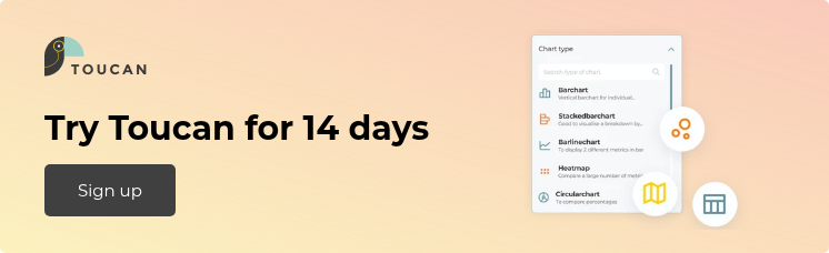
Toucan

Toucan is an embedded AI analytics platform built for SaaS product teams. It delivers white-label, customer-facing analytics via web component or React component, with native multi-tenant row-level security and a conversational AI layer. Non-technical users build and update dashboards without engineering tickets. Developers extend via SDK for custom integrations. The AI layer lets end users ask business questions in natural language and receive instant charts, without SQL or analyst support.
Pros: fast to deploy, strong security, user role management, white-labeling, self-service, SDK for deeper customization, low TCO.
Cons: less suited for heavy data modeling.
Pricing: License-based (per app or workspace), usually mid four-figures annually.
Learn more: Toucan on G2
G2 reviewers consistently highlight speed and ease of deployment: "Crazy fast prototyping" and "Sharing data with customers is no longer a hassle." Toucan holds a strong rating across 163 verified reviews.

Domo

Domo is a full data platform. It has more than 1,000 connectors and lets you build internal apps on top of dashboards. It fits large environments but takes time to set up and maintain.
Pros: powerful, huge ecosystem, real-time pipelines.
Cons: expensive, steep learning curve, may be too complex for small teams.
Pricing: Enterprise-level, often six figures annually.
Learn more: Domo documentation
Embeddable

Embeddable is a developer-first embedded analytics toolkit for SaaS companies that want to deliver fast, secure, and fully native dashboards inside their products. It combines a no-code dashboard builder for rapid iteration with React/Vue SDKs and APIs for full code-level control. Designed for multi-tenant SaaS environments, it supports advanced data partitioning, row-level security, and environment-based deployments - ensuring analytics that scale securely and feel 100% part of your product.
Pros: fully native embedding (no iframes), lightning-fast load times, developer-friendly SDKs and APIs, SOC 2–certified, predictable fixed pricing.
Cons: requires some frontend development for highly complex designs; you’ll likely require a separate tool for your internal data team to run BI & analysis (Embeddable is, as the name suggests, for embedding).
Pricing: transparent fixed subscription with unlimited usage, no per-user or per-dashboard fees; enterprise options available.
Learn more: Embeddable documentation
Microsoft Power BI Embedded

Power BI, from Microsoft, makes it easy to share insights directly inside your own app. It uses Secure Embed, a no-code option that lets you place reports on a web page without heavy setup. Power BI supports embedding data both inside and outside your organization, keeping it current while controlling who can access it.
Pros: Strong embedding tools, works well with other Microsoft products.
Cons: Limited options for sharing outside your organization.
Pricing: Usage-based (per render/hour), starts low.
Learn more: Microsoft Power BI docs
Sisense

Sisense is aimed at teams with strong technical skills. It offers deep APIs and an in-memory engine for large datasets. It gives full control over UX and data flows but takes time to learn. Pros: flexible, powerful, scales well, strong developer APIs.
Cons: complex setup, high price, needs skilled engineers.
Pricing: Custom enterprise pricing, typically six figures.
Learn more: Sisense reviews on G2
Looker

Looker uses a modeling layer (LookML) to manage data consistency and governance. It fits large organizations that need strict control but requires data expertise.
Pros: strong governance, high customization, scalable.
Cons: slow setup, expensive, needs data engineers.
Pricing: Enterprise pricing, low six figures annually.
Learn more: Looker overview
Qlik

Qlik uses an associative engine that supports data exploration. Analysts like it for finding patterns, though the UI feels dated to some.
Pros: good for exploration, fast analysis, strong self-service features.
Cons: dated UI, steep learning curve, limited white-labeling.
Pricing: Per-user or capacity-based.
Learn more: Qlik Sense docs
Logi Symphony

Logi Symphony is built for developers. It lets you control every detail of the UX, which makes the setup longer but gives full flexibility.
Pros: highly customizable, powerful APIs.
Cons: long implementation time, needs developer resources.
Pricing: License-based, mid five-figures annually.
Learn more: Logi Symphony site
Yellowfin BI

Yellowfin focuses on collaboration. Users can comment, build stories, and discuss insights directly in the platform. It is quick to deploy but less flexible.
Pros: quick to deploy, collaborative features, intuitive UX.
Cons: limited advanced modeling, less design control.
Pricing: Subscription-based, low five figures annually.
Learn more: Yellowfin reviews
Metabase

Metabase is open source and easy to install. It suits small teams or MVPs that need fast answers but not enterprise-level security or scale.
Pros: free, fast setup, easy to use, large community.
Cons: limited customization, lower security, scaling issues.
Pricing: Free (self-hosted) or paid cloud plans from ~$100/month.
Learn more: Metabase docs
Luzmo

Luzmo (formerly Cumul.io) is focused on fast setup and UX. It’s good for SaaS teams with limited dev capacity that want branded dashboards quickly.
Pros: fast to embed, strong branding, responsive design.
Cons: fewer advanced analytics, smaller ecosystem.
Pricing: Tiered SaaS pricing, low four figures annually.
Learn more: Luzmo blog
Qrvey

Qrvey is built for AWS environments. It scales well but requires AWS skills to use effectively.
Pros: scalable, serverless, secure, fits AWS stack.
Cons: needs AWS expertise, fewer visuals, less known.
Pricing: Custom, mid five figures annually.
Learn more: Qrvey overview
Holistics

Holistics is built for data teams. It includes modeling and version control but assumes SQL knowledge.
Pros: strong modeling, version control, reproducibility.
Cons: requires SQL, fewer visualization options, less beginner-friendly.
Pricing: Per-user subscription, mid five figures annually.
Learn more: Holistics blog
Explo

Explo is a newer tool with clean design and fast setup. It lacks advanced features but suits startups that want to move quickly.
Pros: fast setup, modern visuals, UX-focused.
Cons: fewer advanced features, small community.
Pricing: Tiered SaaS pricing, low four figures annually.
Learn more: Explo site
Knowi

Knowi brings embedded analytics to both product and business teams. You can embed dashboards via iframe or JavaScript and fully white-label them so they blend into your app. Non-technical users get self-service features to build reports, filter data, and share dashboards on their own. Developers can use REST APIs and an SDK to manage user roles, permissions, and embed logic with precision. Knowi supports secure access controls and connects to both SQL and NoSQL sources, letting you blend data without heavy ETL work.
Pros: strong self-service, flexible embedding, fine-grained security, SDK/API support, white-labeling.
Cons: setup can be complex for very custom UI, advanced modeling needs extra work.
Pricing: Starts around US $15 000 per user per year, with Basic, Teams, and Enterprise tiers. Cost depends on user count, deployment type (cloud, on-premises, hybrid), and selected features. Special pricing is available for startups and non-profits.
DataBrain

DataBrain is an embedded analytics platform designed for modern SaaS businesses to integrate interactive dashboards and reports directly into their applications. It provides a low-code interface for building and embedding analytics, allowing companies to deliver customer-facing insights without building an analytics system from scratch.
Pros: Purpose-built for SaaS embedding. Simplified multi-tenancy with database-per-tenant model. User-friendly AI features. Extensive customization options. Supports both self-hosted and cloud deployment.
Cons: Relatively newer platform with a smaller community. Less integrated with the AWS ecosystem, and some advanced analytics or complex data transformation workflows may require custom setup.
Pricing: Transparent flat-rate plans starting at $999/month (Growth), $1,995/month (Pro), and custom Enterprise pricing; includes unlimited users and sessions with no additional costs as customer base scales.
Final Thoughts on Choosing Embedded Analytics Software
Choosing the right embedded analytics software is less about finding the best tool on paper and more about picking one that fits your product, users, and resources. The market offers many options, each strong in different ways — from fast setup to deep customization, from low cost to enterprise-grade control. What matters is choosing a platform that fits naturally into your product, supports your growth, and helps users make sense of their data without adding complexity.
In the end, the best embedded analytics tool is the one your users actually use.
.png?width=112&height=112&name=portrait_agathe_face%20(1).png)
