


Financial Data Visualization: Everything You Need to Know
.png?width=88&height=88&name=portrait_agathe_face%20(1).png)
Agathe Huez
Publié le 11.03.22
Mis à jour le 13.01.26
3 min
Today's finance teams are generating an incomprehensible amount of data, making anyone recognized as a financial leader vital to helping businesses take advantage of trends, improve performance, improve products and service offerings, set realistic goals, and make more informed decisions.
Yet the mere collection and processing of information, in and of itself, isn't all that valuable. It's difficult to draw any meaningful conclusions from a bunch of 0s and 1s. Rather, what becomes truly impactful is presenting actionable insights to people in a simple, easy-to-digest manner. Financial data visualization is, more than ever before, help companies present their data and statistics in ways that truly drive progress.
People process images 60k times faster than text. This is why adding relevant charts, pictures, and diagrams to financial reports is what elicits understanding for teams and compels partners, colleagues, and customers.
Types of Financial Data Visualization
There are many different data visualizations, so we figured a good place to start would be to help you re-familiarize yourself with some commonly seen ones:
-
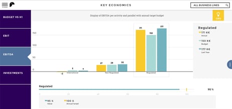
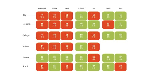
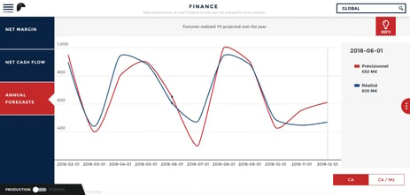
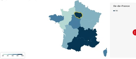
Charts
-
Tables
-
Graphs
-
Maps
-
Infographics
-
Dashboards
It's worth noting that each of the above visualizations shares a common goal: to make it easy for users to...
- ...explore their data
- ...uncover patterns
- ...tell a compelling, data-driven story.
Visualizations facilitate accurate analyses and help teams avoid confusion. By leveraging data visualization tools, finance teams can create a wide variety of charts and diagrams to display their figures and other information more intelligently.
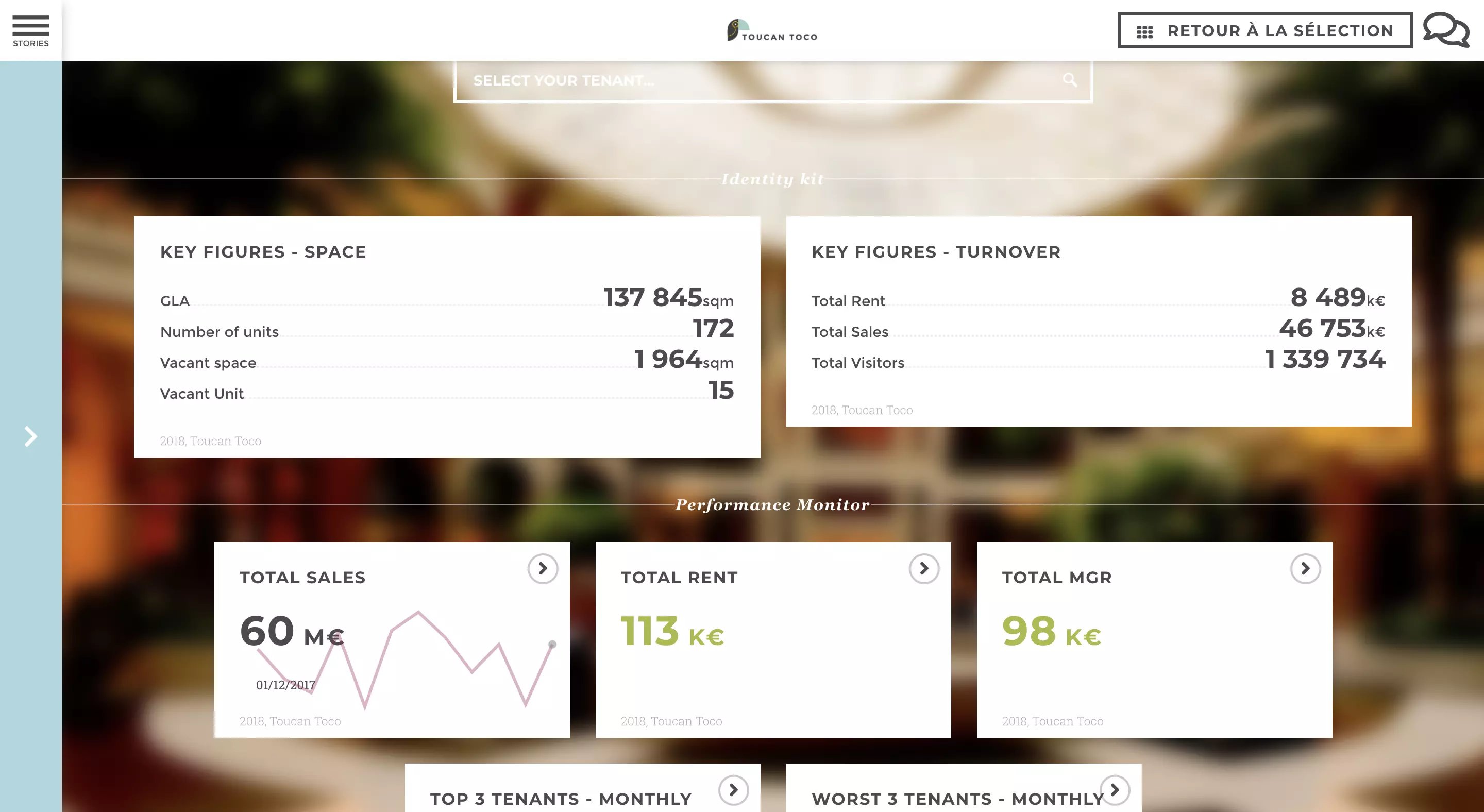
What Are Data Visualization Tools?
Data Visualization Software, in short, helps you transform raw data into easily-understandable formats. There are many different types of data visualization software available today providing visual representations of statistical data in the form of charts, infographics, videos, etc.
Of these technologies, the highest rated share user-first design and a focus on ease of use, all while maintaining the functionalities that their competitors offer.
Information is king. Leading finance teams leverage data visualization tools to save time and money; instead of digging through data using more conventional methods, they're able to focus on what matters most and drive lasting change. Picking the right tool becomes key to success, with the goal of an ideal data visualization tool being to turn data into easily digestible information for any stakeholder.
Doing Financial Data Visualization Right
All data visualization isn’t created equal. When done well, it makes complex concepts easier to understand. When done poorly, data visualizations actually just confuse your audience more or even entirely misrepresent your data.
Here are some tips for finance leaders looking to improve their analytics efforts and communication:
- Invest in the right tech.
There's a rather overwhelming volume of technology tools available on the market right now. Some of them are truly able to empower users to easily create compelling visualizations. To get started, finance leaders are often looking to first invest in ERPs that eliminate data silos and create a single access point to information. They then shift their gaze to look for platforms that enable them to easily visualize their data with things like drag and drop functionality, chart and graph libraries, intuitive search functions, and guided navigation that helps answer questions.
- Know your purpose.
Understanding what you hope to accomplish before you start creating visualizations is key to success. Determine whether your purpose is declarative or exploratory. Make sure you understand your financial KPIs. Determining the answers to these questions will help guide you toward the tools and formats that will be most beneficial for you.
- Keep your audience top of mind.
Your data visualizations will require varying levels of detail depending on the context, such as who is viewing them. Financial data presentations for the C-suite need high-level, highly relevant information that helps leaders make strategic decisions. However, if you are presenting to line-of-business leaders, digging into the finer details can provide them with useful information.
- Enhance your team’s data visualization skills.
Sixty percent of agile finance leaders rate their team's ability to visualize data as excellent, while only 24 percent of their peers agree. While everyone on your finance team can master the basics of data visualization, training and a new hiring focus can take your team’s data visualization competencies to the next level. Implement training on data visualization tools so that your team is aware of the capabilities of your technology. When making new hires, look for people with a strong data analytics background and deep experience in data visualization.
.png?width=112&height=112&name=portrait_agathe_face%20(1).png)
