


Data Viz Best Practices: 7 Gestalt principles for Data Visualizations
.png?width=88&height=88&name=portrait_agathe_face%20(1).png)
Agathe Huez
Publié le 23.11.23
Mis à jour le 13.01.26
5 min
Visual language enhances problem-solving efficiency by 19%. When you use visual language to represent data, you can see patterns and trends that are easy to miss. You need to apply the data visualization best practices of Gestalt psychology while doing this.
Gestalt refers to the idea that the whole is greater than the sum of its parts. It's about how our brains organize visual information into meaningful patterns. The Gestalt Principles describe how we perceive visual information.
By understanding the Gestalt principles, you can create more effective visuals. These visuals can excel in visual hierarchy, symmetry, and hyperlink effectiveness. In this guide, we'll explore how to apply the principles of Gestalt to create compelling graphics.
Gestalt Principles of Visual Perception
Gestalt principles describe how humans group similar elements. They also help explain how we recognize patterns and understand complex images. Here's a breakdown of each of them:
1. Enclosure
The Gestalt principle of enclosure focuses on how we perceive objects enclosed in a common area. Under this principle, our brains perceive these objects as if they belong to that area. As such, the brain can fill in the missing pieces of information to create a complete image.
For example, if you see a circle with a few dots inside of it, you'll perceive the dots as being inside the circle. You'll see it that way, even though they have no physical boundary. The enclosure principle can help create a sense of depth and space.
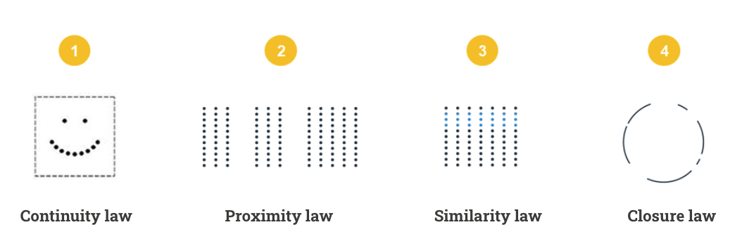
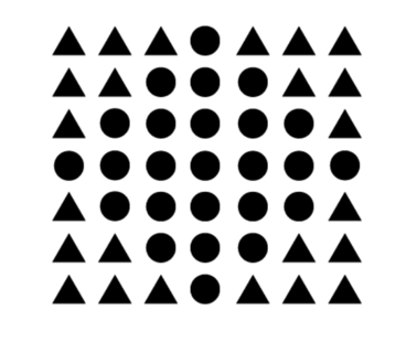
2. Similarity
The Gestalt similarity law states that the brain groups objects together that are similar in appearance. When you look at a group of objects, your brain automatically tries to find patterns. As such, it's easier to understand the scene and pick out individual objects.
For instance, when you look at a crowd of people, you can easily pick out individuals who are wearing similar clothing. You can easily scan the different sections and find the items you're looking for on a menu. Either way, you can use this principle to make better decisions.
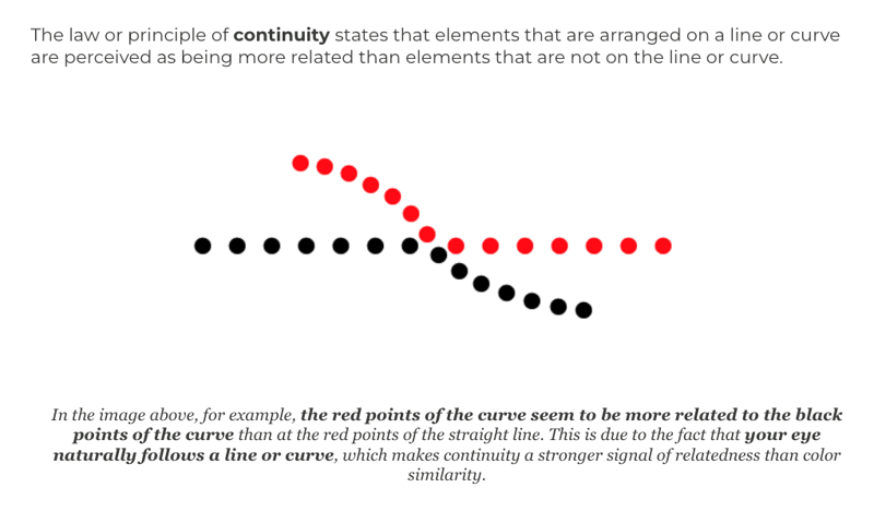
3. Continuity
The Gestalt principle of continuity focuses on elements aligned in a certain way. It states that the brain perceives elements aligned in a way that suggests a continuous line or curve as being more related to each other. The principle also considers these elements different from those not aligned in this way.
For instance, when you look at a string of beads, you're more likely to see them as a continuous line. You're also less likely to see them as a series of individual dots. Similarly, when you look at a winding road, you may see it as a single path rather than a series of disconnected segments.
4. Closure
The Gestalt closure law states that the brain perceives incomplete shapes or figures as complete. So, you'll fill in the gaps in the mind even without the full details. The brain perceives the world in terms of whole objects rather than as a collection of individual parts.
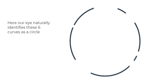
For instance, when you look at a Pac-Man symbol, you see it as a complete circle. Similarly, when you look at a fence with missing pickets, you see it as a continuous fence. The principle of closure helps create a sense of unity and cohesion.
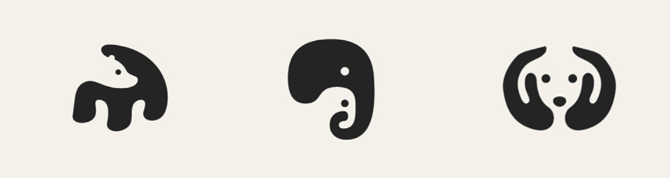
Here is the work of an artist, George Bokhua who works a lot with negative spaces and this idea of enclosure.
5. Connection
The Gestalt principle of connection states that people perceive elements connected to each other as belonging together. Your brain will group physically connected objects together. It will group them by a line or a shared border.
When you see two connected objects, the brain will try to find a way to explain this connection. The simplest explanation is that the two objects belong together. So, your brain will group them as a single unit.
For example, when you look at a group of dots connected by a line, you see them as a single shape. You don't see them as a series of individual dots. Similarly, when you look at a group of people holding hands, you see them as a group rather than a series of individuals.
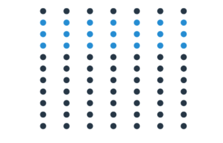
6. Proximity
The Gestalt principle of proximity focuses on objects that are closer together. It states that the brain perceives these objects as being more related than those that are farther apart. The eyes naturally group objects together that are close to each other.
Take a look at a group of circles that are all the same color. But some of the circles are closer together than others. You'll still perceive the circles as being grouped together based on their proximity.
7. Symmetry
The Gestalt principle of symmetry states that the brain groups that are symmetrical to each other together. It's because symmetry is a visual cue that suggests order and balance. The main types of symmetry are bilateral symmetry and radial symmetry.
Bilateral symmetry is when an object is symmetrical about a central axis, like a butterfly or a human face. Radial symmetry is when an object is symmetrical about a central point, like a flower or a pinwheel. Either way, the brain can detect symmetry, and it finds it to be very pleasing.
How to Apply Gestalt Principles to Data Visualizations
When applied in dataviz, Gestalt principles make it more effective and easier to understand. These principles help you know how the brain perceives and organizes visual information. Here's how to apply them in your data visualization strategies:
Use Proximity to Group Related Data Together
Suppose you're creating a bar chart to compare the sales of different products. You can use proximity to group the bars representing products related to each other. For example, you could group all of the bars representing food products together to make it easier for viewers to see the trends in sales for different product categories.
In addition to proximity, you can use similarity, closure, and continuity to create more effective data visualizations. By using these principles, you can guide the viewer's eye through the data. They can easily find the information they're looking for.
Use Similarity to Code Data Points According to Their Values
You can code points visually according to their values. Larger circles or squares can represent data points with higher values, while smaller ones can represent data points with lower values. This way, viewers can quickly identify trends in the data.
In addition to size, color, opacity, and texture can help code data points according to their values. For example, data points with higher values can have brighter colors. Alternatively, those with lower values may have duller colors.
Use Continuity to Guide the Viewer's Eye Through the Visualization
Lines and arrows can help connect different types of data points related to each other. Doing this can help viewers see the relationships between different data points and follow trends in the data. For example, if you're creating a line chart, you can use a line to connect the data points representing monthly sales figures.
You can also use color gradients to create a sense of flow in your data visualization techniques. This way, viewers can see the movement of data from one point to another. For example, if you're creating a bar chart, you can use a color gradient to represent the sales figures for different products for viewers to see which products have the highest and lowest sales figures.
The principle of continuity can also manifest in data visualization through grouping or use of negative space. You can use grouping to create a sense of hierarchy.
Use Closure to Create Complete Shapes and Figures
To create complete shapes and figures, you can add outlines, texture, and color to your data sets. Outlines can help create the illusion of complete shapes. This way, viewers can see the overall shape of the data even if some of the data points are missing.
Color can help fill in the gaps between data points and create the illusion of complete shapes. So viewers will see the overall shape of the data even if there are unconnected data points. They'll also see the overall trend in the data.
Texture can create the illusion of depth, making the data appear more three-dimensional. This way, you can see the overall shape of the data. The same applies even if the data points aren't three-dimensional.
Use Pragnanz/Symmetry to Create Simple and Easy-to-Understand Visualizations
Simple and symmetrical shapes are easier for the brain to process than complex and asymmetrical shapes. If you use simple and symmetrical shapes when visualizing data, the viewers will likely understand them. For example, if you're creating a bar chart, you can use simple rectangles to represent the data points for viewers to see the relative sizes of the data points.
You can also use a limited number of colors for viewers to understand your data. The same applies to consistent formatting, annotations, and labels. Use them in moderation for the best results.
Ready to Apply Data Visualization Best Practices?
The Gestalt theory for data visualization is vital for many industries. Regardless of your industry, it helps you understand how the brain processes visual information. Data visualization best practices based on this theory can help you communicate your message effectively.
Don't let your data remain untapped. Embark on a journey of data-driven engagement with Toucan today. Request a demo now and experience the transformative power of customer-facing analytics.
.png?width=112&height=112&name=portrait_agathe_face%20(1).png)
