


Your guide to data visualization: what it is and how to use it
.png?width=88&height=88&name=portrait_agathe_face%20(1).png)
Agathe Huez
Publié le 02.08.21
Mis à jour le 13.01.26
6 min
You might think you don’t know much about data visualization, but you do. You already rely on the power of data viz to make sense of the world around you.
In weather forecasts, in banking apps, and even on the news, crucial information is presented visually to help you make better decisions: do you need an umbrella for that trip? Can you splurge on a new laptop?
Data visualization is nothing more than that: the graphical presentation of information.
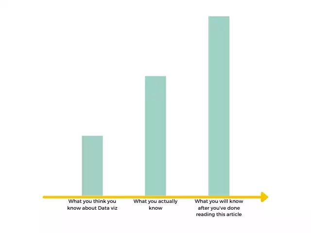
But being surrounded by data visualization doesn’t mean you’ll intuitively know how to turn raw information into compelling graphs. There’s an art to presenting data in a way that is both aesthetically pleasing and didactic: it takes much more than flashy colors and sleek designs. Being an expert in business intelligence is not enough either. There’s a world of difference between skillfully exploring data and communicating important learnings effectively.
The good news is anyone can learn the key principles of data visualization and use one of the many data visualization tools available on the market to make their businesses more successful.
In this guide, you’ll learn:
- What makes data visualization so effective
- Some concrete examples of data visualization
- The main advantages of data visualization for businesses
- To identify the best chart for each type of data
- To choose the best tool that will help you get started on data visualization
The power of visuals
The year 2020 was the year of data visualization. The importance of interpreting numerical information was at the forefront of our lives. During the long months we’ve had to spend locked in our homes, all eyes were on charts, graphs, maps and rankings: how fast is the covid-19 progressing? How many new cases in a month, in a week? What regions are the most affected? The answers to these pressing questions were always presented to us in visual form.
Why? Because visuals are the best way for us to understand numbers.
The reason for this is directly tied to human cognition or the way we perceive the world around us. Humans can understand differences in color, length, shape, size, movement and spatial positioning on a subconscious level in less than 500 milliseconds: this superpower we all possess is what we call preattentive visual processing. Compare this to the time it would take to analyze numbers or read a text. Data visualization takes advantage of this human predisposition and sheds light on the most important information hidden within long or complex data sets: American statistician Edward Tufte, a pioneer in the field of data visualization, goes as far as to say that “graphics reveal data”.
At its core, data visualization is about communicating and managing information. And in the knowledge economy, communicating information is a key skill that could make or break your business strategy.
Data visualization in action
We could go on and on about the importance of data visualization and the properties of human cognition, but that would defeat the purpose of this article, wouldn’t it? The best way for you to understand the power of data visualization is to see it for yourself. Thankfully, skilled data analysts, designers, and data lovers have spent hours putting into graphics anything that can be measured. The internet is ripe with amazing data visualizations: some are entertaining, others make us think about the state of our world and compel us to take action. We’ve listed some of our favorite data visualizations here.
We can also recommend some of our favorite data visualization websites: information is beautiful for surprisingly fun charts (they’ve recently ranked dog breeds from inexplicably overrated to overlooked treasures) and our world in data to learn about pressing issues pertaining to the economy, the environment, and inequalities. When you add historical data into the equation, you can learn important facts about the strides we’ve made in recent years in terms of global health, like in the video below:
Why data visualization is a must-have skill for modern businesses
As much as we enjoy learning new facts through infographics, we know that data visualization is about more than just discovering the world around us. It’s a crucial strategic tool that anyone can benefit from and that can boost any career, whether in the world of business or in the public sector. Here are some of the advantages you will draw from using data visualization in your professional life:
Making sense of big data
We’re producing way more data than ever before. As consumers use digital tools for most of their daily activities, everything they do leaves a data trail that can be analyzed and understood. Big and small businesses alike now have considerable data assets. They’re faced with the challenge of properly analyzing and interpreting huge volumes of data. Organizations that will reap the benefits of big data are those that know how to present and communicate the most important insights buried in the data.
Making data-driven decisions
When you have access to more information, you can make better decisions. Data-driven organizations are those that leverage data in their decision-making instead of relying on instinct or common sense. But there’s a catch: it’s hard to know what to do when you’re faced with cryptic tables or excel spreadsheets (and when you’re not a data scientist or analyst). Data visualization facilitates decision-making for non-data experts by highlighting outliers and elements that stand out.
Recognizing trends and spotting patterns
The cool thing about data: it allows you to predict likely scenarios for the future. This is why data is at the core of the field of machine learning. But even without relying on algorithms, some correlations and patterns can be spotted by the naked eye if they’re presented well. You’ll be able to recognize positive trends and recognize their main determining factors, or forecast potential problems when it’s early enough to fix them.
Convincing others
98% satisfaction rates. 85% ROIs. 5/5 ratings. Numbers and statistics are a powerful way to corroborate your point of view or prove the effectiveness of your solution. The trouble with numbers is that they’re not humans’ most instinctive way of processing information. Data visualization can help fix this problem whether you’re marketing a product, trying to prove the effectiveness of your strategy to the board of your company or campaigning to get your party reelected. When it comes to convincing others, nothing beats a good story: data storytelling is the natural next step to data visualization. You can learn about it here.
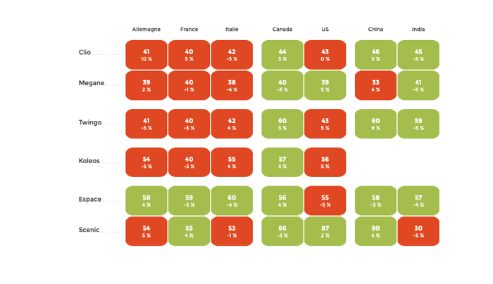
Not all visualizations are created equal
At this point, you might be eager to put everything you’ve learned into practice: you’re already picking the colors of the many pie charts that will illustrate your next quarterly report. Not so fast.
There are certain fundamental rules that you must know before you attempt to present your data visually. On the topic of pie charts, specifically, we at Toucan Toco think it’s by far the most overrated chart (no offense to pies). The reason for this is that we humans are not particularly good at estimating surface areas at first glance. We’re way better at estimating length, for instance (remember preattentive attributes we’ve mentioned earlier?). This makes bar charts superior to pie charts.
We take you through the process of choosing the right chart for you here, but here’s a selection of our go-to charts for certain types of data:
Line charts
Simple, but effective when it comes to presenting the evolution of a series over time (sales growth, for instance).
Bar charts
Do you want to rank your best salespeople, the busiest shops in your network of franchises or the days of the week where your customer support teams get the most phone calls? A bar chart is what you need.
Bubble charts
When it comes to highlighting correlations between two or more variables, nothing beats a bubble chart: it can help you spot patterns and understand causes behind trends.
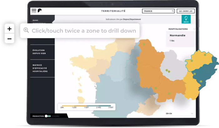
Cartographies
Maps are the most straightforward solution when it comes to highlighting geographical variations or distributions.
Heatmaps
One of our favorites, here at Toucan: cross-reference your data to show the extent and intensity of a phenomenon. Choosing the right color-scale will help you get your point across.
Tools to get you started
Another good news before we go: if the process of building your own data visualizations seems a bit too daunting at this point, you don’t have to do it alone. You can rely on the expertise of data analysts and UX designers that is packed within most data visualization tools.
Article: The Top 10 data visualization tools to consider in 2023 regarding your needs
What can a data visualization tool do for you?
A data visualization tool is software that is built to help you visualize your data. You input your data in raw form (as excel sheets, CSV, or directly by connecting to your BI tool) and tada! you get user-friendly visualizations that you can manipulate and share. Most businesses would benefit from a data visualization tool, whether it is to share information transparently within the organization or to communicate their key figures to the general public. Furthermore, data visualization tools can help managers make better decisions.
Choosing your data visualization tools
You’ll find many tools on the market allowing you to put your data into form, depending on your business needs and on your budget.
Microsoft Excel
We’ve mentioned Excel in this article primarily to say that spreadsheets were not the best way to understand information. But Excel also has integrated data visualization capabilities that allow you to turn the data in your spreadsheet into visually appealing graphs. If it’s the tool your company uses, then you can access these features with no added costs, but you’ll find they’re rather limited in terms of processing power.
Toucan Toco
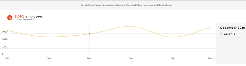
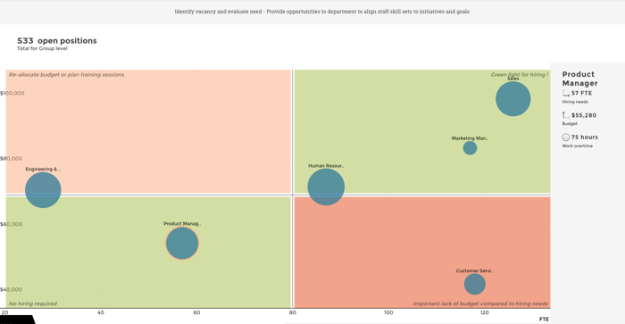
At Toucan, we help companies tell compelling stories with their data. This means helping managers understand their sales numbers and make on-the-go decisions, helping the C-suite understand the evolution of the workforce, or helping tech leads monitor their pay-as-you-use solution. We provide easy-to-build dashboards (called apps) that are adapted to your context and your needs. If you think your organization would benefit from data visualization and customer-facing analytics, give it a try!
.png?width=112&height=112&name=portrait_agathe_face%20(1).png)
