


5 Strategies for creating customer-facing analytics
.png?width=88&height=88&name=portrait_agathe_face%20(1).png)
Agathe Huez
Publié le 27.12.23
Mis à jour le 13.01.26
5 min
Did you know that 90% of information transmitted to the brain is visual? This highlights the importance of using visualizations to communicate insights.
It's especially important in today's digital age, where customers deal with a lot of information every day. Recognizing any data pattern and trend from such a massive amount of data becomes difficult. That's why data visualization is crucial for simplifying data.
However, creating an effective data visualization for customers is not always easy. You need a deep understanding of embedded analytics, the audience, and the message you want to convey. With that in mind, this post explores the five rules for data visualization.
Keep reading to learn more about designing visualizations for your customers.
Rule #1: Define User Personae
The first step in any data storytelling project is to define the user persona. This refers to a semi-fictional representation of your ideal customer. Understanding who your customer is helps you create visualizations that are specific to their needs.
We'll place ourselves in the role of a SaaS CRM team that needs to produce data visualizations for their tool. Here are the 3 user personas they have defined:
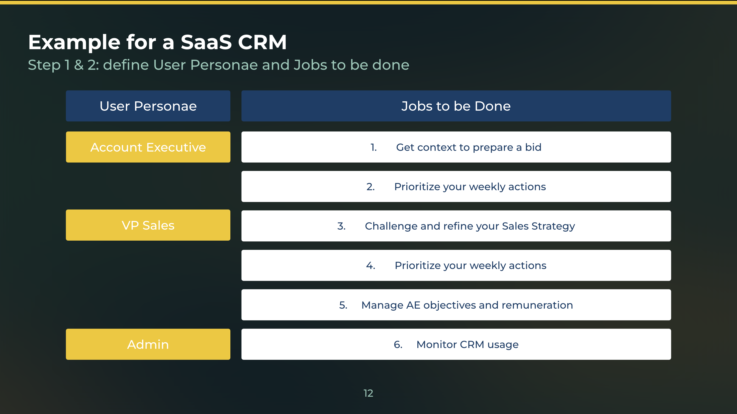
Account Executive
They are responsible for managing relationships with existing customers and identifying new sales opportunities. They need data to understand their clients' needs, preferences, and consumer behavior. The executive also needs a clear view of the prospect's pain points to ensure a valuable and effective sale.
VP Sales
The VP of Sales is responsible for developing and executing the overall sales strategy. They need data visualizations that provide insights into sales performance across regions, products, and customer segments. Metrics will also help evaluate how effective their sales strategies are.
Admin
Admins play a critical role in managing the sales team's operations, including data entry, lead qualification, and sales forecasting. The right data visualizations can help track progress toward sales targets. They can also use visualizations to identify bottlenecks in the sales funnel and optimize workflows.
By defining these user personas, you can tailor your data visualizations to meet the specific needs of each group, ensuring that they have the information they need to perform their jobs effectively.
Rule #2: Define Jobs to Be Done
You'll also need to determine the jobs that need to be done. This involves identifying the specific tasks and goals that they need to accomplish, and the data visualizations that can help them do so.
Here are some examples of jobs that sales teams may need to get done:
Get Context to Prepare a Bid
Sales teams often need to prepare bids for potential clients. This requires collecting data on market trends, customer behavior, and competitor analysis. A data visualization that provides a comprehensive overview of the market landscape can help them develop a compelling bid proposal.
Prioritize Weekly Actions
Sales teams typically have a long list of tasks to complete each week, ranging from follow-up calls to demos and pitches. A data visualization that highlights priority leads, accounts, and activities can help them focus their efforts on the most important tasks.
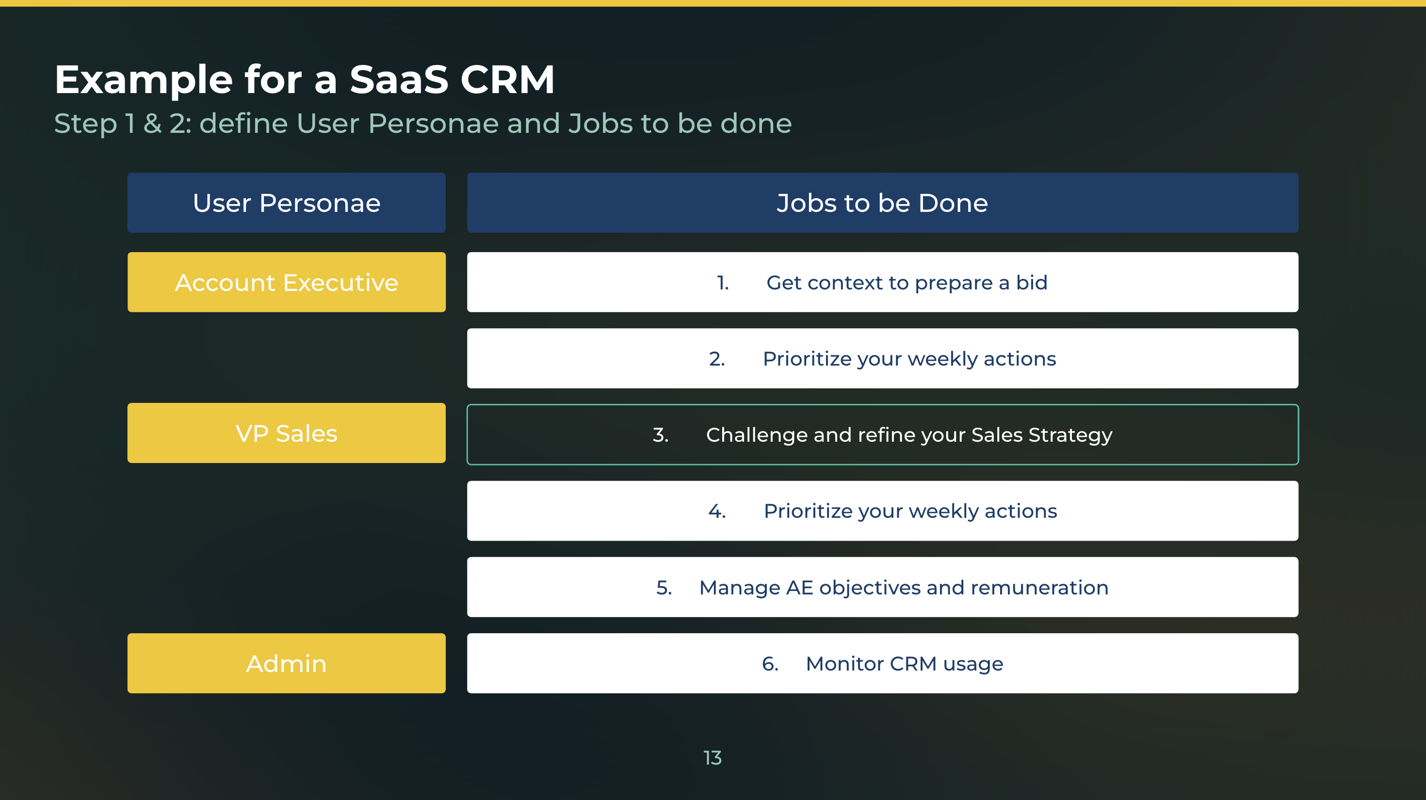
Challenge and Refine Your Sales Strategy
VP Sales and sales managers need to continually assess and adjust their sales strategies to ensure they are meeting their targets. This is where business intelligence comes in. Data visualizations that show sales performance against benchmarks, trends, and objectives can help identify areas for improvement and adjust their tactics accordingly.
Monitor CRM Usage
Admins need to track user adoption and engagement with the CRM system to ensure that data is accurate and up-to-date. A data visualization that monitors CRM usage patterns can help them identify training gaps and optimize the sales process.
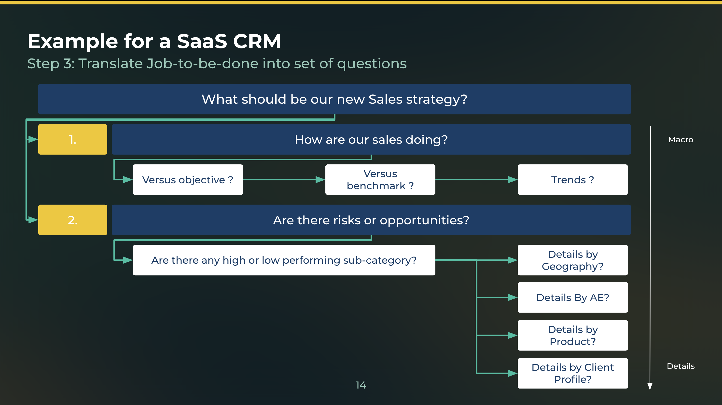
Rule #3: Translate JTBD into Sets of Question
Once you have identified your customer's jobs to be done (JTBD), the next step is to translate them into sets of questions. Design these questions to help you understand the specific steps your customer takes to complete their job, as well as the obstacles they face and the desired outcome they hope to achieve.
Asking the right questions goes a long way toward ensuring that your data visualization design meets your customer's needs. It's a powerful way to gather information and gain a deeper understanding of your customer's needs. This includes obstacles the customer faces, the outcome they hope to achieve, any trade-offs they're willing to make, and more.
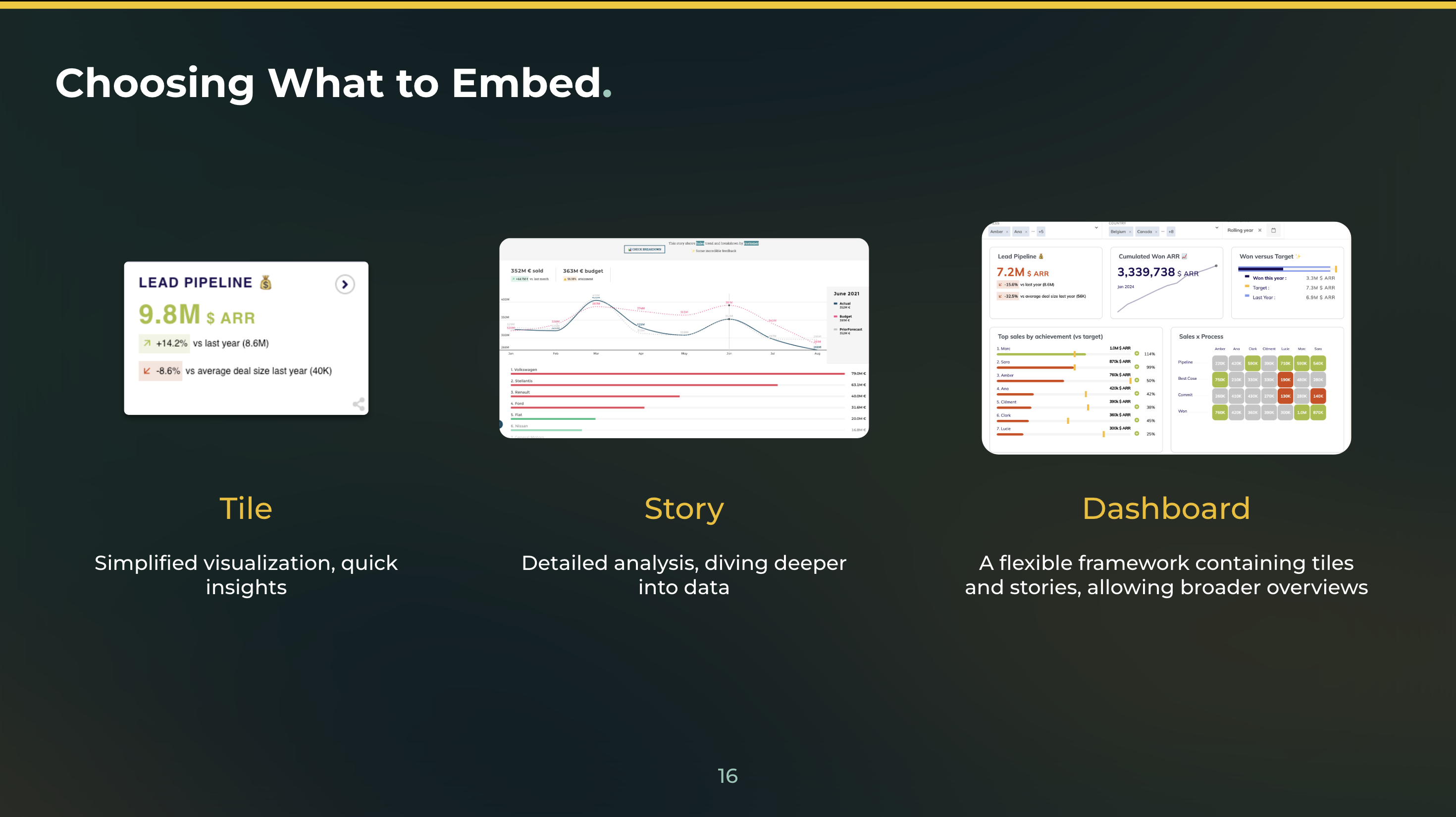
Rule #4: Optimal Data Visualization for Customers to Answer Each Question
Choosing the right visualization is key when reporting for customers. This is because there's no such thing as "one size fits all" when it comes to visualizations. Different types of data and questions require different visuals.
Start by considering key elements of the question and required insights:
- What is the time horizon?
- Are you comparing periodic - annual, monthly, or weekly - trends?
- How many data dimensions do you need to analyze?
- Is your analysis based on categorical data like region or numerical metrics like revenue?
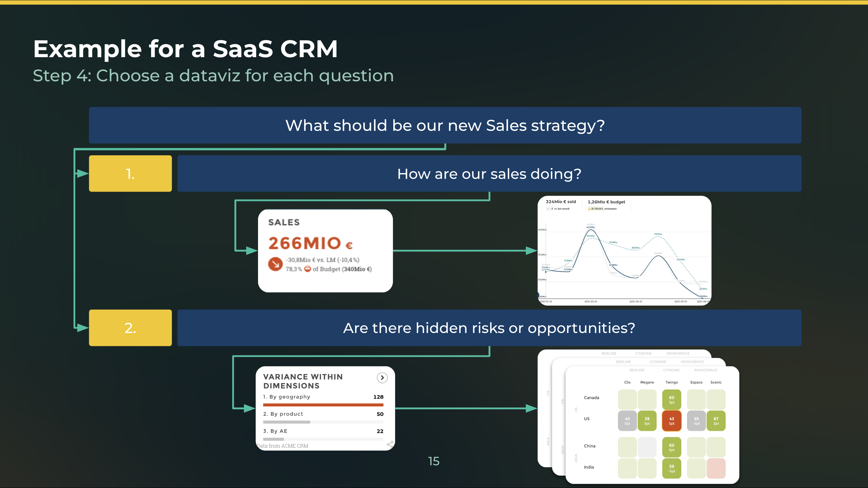
The same is true for analytical sophistication. More advanced users may prefer multifaceted visuals like clustered heatmaps to uncover correlations.
Executives often want top-level time series charts to track key performance indicators. On the other hand, less experienced customers need more descriptive visual guides revealing data stories.
Interactive data visualizations allow users to explore the data in more detail. They're particularly useful for presenting complex data sets. Consider whether an interactive data visualization would be beneficial for each question.
Finally, remember that visualization in embedded analytics is not just about displaying data; it's also about telling a story. Choose a data visualization that helps to convey the message or insight you want to communicate to your customer.
While the right tool can make creating data visualizations easier, there are still some best practices to keep in mind to ensure that your data visualizations are effective. Here are some tips to keep in mind:
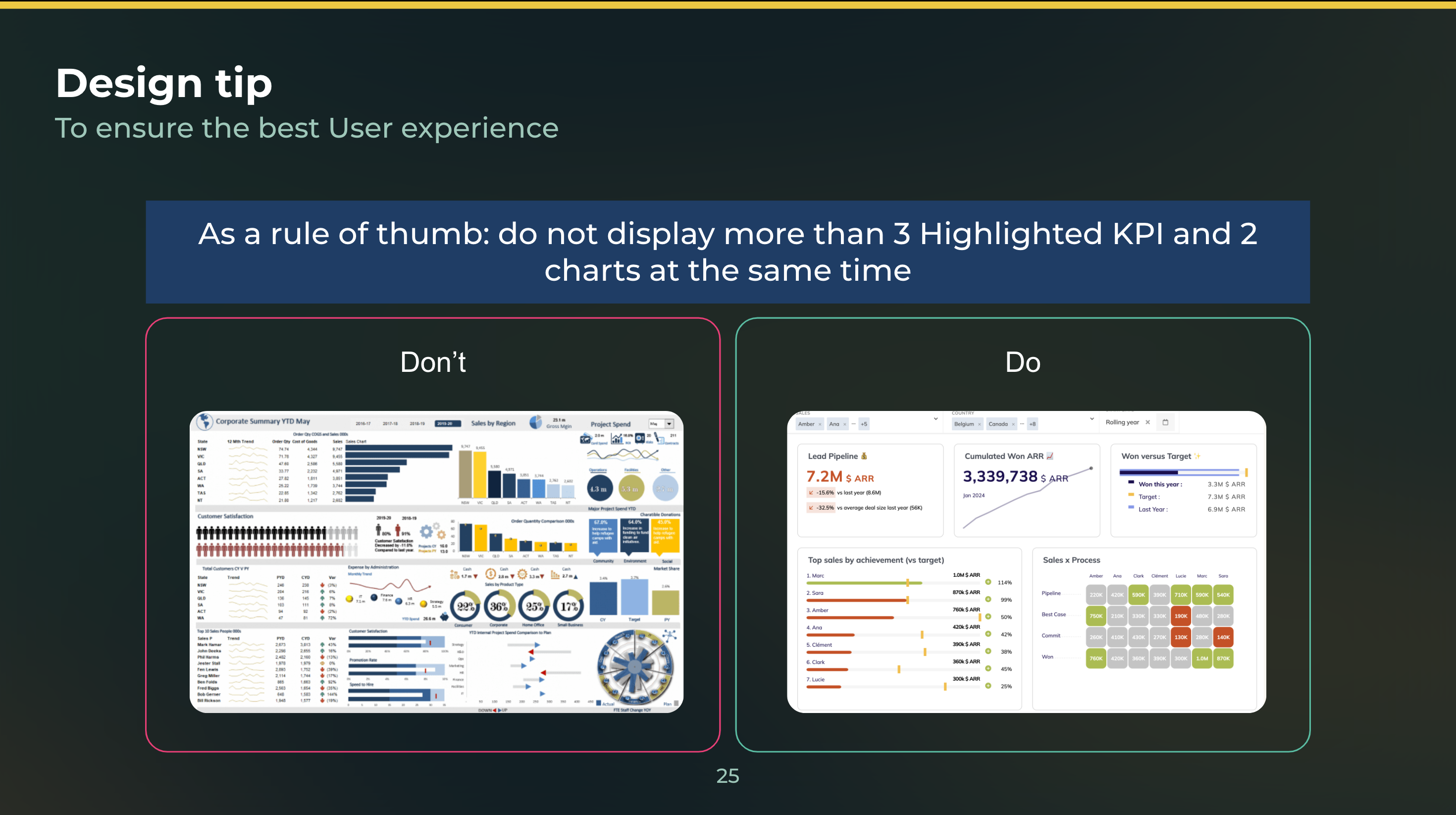
1. Keep it Simple
Avoid using too much color or unnecessary embellishments that can distract from the data. Instead, focus on simplicity and clarity.
2. Use Appropriate Colors
Use colors that are appropriate for the data you are presenting. For example, green is often associated with positive values, while red is associated with negative values.
3. Label Your Axes
Make sure to label your axes clearly and consistently throughout your visualization. This will help viewers understand the data and its context.
4. Avoid 3D Charts
Unless necessary, avoid using 3D charts as they can be difficult to interpret accurately. Stick to 2D charts that are easier to read and understand.
5. Test With Users
Finally, test your data visualizations with real users to ensure they are easy to understand and meet the needs of your target audience.
Rule #5: Choose Where and How to Communicate Data Visualizations
Once you have created your data visualization, it's important to choose the right channel and format to communicate it to your customers. This will depend on your audience's preferences and the context in which they will be viewing the visualization.
Here are some tips for choosing where and how to communicate data visualizations:
1. Consider the Platform
Where will your audience be viewing the visualization? Will it be on a computer screen, tablet, or smartphone? Will they have access to internet connectivity or will they need to view it offline? Considering the platform will help you choose the right format and resolution for your visualization.
2. Choose the Right Format
There are several formats to choose from when sharing data visualizations. This includes PDFs, images, interactive web pages, and videos. Each format has its own strengths and weaknesses, so it's important to choose the one that best fits your audience's needs and preferences.
For example, if your audience prefers printed materials, a PDF might be the best option. If they are tech-savvy and like interactive content, an interactive web page or video might be more suitable.
3. Optimize for Mobile Devices
With more and more people accessing information on their mobile devices, it's important to optimize your visualization for mobile screens. This means using clean designs, simple color schemes, and avoiding too much text or clutter.
4. Embed Visualizations in Reports and Presentations or any webapp
If you're creating a report or presentation that includes data visualizations, consider embedding them directly into the document rather than linking to external files. This will make it easier for your audience to access and view the visualizations without having to leave the document.
Transform Your Embedded Analytics Methodology With Toucan!
The above rules provide a pretty straightforward embedded analytics playbook for designing data visualization for customers. But remember, data visualization is not a one-size-fits-all solution. It's important to continually experiment and refine your approach to find what works best for your unique audience and goals.
One of the best tools to leverage is Toucan. It's a leading customer-facing analytics program that makes each of the above steps easy. Whether designing a dashboard for customers or in-house use, you can rely on it to deliver the best user experience.
Sign up today to get a free demo and transform your analytics.
.png?width=112&height=112&name=portrait_agathe_face%20(1).png)
