


DEAR DATA: 52 WEEKS OF DATA VISUALIZATION!
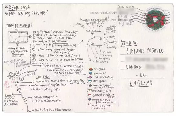
The designers Giorgia Lupi and Stefanie Posavec collect data affecting them on a particular subject every week. They then build a data visualization based on these data and send them to each other via emails. The caption of each of these visualizations is written at the back of the postcard. “Dear Data” gathers a full year of exchanges on varied thematics. From “a week of thank you” to “a week of drinks”.
Giorgia Lupi is an Italian designer who lives in New York. She’s the co-founder of Accurat, which is a company behind visualizations such as The lifecycle of ideas or Famous writers sleep habit.
Her best visualizations from the book :
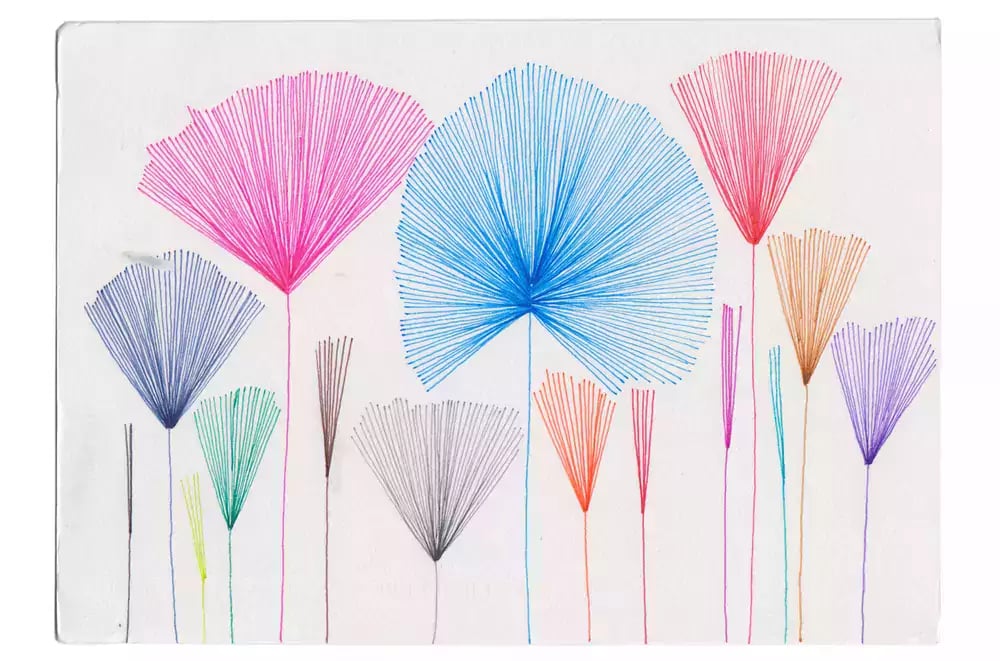
Stefanie Posavec is an American information designer who lives in London. She was the first data artist from Facebook and she now works as a freelancer. Her best viz from the book :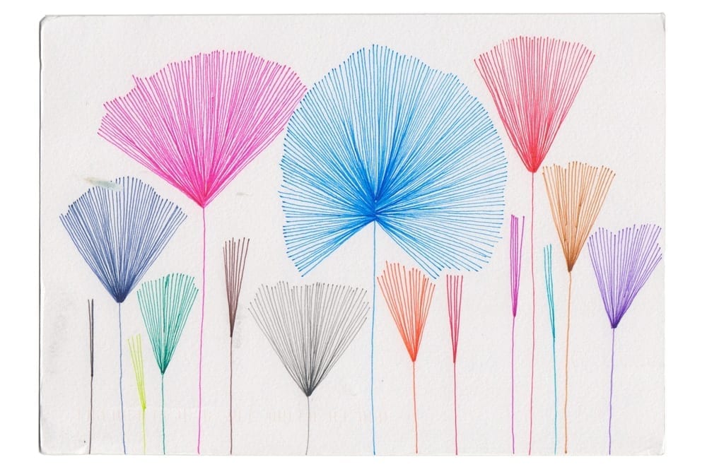
SMALL DATA VS BIG DATA
Giorgia and Stefanie recognize being in line with other “self reporters” or “quantified selfers”, just like Nicholas Feltron.
They collect a limited quantity of data with a very limited amount of 2 people working for this. Why restricting themselves like this? Why not collecting data linked to more than 2 people? Why not extending the data collecting period for a couple of weeks/months?
When the number of observations overtakes a certain level, it becomes necessary to think by aggregates. These aggregates (average, median, maxima) are the only tool to analyze hundreds, thousands, even billions of collected data.
However, for the authors of Dead Data, data aggregation can make some other types of information get lost, such as specific characteristics & proper asperities of each observation which only make sense/interest for the person concerned by the said data.
By digging a bit deeper into small data, into these little data we all produce in a daily measure, we can learn a lot more about ourselves than by reading reports of an umpteenth study.
What’s cool about all of this is that everyone can try it out! You just need to pick a subject, collect data for a week or so then analyze them, and draw with a simple pen a visualization that allows us to tell a story about it.
At Toucan Toco, we also think that data of a company can’t be kept combined by only the 1% of analysts in the company, but have to be shared to the other 99%, whether they’re managers, producers or actors of this data.
Besides, I was particularly curious about knowing how this “a week of to-do” subject had been treated and I’ve asked myself what visualization I could’ve built on this matter.
AND YOU, DO YOU MAKE YOUR OWN “TO-DO”?
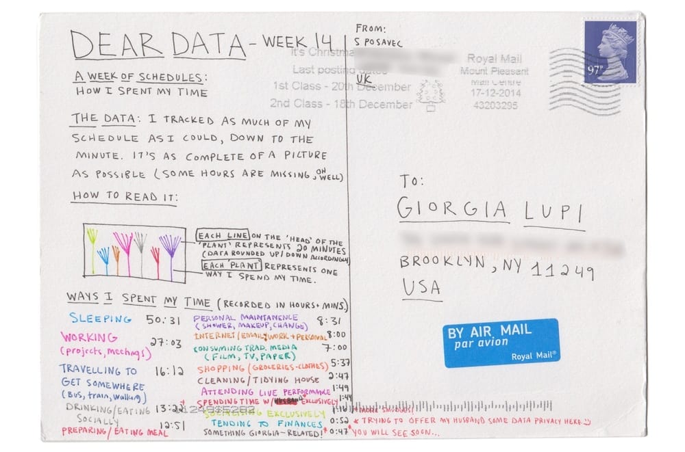
A WEEK OF TO-DO BY GIORGIA
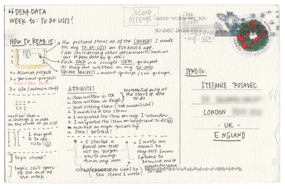
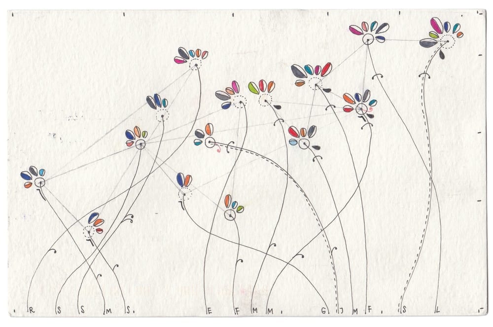
A WEEK OF TO-DO BY STEFANIE
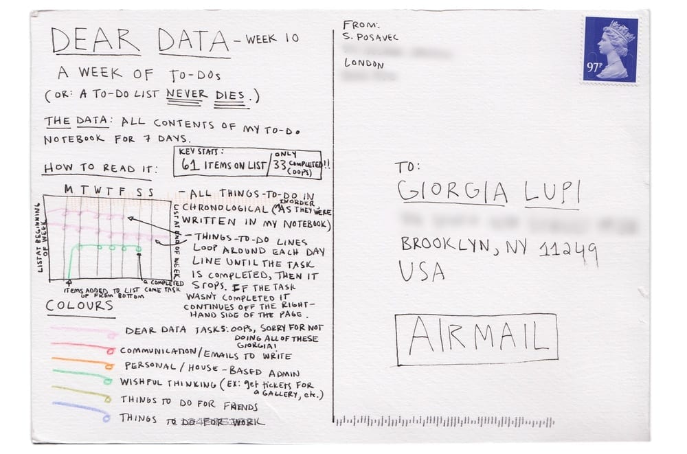
I prefer Stefanie’s approach, it allows us to get the idea of what happened in the week with a glance :
- tasks’ categories are obvious (colors)
- a new task is nice & clear (they start at the bottom of the visualization)
- for a certain day, we can easily see tasks that have been fulfilled / new tasks.
What lacks :
- the visible highlight of tasks ended during the week (the price to pay in order to have a task flow that progresses from the bottom up)
- a synthetic point of view of the week (even if we already have access to the key stats of the week in the captions).
- the notion of prioritized tasks.
- the satisfaction of ending or progressing into a task (did I progress today ? Is the result what I was expecting ?) l
OUR METHOD
- Source: Fake data! But I use trello to write down my to-dos, whether they’re professional or personal. What’s cool with Trello (besides being 100% free to use!) is that every single task is traced. I know when a task has been created when it has been started & when it’s over.
- Method: taking inspiration from Dear Data, and identify what can be improved right away, and how the use of an interactive visualization rather than a paper visualization can make discovering data easier.
And what about you? If you have a subject that’s important to you, the patience of gathering datas: take a pen, a piece of paper and that’s basically the only things you need to explore this subject 🙂
