


How to Create Engaging and Effective Data Visualization
.png?width=88&height=88&name=portrait_agathe_face%20(1).png)
Agathe Huez
Publié le 24.08.23
Mis à jour le 13.01.26
5 min
Have you ever stopped to think about just how many bytes of data are generated around the world each day? The answer is a staggering 2.5 quintillion bytes.
In a world awash with data, the power to distill meaning from chaos is the modern alchemy of insight.
Enter the realm of data visualization. This is where numbers metamorphose into captivating narratives. Utilize engaging data visualization properly, and you can convert any message to your audience.
Imagine unlocking the art of choosing the perfect visual key to unlock complex datasets. Picture-wielding tools that turn raw information into compelling stories.
Let's take a look at the current landscape of data visualization. Every byte paints a story waiting to be discovered.
The Impact of Visuals
Human brains love visual information. We can process visuals quickly and efficiently. When we encounter a well-crafted graph or chart, our brains effortlessly decode the information.
This easy decoding allows us to recognize patterns. We can then compare values and draw conclusions in an instant. This rapid processing of visuals taps into our innate ability to recognize shapes, colors, and spatial relationships.
Visuals are also a universal language. They can transcend language barriers and convey complex information to anybody.
Visuals provide a common ground for communication. They enable individuals from diverse backgrounds to engage with data in a shared language.
Types of engaging Data Visualization
What is data visualization? Put simply, it is how you present your data to the world. Raw data tends to be a confusing jumble of information that is only discernable to the person working on it.
Engaging data visualization changes that. It turns raw data into an easy-to-digest format that anyone can look at and understand. Data visualizations are present in every industry.
It is highly likely that you've come across many of the different types of data visualization out there. Maybe you have even used some common data visualization tools.
Data visualization offers a diverse array of methods. Each of these is strategically designed to emphasize different aspects of data.
Here's a concise overview of some key visualization examples and their strengths.
Bar Charts
Ideal for comparisons and categorical data, bar charts use bars of varying lengths to represent values. This makes trends and differences easy to grasp.
Line Graphs
These are excellent for tracking trends and changes over time. They utilize lines to connect data points and reveal patterns.

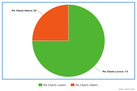
Pie Charts
Perfect for illustrating proportions within a whole, pie charts present data as slices of a circle. They make part-to-whole relationships clear.
Scatter Plots
Visualize relationships between two variables with scattered data points. They facilitate the identification of correlations and outliers.
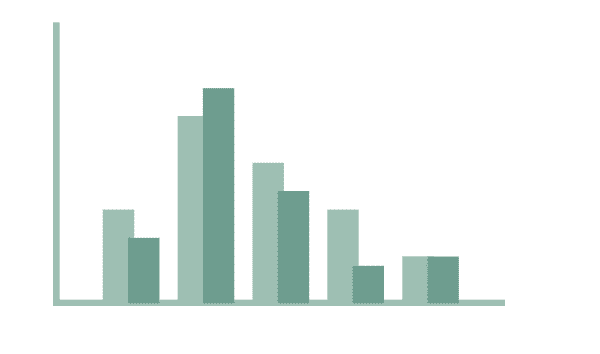
Histograms
Depict data distribution by dividing it into bins. Histograms provide insights into frequency and density within numeric ranges.
Heatmaps
These display data density using color gradients in a matrix format. Heatmaps reveal patterns and correlations in large datasets.
Bubble Charts
Extend scatter plots by introducing a third variable through the size of data points (bubbles). They enable multivariate analysis.
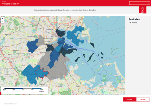
Choropleth Maps
Utilize color gradients to represent data values across geographic regions. They convey spatial patterns and variations.
Each visualization type has distinct advantages. They each cater to specific data characteristics and communication goals.
Considerations for Choosing the Right Visualization
Knowing all the different types of data visualization is only one part of the game. You have to make a conscious and calculated decision about which type of data visualization is right for your purposes.
There are several things that you need to consider. You need to make sure that the chosen type of visualization accurately reflects the underlying data. It needs to effectively communicate your intended messages.
Let's take a closer look.
Understanding Data Characteristics
The first thing you need to grasp is the characteristics of the data that you're trying to present.
Is the data categorical? Is it numerical? Or is it temporal in nature? Recognizing these distinctions informs your choice of visualization.
Categorical data might be better suited to bar charts, while line graphs are better suited for tracking trends over time. Identifying the characteristics of the data helps you to lay the groundwork for visualization.
Matching Visualization Types to Data Types
The visualization type you pick needs to complement the data type. This is where the art of selecting the right visualization becomes clear.
Each visualization method has strengths that align with specific data attributes. Scatter plots flourish when showcasing relationships between numerical variables. Pie charts excel in illustrating proportions within a whole.
Some data types will suit multiple visualization types. It is a decision that depends a lot on context. Trial lots of different visualization types to see which one works best.
Ensuring this alignment is vital. It fosters accuracy and prevents misinterpretation. This will then enhance the overall impact of your visualization.
Communicating Effectively
Good data visuals are all about communication. You need your visualization point to convey key takeaways to the people you're presenting the data to.
If your goal is to emphasize comparisons, a bar chart may be your ally. But a line graph could elucidate trends.
The chosen visualization should amplify your message. It should also facilitate a deeper understanding for your audience.
Interactivity and User Experience
Interactive data visualizations have revolutionized the way we present and understand information. By incorporating interactivity, you can engage your audience.
But more than that, you can provide them with a deeper exploration of complex datasets. This dynamic approach offers several advantages.
Interactivity encourages users to actively participate in the data exploration process. It empowers them to customize their experience and focus on specific data points that interest them the most.
Real-time feedback through tooltips, click-through actions, and filtering options provides immediate insights. This on-the-spot information can aid decision-making and enhance the overall user experience.
Creating an engaging user experience involves careful design and execution. Ensure intuitive navigation by incorporating features like zooming and panning. Make interactive elements user-friendly with clear instructions and visual cues.
A responsive design ensures that your interactive visualizations adapt seamlessly to different devices. This makes it convenient for users to engage regardless of the device that they are using.
Data-Driven Storytelling
Your data needs to tell a story. This is especially true if there is going to be a language barrier between you and your audience.
Data-driven storytelling is a powerful technique. It transforms raw data into a compelling narrative.
Understand your audience and tailor your narrative to their level of expertise and interests. Be sure to define the purpose of your visualization.
Is it to inform? Are you trying to persuade? Or maybe you want to inspire action.
Structure your narrative by introducing the topic and its relevance. Present the challenge or issue at hand. Make sure that you're displaying the data through visuals that support the narrative.
Maintain visual consistency by using a uniform style and color scheme throughout your narrative. It is also important to keep a logical flow between visualizations. This will help to guide the audience through the story you're trying to tell.
Provide context through annotations, captions, and supplementary information. Contextual details help the audience grasp the significance of data points and trends.
Continuous Improvement
Embracing an iterative approach to data visualization is crucial for ongoing success.
Regularly seek feedback from colleagues, stakeholders, and users. Constructive input can offer valuable insights into the clarity and usability of your visualizations.
Conduct user testing to identify areas where users might face confusion or difficulty. Observing user interactions will highlight potential pain points that need improvement.
Iterate your visualizations by creating multiple versions as you make enhancements. You can then track changes and analyze the impact of each iteration.
Experiment with different design elements, layouts, and levels of interactivity through A/B testing. This helps you identify the most effective presentation methods for your audience.
The Path to Effective Data Visualization Starts Here
Every pixel and data point serves as a brushstroke in the canvas of insights.
With an array of tools, libraries, and best practices at your disposal, you have the means to craft narratives that enlighten, engage, and empower.
By embracing the symbiotic dance between data and design, you wield the power to transform raw information into stories. Stories can transcend numbers and resonate with audiences worldwide.
Are you struggling to turn your raw data into engaging data visualization? You're not alone.
Come and have a chat with us today. Our platform can turn your data into engaging visuals in no time.
.png?width=112&height=112&name=portrait_agathe_face%20(1).png)
