Toucan provides the best possible support to HR in the transformation challenges
Back
PEOPLE ANALYTICS
Data Storytelling for next-level workforce management


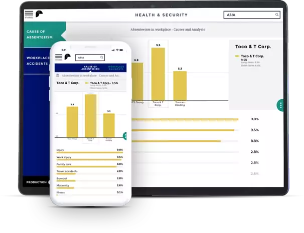
Compensation & Benefits Benchmarks
Keep your compensation strategy fair and competitive by tracking your payroll distribution and comparing it to industry standards.

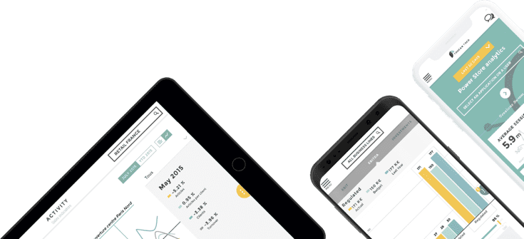
Your workforce in numbers
Manage your workforce by aggregating your
most important KPIs in one platform:
age & gender distribution, absenteeism,
training hours, recruitment & turnover...
Customer Stories

Before Toucan, our HR dashboards were destined for experts. Now, they are accessible & understandable by everyone.
Quentin Vanoosthuyse - HR Data Manager - Nexity


Toucan helped Top Management gain access to clear HR data, and supported the department in the monitoring of our new HR policies.
Patricia Zuk - HR Project Manager


Toucan highlights market studies results and helps our customers take hold of their strategic Comp&Ben plan.
Franck Cheron - Human Capital Partner


Toucan digitalized our Employee Reports. Accessing their performance and benefits data's increased employee engagement and satisfaction.
Quentin Vanoosthuyse - HR Data Manager


Ready to get started? Experience data stories