


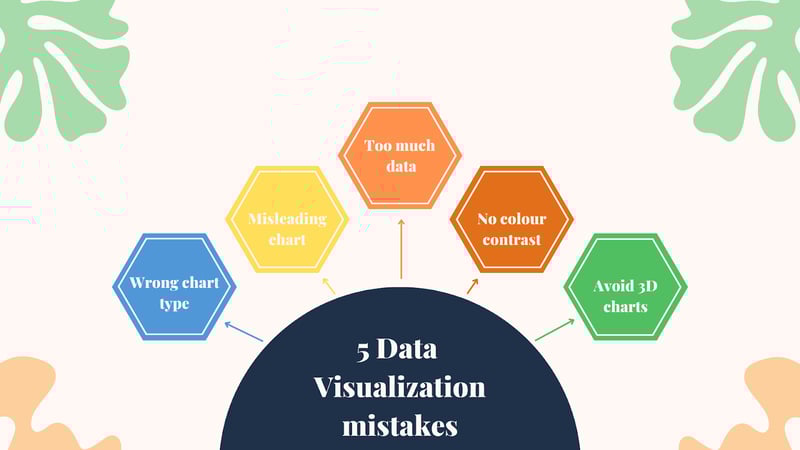
5 Critical Mistakes to Avoid in Data Visualization
Toucan Toco
Publié le 17.02.23
Mis à jour le 13.01.26
4 min
Data visualization is a great way to share large amounts of at-a-glance data. Using charts, graphs, and diagrams to condense and present facts and figures creates data storytelling, which makes decision-making much quicker and easier.
But what happens if data visualization isn’t done effectively?
Like anything, creating a data visualization asset is open to human error for several reasons. A small mistake in the creation phase can mean the difference between an accurate, useful graphic and something that is about as helpful as an inflatable dartboard.
Furthermore, poor data visualization can lead to bad decision-making through a failure to spot trends and patterns and an inability to make correlations. Mistakes like these can cost your business valuable time and money.
While some companies employ data warehouse concepts, smaller businesses may produce their data visualization assets themselves and should therefore pay attention to the accuracy and usefulness of their design.
If you want to make sure that the data itself is reliable, you could undergo the process of data enrichment to boost its accuracy and quality.
Let’s look at the five most common mistakes people make in data visualization.
1. Using the wrong type of chart
Each data visualization type has a time and a place. Whether you choose scatter graphs or infographics, you must consider whether you’ve selected the best medium for the data you want to display.
Compare the two images below.
When data types are close in value, it often makes the segments of a pie chart hard to distinguish between, and they may appear to be equal. A bar chart, on the other hand, can demonstrate marginal differences much more visually.
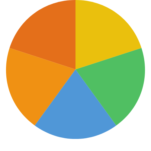
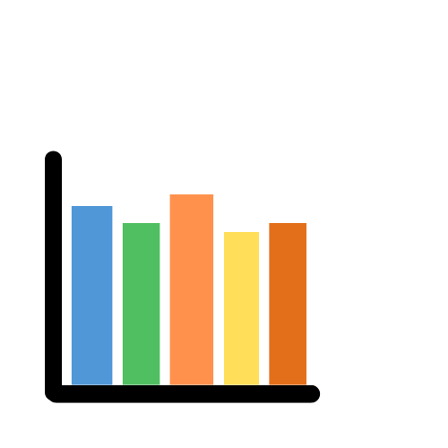
Selecting the best chart type isn’t just to do with the data values, either. The type or quantity of data you want to display can play a big part in selecting which chart to use. Different chart types are useful for various reasons. Consider the purpose of your chart type choice. It is to inform, show change or compare data or information.
If your purpose is to inform, consider either just highlighting the key figure as part of a visual quote or using a donut chart or a pictogram to keep the visual clear and easy to understand.
If you want to show patterns or changes, consider line charts, map charts, timelines, or area charts.
Comparisons usually work well when put into a simple bar or pie chart. Depending on the type of comparison you’re trying to show and the amount of data you need to include, you could consider a tree chart, stacked bar chart, word cloud, or bubble chart.
2. Using misleading or biased visualizations
There are many ways you can purposefully or unintentionally mislead a reader. Incorrect scaling, labeling, perspectives, or using a truncated axis can all change the message the data should really convey. Take a look at the example below:

Both bar charts show the same data, comparing figures from two consecutive years. By truncating the axis on the left, the difference between 2010 and 2011 looks quite staggering. On the right, where the axis starts at zero, the increase appears to be much less.
3. Be careful not to include too much data
Look at the image below. The pie chart shows how the US budget was spent in different areas in one particular year.

Image sourced from Wikipedia
You’ll notice there’s far too much data for this type of chart. As a result, it’s overwhelming and impossible to see the categories and percentages of the lower % spend categories. The chat is cramped and confusing, and the legend is too long to be of much use.
Pie charts are better kept to 5 “slices.” This will really highlight what the data is trying to convey.
To improve this chart. There are a few things you could do.
- Consider another type of data visualization, such as a bar graph.
- Focus on the key takeaways and information you want to present. What does your audience need to know?
- Try to condense the areas of spending into encompassing categories such as; medical, education, military, etc.
If you need to present many facts and figures and can’t find the right type of chart, there’s nothing wrong with using an ordered list or table.
4. Poor color choices
Going back to the example above, you’ll see that many of the colors used are too similar, too. The lack of contrast makes it difficult to distinguish between the different shades of blues, greens, oranges, reds, etc.
Too much color or a lack of distinguishing color choices can slow down the reader and increase the time it takes them to process the chart, which defeats the object of data visualization. Colors should stand out and be easy to distinguish. You should also consider what the visuals will look like if printed in black and white.

It’s worth considering a cool or warm scale, with the darker color showing a higher value/intensity and the paler colors showing the opposite. As people will automatically draw this assumption, it’s important not to go against the grain.
5. Avoid using 3D charts ineffectively
3D charts can easily distort data. Don’t fall victim to putting aesthetics over function. With 3D bar charts, less significant bars can become hidden behind more prominent ones, and the heights are difficult to determine. Segments at the front may appear disproportionately bigger.
It’s advisable to avoid 3D chart types unless absolutely necessary (for instance, when a z-axis is required).
Or, consider automation
Is creating data visualization a time-consuming task that could be automated?
Using a software package to provide easy-to-use analytics might be the solution you’ve been looking for.
What are the key takeaways?
Becoming more aware of how you present data is the first step in producing high-quality data visualizations. Poorly constructed charts and graphs will lead to bad decision-making and a lack of overall progress in your business, which is why it’s important to pay attention to the common pitfalls.
The ability to present facts and figures in a clear and compelling way will speed up decision-making and help improve the quality of those decisions. What’s more, the initial data you have must be accurate. Building charts and graphs from badly collected data will only lead to useless data visualizations. Using high-quality data and avoiding the common pitfalls will help you level up your data analysis and speed up your decision-making process.
