


My SQL data visualization: comparing 4 tools
.png?width=88&height=88&name=portrait_agathe_face%20(1).png)
Agathe Huez
Publié le 27.12.23
Mis à jour le 13.01.26
5 min
.png?width=860&height=580&name=SQL%20(3).png)
MySQL is a powerful database management system. With an efficient querying and data retrieval system, the potential for fast setup, and an open-source architecture, for which there’s a vast community of support, MySQL can enable companies to harness the power of their data effectively.
While MySQL can be a powerful component in an organization’s toolbox, allowing for the storage, management, and application of vital data, but visualizing that data can be another story entirely. That’s where database visualization tools come in. Data visualization tools enable users to create visualizations out of data to suit a range of uses. Often, data visualization is a matter of identifying patterns and trends, or enables teams to share actionable insights in an easy-to-understand format.
However, choosing the right visualization tool can be important. That’s why we’re exploring five MySQL data visualization tools. There are a few important considerations when choosing the right visualization tool. We’ve selected these five based on certain criteria that can be important when connecting a visualization tool to MySQL databases.
We’ve selected a range of My SQL data visualization tools based on the ease with which they can connect to MySQL, as well as their ease of use, and we’ve selected a range of tools that offer various pricing models and use cases, for a range of applications.
For each tool, we’ll offer a brief overview, and cover some potentially important information. We’ll discuss who each tool might be used by, the level of proficiency with data likely required to operate each one, what each tool might be known for, and what the pricing or business model looks like for each. Let’s dive in. Here are five powerful visualization tools for MySQL.
#1 Mode | Advanced Analytics
 Who it is made for: Data analysts and business analysts
Data level needed: Advanced
Known for: Notebook for Python, SQL, or R queries
Business model: SaaS
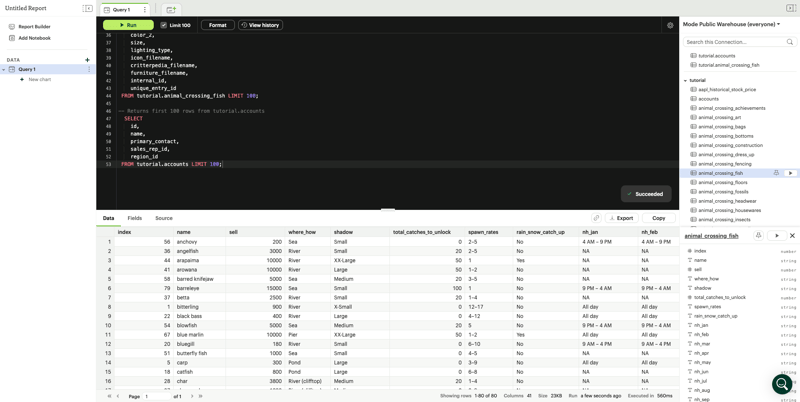
Mode is an extensive analytics platform that offers a range of visualization capabilities in addition to its other powerful data capabilities. Importantly, Mode enables the visualization of MySQL data, making it a powerful contender for MySQL visualization with a range of capabilities. One of the great things about Mode is that it offers interactive dashboards, in addition to its ability to easily connect with MySQL.
With Python and R support, Mode is as comfortable to use for advanced data analysis as it is for more basic reporting functionality. Importantly, Mode also offers collaborative features, making it a strong tool for teams with a range of use cases and applications. Mode also offers a high degree of flexibility, enabling users to create customized data visualizations for a range of uses. With automated reporting features, it can also be an effective part of a tech stack for regular communication and reporting.
#2 Redash | Capable Querying
 Who it is made for: Data analysts and developers
Data level needed: Intermediate to high
Known for: Efficient SQl querying
Business model: Open Source project 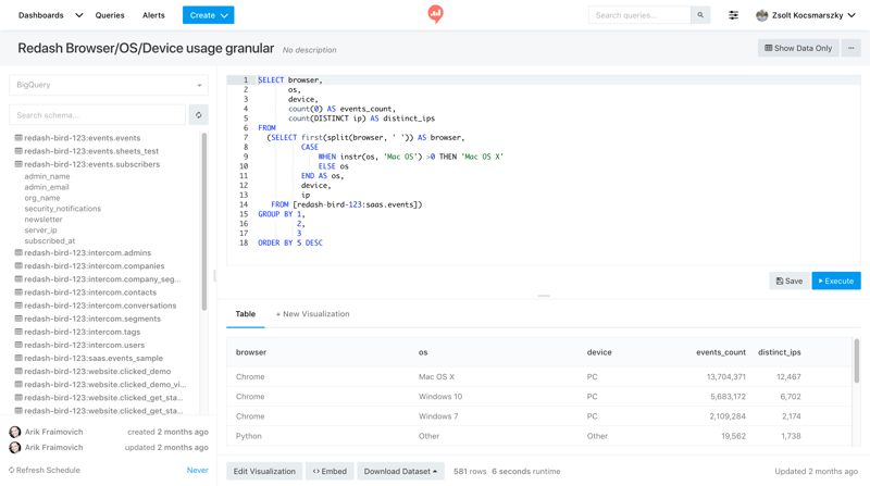
Redash is a highly capable visualization tool that’s known for its efficient SQL querying capabilities. Redash is designed with SQL in mind, and offers a powerful interface for making efficient queries quickly. Offering a full cloud-based SQL query editor, those familiar with SQL will be able to navigate and make use of Redash’s powerful interface, while even those less familiar with SQL will be able to make customized data visualizations once the data has been properly prepared.
Importantly, Redash is well-integrated with MySQL, enabling users to query in SQL, and offering robust visualization capabilities, including charts, box plots, word clouds, pivot tables, maps, counters, sunbursts, and more. With embedded reporting capabilities, Redash can be a powerful tool for collaboration, enabling users to share insights easily.
With communications integrations, Redash can be used to generate reporting and disseminate crucial information quickly using established internal and external communication channels. Finally, one of Redash’s core strengths lies in its efficient querying. With query caching, every query is cached automatically for enhanced speed and efficiency.
#3 Tableau | Business intelligence platform
 Who it is made for: Data and business teams
Data level needed: Advanced to expert
Known for: data exploration and data visualization
Business Model: Tiered pricing options based on the number of users
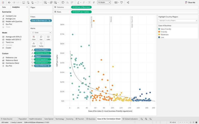
Tableau is a powerful data visualization tool from Salesforce. Designed to enable businesses and other organizations to harness their data, Tableau offers a range of visualization capabilities.
Tableau has quickly become a mainstay of business intelligence solutions, offering a user-friendly interface that enables a range of users across technical proficiency levels to create powerful visualizations from their data.
Tableau offers several features that make it particularly useful for business intelligence applications. It features governance capabilities that make it an excellent choice for internal compliance, as well as powerful collaborative capabilities, making it a strong tool for internal communications and decision-making.
One of the powerful draws to Tableau is that it offers an interface that’s comfortably used by both high-level data users and less technically proficient business users.
Importantly, Tableau connects with MySQL databases, making it a powerful choice for MySQL visualizations. Tableau is also offered in a range of configurations —- ranging from on-prem with Tableau Desktop and Tableau Server to off-prem with Tableau Cloud to meet the varying needs of its users. With built-in Einstein AI, Tableau is designed to enable the creation of powerful predictive models without the need for advanced data proficiency.
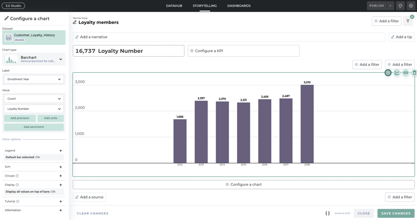
#4 Toucan | Customer-facing analytics and data storytelling
 Who it is made for: who need to communicate data internally and externally
Data level needed: Intermediate
Known for (Specifically): Customer-facing analytics and data storytelling
Business model: open source software based on a subscription model
(Hi there 👋)
When it comes to creating customer-facing analytics, Toucan is a powerful choice. Toucan’s focus on customer-facing visualizations makes it a powerful tool for collaboration and data storytelling. With embedded reporting capabilities, Toucan can be used to easily share insights where they’re needed the most. Standalone reporting makes it a flexible solution for delivering insights to end users.
With the ability to embed analytics in other apps, and web pages, and to provide standalone analytics experiences, Toucan makes it simple to share insights with customers. With powerful customizable dashboards, you can go beyond just showing visualizations and tell an actionable story with your data.
Toucan’s storytelling studio is designed for ease of use while also prioritizing a high degree of customizability. With a visual query builder, effective data prep is simplified. With a visual design interface, extensive coding knowledge won’t be required to create breathtaking visualizations and reporting, either.
Finally, Toucan offers a robust collaborative environment, perfect for communicating between teams and user roles. With glossaries and narratives, visualizations can be prepared with an additional layer of context, ideal for enabling quick data-informed decision-making in fast-paced business environments. Toucan’s action center is designed to make it easy to stay on top of what’s important — with alerts, notifications, and integrations with comms systems.
The Bottom Line
MySQL is a powerful database management tool, but when it comes to harnessing the power of your data, management is often only the first step. When it comes to making data actionable, it can be important to find effective ways to conclude, identify trends, and share a clear picture. That’s where visualization tools come in. Utilizing visualization tools can be an effective way to draw insights, share important trends, and analyze crucial data.
In order to find the right reporting tool for your needs, it can be helpful to explore some of the options available. Different MySQL visualization tools may be aimed at, or more helpful in, certain use cases. As such, it can be helpful to consider not only what your specific needs and intended use are, but also what capabilities and technical requirements different tools present.
If you’re looking for a powerful solution that can enable you to embed analytics easily, don’t hesitate to reach out. With Toucan, create stunning customer-facing dashboards that don’t just report data, but tell a story. To see for yourself, get a demo today!
.png?width=112&height=112&name=portrait_agathe_face%20(1).png)
