


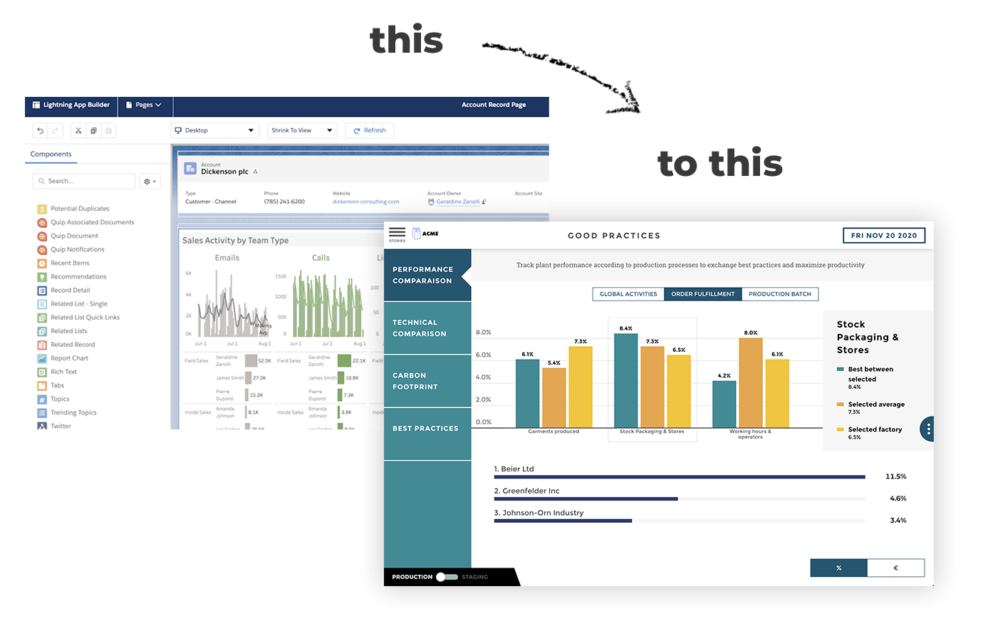
A 6-step process to design business dashboards
.png?width=88&height=88&name=portrait_agathe_face%20(1).png)
Agathe Huez
Publié le 15.06.22
Mis à jour le 13.01.26
6 min
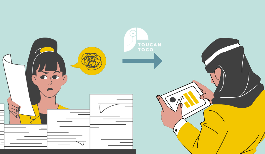
Utilizing dashboards properly can help every individual in the organization make better decisions based on actionable insights from data. Most dashboards, however, do not do so for a number of reasons, including poor navigation and poor layout. Because of this, it is crucial not to jump straight to building a dashboard. Start by understanding why we are building a dashboard and take the time to explore multiple ideas.
Dashboards can broadly be classified into three types:
- Operational (real-time data related to daily operations)
- Analytical (interactive and trends - influence future decision making),
- Strategic (tracking KPIs and strategic objectives).
Regardless of the type of dashboard you create, you can make sure it will be successful by following a simple blueprint consisting of 6 steps. We start by defining our stakeholders and determining what decisions they must make.
01. Understanding the needs of Business Users
This is the most critical step of the process - asking your users and stakeholder the right questions and gathering accurate requirements. It will set the foundations for your build and have a profound impact on your next steps as well.
There are 4 main stakeholders
- The designer (you)
- The audience (who will be viewing this dashboard)
- The point person (the member of the audience who has the most experience)
- The data gatekeeper (member of the data team who will help with the database)
Here are a few things you may want to consider:
- Understand the type of request: Is it a one-off data extract/analysis or a visualization project that requires a periodic refresh?
- Who is your intended user base/audience?
- What are the problems the users are trying to solve or what are the potential hypotheses they would like to test using the dashboard?
- Which platform(s) should the dashboard be accessible through?
- Do they want to see any trends or growth/decline in certain metrics?
- What are the questions or problems your users are trying to solve through the dashboard?
- What views would your users like to see?
- Do they want to see the dashboard refreshed annually, monthly, weekly, daily or in real-time?
- What data sources can be used?
- How are they currently viewing these KPIs?
- How can I use storytelling to put my KPIs into context?
The second step is the prototyping of the dashboard, many projects stop at this second step after a multitude of painful back and forth between the business and the person in charge of the project. The business does not manage to get a satisfactory prototype, the project manager is torn between other demands.
To avoid too much back and forth, you need to make sure you understand the need deeply. Search! "Why?" will be your best friend. You need to understand the motivations and objectives behind the dashboard project. Does the business want to justify the actions they have taken? Need to communicate internally? Does it want to negotiate a new budget? Once you understand the motivation, you need to challenge the chosen KPIs to make sure they provide the right insight.
Once you have a complete understanding of the motivations behind the dashboard project you can move on to the next step.
02. Prototype the dashboards

Once you have gathered the requirements, it is time to put more thought into what the final product will look like. At this step, you not only think about the technicalities but also come up with a solid work plan. It is a smart idea to break your project into manageable chunks making it easier to delegate tasks and then synthesize everything into one single product. A few things you may want to consider at this stage are:
- Wireframing: come up with mockups of how you think the end product will look like. Discuss with your team which charts to use, where they will be located, what your pages will look like, what your headline metrics and titles should be, where you will place logos and icons etc.
- Technical requirement: Think and document in detail the technical requirements of the dashboard, things such as KPI calculations, data assumptions/inclusion/exclusions and the automation process.
- Storyboarding: Now that we have an idea of what the end product looks like come up with a few key questions your users may want the dashboard to answer and see if those can be answered.
- Project management: Think about the tasks and steps, who will do what, and the timelines.
Data representation is a complex task, especially since you will want to display multiple types of information in a dashboard, be it static or dynamic changes over time. This can be quite challenging. Choosing the wrong chart type could confuse users or lead to data misinterpretation. Before you start, take a look at internal documents and reports to get some inspiration. Here are some visualization suggestions that are based on what users need to see:
- Scatter charts are primarily used for correlation and distribution analysis.
- Bubble chart helps introduce the third dimension into the chart.
- A network diagram is handy when even the most minor connection between data points is very important.
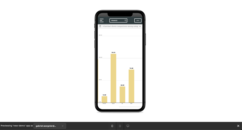
- Column and line charts are probably the most used for comparisons
- Pie and Donut charts are quite difficult to read as it is hard for people to differentiate values when it comes to angles and areas.
- Distribution charts help you to illustrate outliers, the normal tendency, and the range of information in your values.
- Gauges were a big trend in dashboards in the past, but trying to replicate physical objects digitally is a terrible idea.
- 3D charts and overstyled charts have lower readability, distract the viewer from data, and are more difficult to develop, so there is little reason to use them.
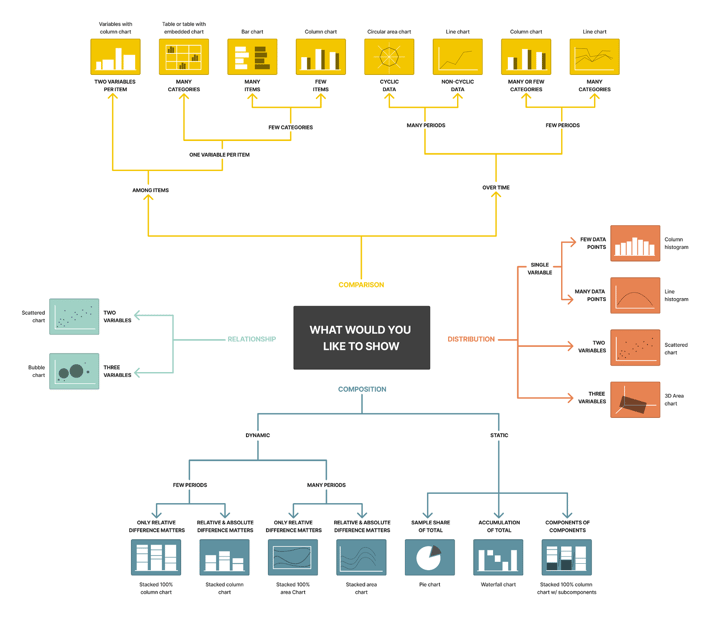
To help you choose the right representation type for the chart, ask yourself these questions:
- How many variables do you want to show in a single chart?
- Will you display values over a period of time, or among items or groups?
- How many data points are needed to display for each variable?
03. Building your dashboards
Once we are satisfied with the prototype we have to create the dashboard using real data. As the main goal of the dashboard is to get the message across at a glance, every little thing counts. The biggest benefit of using a clear framework is data consistency. If your data is named the same way in each tool, it will be easier for you to use those tools. One framework. No questions.
Find the Data
Many challenges can arise at this point. Where is the data stored? Is the data messy? Do we even have the data available? Working with the data team and the data gatekeeper is critical to navigating this step.
- Gather your data - collate your core, peripheral and external datasets
- Conduct data pre-processing - there are a number of things you may want to look at in this step such as data exploration, quality check, profiling/cleaning, encoding, and feature engineering.
Build Metrics/Dashboard
Once the underlying data table has been prepared, it is time to build the visualization in accordance with your endorsed wireframe. At this point, you have everything you need to start building the app - you know which charts to design and the data table to connect to.
Here are a few things to keep in mind:
- Follow your organization's style guide: As more products are added to your team's repertoire, it helps with branding and ease of use. The more familiar the users are with the layout and colors, the more willing they will be to accept new products.
- Refreshes that are fully automated: If this dashboard must be updated regularly, then ensure that the end-to-end process is automated. Do not make manual changes!
04. Test your dashboards
To create a dashboard that provides a comprehensive overview of everything, you should present critical data that provides an overview of past trends, insights that offer a forecast of future outcomes, and real-time data that shows what's happening in real-time.
A balanced mix of data-driven insights will empower your users to develop key initiatives that will drive the business forward while helping you get ahead of your competition.
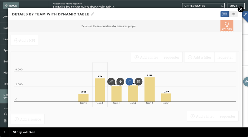
By adding filters and functionality to your dashboard, you can make it easier for users to analyze, arrange, and view your balanced mix of data while maintaining the integrity of the design. Test out the dashboards you great to see if it provides the right information to the right audience. These types of customizations can also be done without any technical knowledge when using the right dashboard software, like Toucan's "view as" feature.
05. Deploy your dashboards
When the dashboard has been built, you need to do some quality checks before sharing it with your users and stakeholders. You should perform the following three types of checks/tests:
- Make sure all the numbers on your dashboard match the ones in your database.
- In order to push features such as glossary, tips, filters, navigation buttons, etc. to users, you need to test them first.
- The branding guide should be aligned with the dashboard design.
.png?width=710&height=497&name=Homepage_Hero_image_V2%20(1).png)
During this stage, you should also:
- Have your script reviewed
- Document the results in a test plan
- Include a spell check
06. Maintenance
Dashboards need to change as data sources, tables, and fields change. Keeping dashboards relevant and functional requires setting up scheduled times to review them. Providing the audience with a way to notify you of issues will allow you to make informed improvements to the dashboard.
Views and viewers will grow if the dashboard is useful. A dashboard that includes links, interactivity, and documentation can accommodate more use cases and inspire other dashboard creators. Additionally, as the number of views and grows, optimizing becomes an imperative part of keeping the dashboard useful.
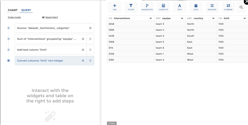
At Toucan, we have developed tools to facilitate the maintenance of dashboards. For example, when you prepare your data, you have access to a detailed flow of each step of your data preparation. It helps you to spot a bug, and you have to edit only one step to fix your chart: we named it YouPrep.
How to do it
Though the six steps mentioned above seem easy, implementing them in practice can be challenging. The most effective way to do it is to have a guide as you continue to build out your dashboards. That is why Toucan has come up with the customer-facing approach. In this way, you can be sure to never get lost in the application as you create dashboards and empower your team.
.png?width=112&height=112&name=portrait_agathe_face%20(1).png)
