Storytelling has a single purpose: convey a message. Children's tales have a moral, advertisements convey ideas and shape the product’s identity.
.webp?width=613&name=photo-1556761175-5973dc0f32e7%20(1).webp)
Data Storytelling is the ultimate communication tool. It can transport and generate interest among readers. Individuals can identify with and project themselves in a story.
This means of communication, naturally applied to children and consumers, is however absent from internal corporate communication. Who has never lost track during a 90-slide PowerPoint presentation?
Our attention span has been declining for the past twenty years; could it be because we’re exposed to too many screens? Constant interruptions from emails and social media? A Microsoft Corp study shows that the average attention span has dropped down to 8 seconds. Worse than the 9 seconds of a goldfish…
So how can you retain the attention of a room and present your results? How can you make a resounding presentation?
Telling a story to catch your audience’s attention
Telling a story helps contextualize an idea and makes it more memorable. This is the principle of data storytelling. Memory athletes all use mnemonics to quickly retain information.
By creating unique stories and linking each piece of information together, they are able to remember complex combinations of numbers and images.
Moreover, the best presentations are visual in nature. Indeed, evoking images allows ideas to be most easily understood. The challenge then is to make data attractive and memorable.
The format of Excel spreadsheets and PPT slides does not allow an easy understanding of graphical representations. Furthermore creating graphs connected to several Excel files, which are then transferred to a PowerPoint presentation, can take weeks for a rather nondescript result. This is a significant waste of time only a few can afford.
This is where the need for Dataviz arises. The different data sources prevent the quick creation of beautiful, understandable, automatically generated presentations. In order to address this issue, the various BI players allow a platform to be connected to the hundreds of data sources available within the company.
This method makes it possible to present the performance indicators of a business unit or department using all the company’s information.
Storytelling and dataviz
New technologies in Data Visualization make it possible to generate graphs and interactive dashboards with captivating designs. Dataviz makes it easy to navigate from one piece of information to the next, while processing massive databases.
During a presentation, the aim is not simply to announce results, but to provide an overview of the business. It is necessary to dive deeper into the data, at a granular level, and understand the reasons behind specific fluctuations. An educational effort has to be made to contextualize the data and help the audience understand it. This is what Data Storytelling is all about.
Each KPI tells a story about the company’s business. Whether it’s HR analyzing staffing trends, or the finance department understanding the balance sheet, any data conveys a message. As Confucius said: a picture is worth a thousand words. Each graph must have a clear and precise message to help understand complex information.
From myths to reality
Data visualization can reveal hidden trends as well as question myths related to a specific industry or trade. Data challenges the status quo, confronts beliefs and brings out hidden truths.
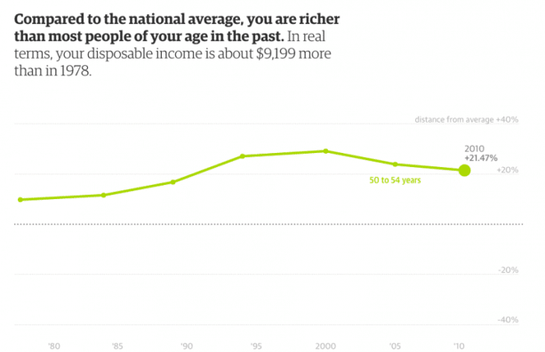
The Guardian’s data visualization perfectly illustrates this notion. Indeed, we believe that purchasing power has declined since 1979, although salaries are higher today. It is therefore difficult to draw a direct comparison. This visualization brings transparency. It shows that, in reality, the standard of living has increased for certain age groups in France, contrary to common beliefs.
This is a great example of Storytelling. It visually explains the evolution by comparing it to different countries, age groups and years. The visualization features a few short comments to guide the audience. It is a powerful means of communication.
Depending on their age and nationality, the reader can compare their situation to the previous 30 years, and assess their standard of living. The conclusion of this study is interesting because it shows that the standard of living is actually increasing, and that for some age groups and countries, it has in fact never been higher.
Fallen.io, a good practice in terms of data storytelling
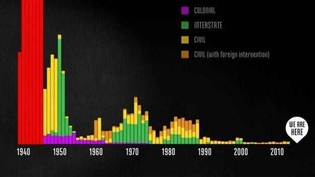
This data storytelling conveys a message through visualization and tells the story of World War II victims. This is an example of good practice. The visualization showed breaks down the various types of warfare since 1940. Discover the story on http://www.fallen.io/
Telling a story visually by using data makes your message credible and understandable. In this example, the visualizations convey a clear message, without unnecessary complexity. The story unfolds step by step, without trying to condense every idea and data into a single visualization.
Negative examples
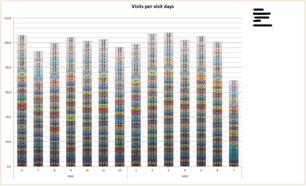
The advantage of a presentation medium is that it helps visualize and clarify data. Too often, overloaded presentations aim to summarise an entire activity on a slide or dashboard. And the fact is, it doesn’t work!
Leonardo da Vinci wrote: Simplicity is the ultimate sophistication. A clear visualization allows the audience to focus on the data rather than trying to decipher a slide. A successful presentation conveys a strong message, contextualized and supported by data.
Communicating results is vital. Presentation media must deliver. They must be designed in such a way that promotes retention and understanding among the audience.
Data storytelling allows you to meet these challenges. It creates a framework that allows people to easily understand and memorize data. An insightful visualization helps share the speaker’s expertise and make their message accessible to all.
Data storytelling allows you to meet these challenges. It creates a framework that allows people to easily understand and memorize data. An insightful visualization helps share the speaker’s expertise and make their message accessible to all.