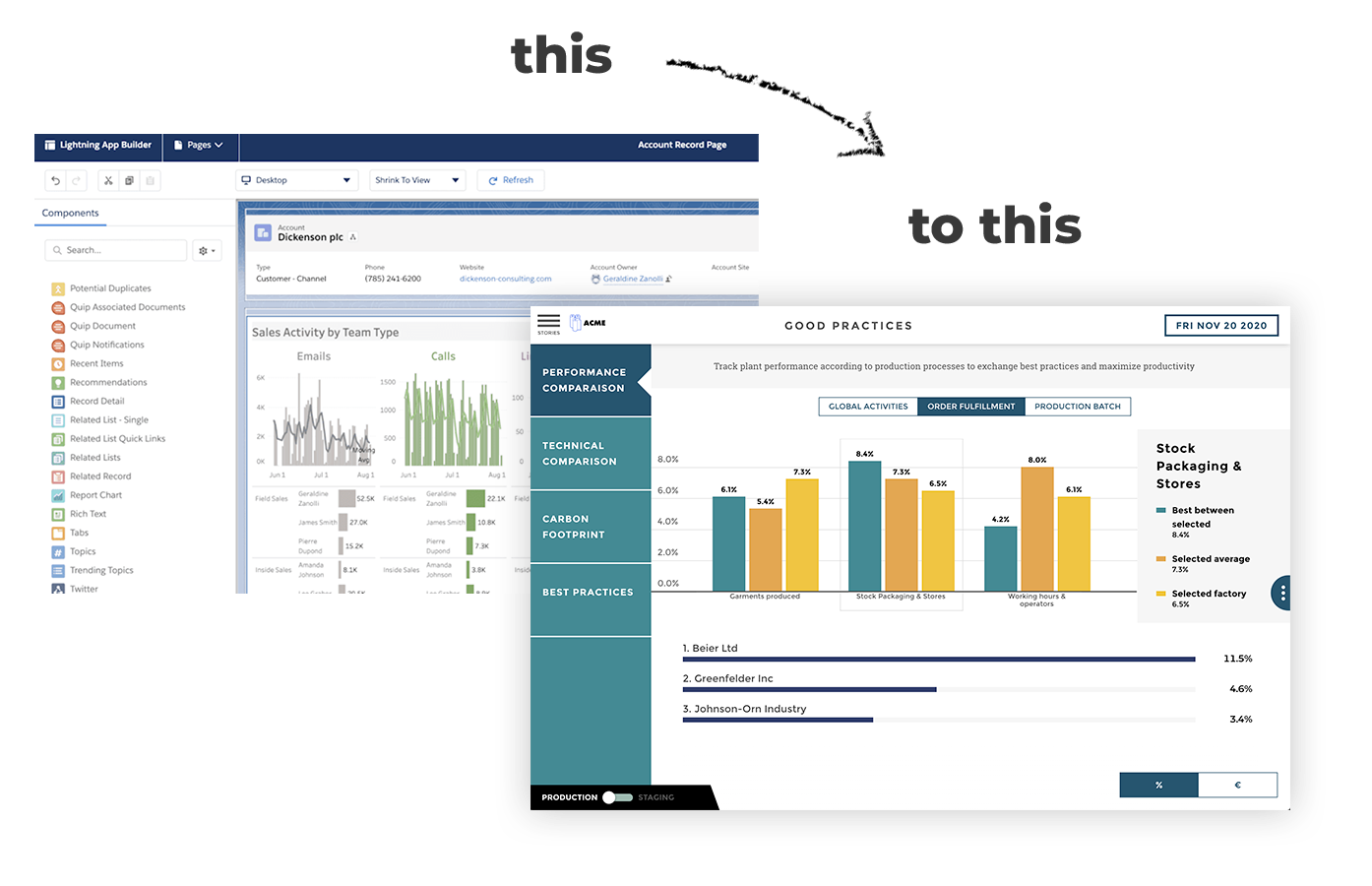
A dashboard is a visual representation of your work. It gives decision makers a way to easily visualize their company’s performance and projects in real time. Dashboard building must meet specific criteria, and you’ll find out about ours in this article.
Rule # 1 : Favour default settings
Your foundation should be simplicity. Most dashboard solutions are highly customisable. Just think Excel stacked with infinite features.
These tools allow for very advanced options, like linking several graphs on the same screen or cross-checking thousands of data. Word to the wise: don’t. Just aim for simplicity. Let data scientists deal with complex cross-checking.
Our clients are large corporations with complex issues. Our only advice: make it simple. The more complex the issue, the simpler your screen should be. This is key to manage your operations efficiently.
On top of that, think end user. Neither you, nor anyone else wants to go through endless clicks or filter settings to get some piece of info. Offer just one way to use your graph. Take this opportunity to jump into data storytelling and truly bring your data to life. I’d say you should just trust the tool you’re using. Believe in default!
Rule # 2: Design first, Data second
What do you mean “Design first”? Sure, data collection is a major step. But going with Design first enables iteration without investing time into structuring the data. Consequence: massive time savings.
Have a little test with your end user and a sheet of paper. Offer one way to use the data. The only thing that matters is the need expressed by the user.

The first iterations are meant for projection and to better define their requirements with you. Once they’re happy, sort out the enormous work of data creation and connection.
Design first puts things into perspective for the user. It allows them to provide immediate feedback before investing too much time. The traditional method on the other hand? A harrowing multiple weeks journey to draw up a graph connected to the data before getting any feedback.
What usually happens is your user will ask for different requirements. Worse yet, you might have to do it all over again and you’d have wasted loads of time. One of the reasons why so many IT projects have failed in the past is due to the Waterfall model.
The end goal is quite simple though: deciding what dashboards will feature before the data connection stage. This step makes it easier to sort out what we really want to tell through our visualizations.
.webp?width=507&name=giphy-downsized-4%20(1).webp)
Rule # 3 : One need = one graph
Putting multiple graphs on a single dashboard often stems from a fear of not seeing a key indicator. That’s why so many dashboards are exhaustive. But when it comes to day to day information gathering, simplicity and relevance prevail over exhaustiveness.
Before anything else, your dashboard must be a communication and education tool. Unique information is easier to understand. The big issue with BI tools is they are over exhaustive, which makes them incomprehensible for dashboards.
With one message per screen, the story you’re telling with your graph is clearer. Remember, the dashboard is there to tell a story through your data.
Not to mention having a single graph per screen allows you to feature actions on this same graph. One click to expand an area dives into a higher level of granularity to get more specific information. A fantastic way to combine simplicity and exploration capacity.
.webp?width=570&name=giphy-downsized-5.%20(1).webp)
Rule # 4: Users are humans too
This rule is about formatting only. View it as your gateway to power. When building your dashboard, there should be no room left for ambiguity in your formatting.
You want to avoid writing 10.05.2017 and favor 10th May 2017 when processing the date or period. It will avoid confusion with date formatting. Let’s take an international date as an example. Although the US format is month/day/year, the international format tends to be day/month/year.
This could lead to confusion if you choose to write 10.05.2017 instead of 10th May 2017. Depending on the country you’re in, the reader might not be able to guess right.
Humans are not robots, avoid treating them as such.
.webp?width=580&name=giphy-downsized-6%20(1).webp)
Rule #5: 3 filters per dashboard
Here comes our friend simplicity again. Rule n°5 resembles the “1 screen, 1 message” rule. Too many filters in one single visualization are bound to create readability issues. We don’t want that to happen.
Whenever you’re tempted to go over 3 filters per screen, you just need to tell another story. Put on your fashion hat for a second and think about the “3 colors rule”. More than 3 colors and you lose any sense of harmony in your outfit!
Now that you’ve been over these golden rules, you are ready to build simple, precise and educational dashboards to tell wonderful stories. Well done, A+!
About Toucan Toco
Our mission: using pedagogy to turn raw and complex data into Dataviz and interactive stories
Our users: Management teams working in Marketing, Operations, Finance, HR or Sales in large corporations.
Toucan Toco in numbers:
- From 4 partners to a team of 50 in 3 years
- 90+ key account clients
- 200 projects including EDF, Total, Renault, JCDecaux, Marques Avenue or BPCE
Toucan’s Small Apps are mobile, user-friendly, easy to implement and integrated in existing IS and contain everything needed for operational excellence in HR, Marketing, Finance, Sales and Executive Management.