Having effective data visualization software is paramount to any company’s sustained success. This software encompasses tools used to visualize your data after input into a raw form, such as Excel sheets, which are transformed into user-friendly visualizations that can be shared and manipulated.
Data visualization software is crucial for managers to decide the company’s path forward. However, it’s important to recognize that new tools require a learning curve with ample time and effort to benefit from the innovation.
Ultimately, you want visualization software that requires minimal effort but successfully engages your audience. When choosing a suitable visualization tool, you’ll want to consider whether your visualizations are reproducible, how efficiently they can explore data, and to what extent the appearance of the data output can be altered.
But with all these requirements, you’re likely wondering how to choose data visualization software. This guide will offer everything you need to make an enlightened choice and ensure visualization software thrives like never before!
What to Consider When Choosing Data Visualization Software
So, what elements should be taken into account when deciding on the right data visualization software for your company? Below are a few components to consider:
1. Reproducibility and Repeatability
The first factor to consider when selecting data visualization software is whether it provides ample resources for reproducibility and repeatability.
The right software solution will be able to produce the same computation and visualization using different data sets, giving you a clear picture of your company’s success. Repeatability encompasses a software solution’s ability to obtain results by applying the same computation to the same software equipment.
But what makes visualization software reproducible and repeatable? This software is reproducible if your plotted data is readily available and your data transformations are precisely specified. For instance, a visualization can be reproduced to a similar visualization with slightly different elements, like colors and fonts, to present the same data differently.
Visualization software is repeatable when the software gives you the resources necessary to create the same visual appearance from raw data across visualizations, meaning the exact visualization can be regenerated whenever necessary.
As you assess different visualization software options for their unique capabilities, put reproducibility and repeatability at the top of your requirements list. Choosing software without these capabilities will minimize the effectiveness of your data solutions, meaning you won’t get as much out of data visualization as possible.
2. Data Exploration Versus Data Presentation
Another factor to consider when selecting the right visualization software is the software’s data exploration versus data presentation capabilities – but what does exploration and presentation entail in the world of visualization software?
Data Exploration
Data exploration is the first step in data analysis, allowing you to explore large amounts of unstructured data to determine trends and identify patterns relevant to your target audience.
When navigating data exploration, you must consider datasets from various viewpoints, angles, and tests while prioritizing speed and efficiency – making reliable visualization software paramount to simplify data analysis. Exploration processes allow you to focus your search and eliminate irrelevant data.
As you assess different options for visualization software, test different visualization outputs, transformations, and varying computations. Exploring these different outputs lets you understand the software’s iteration capabilities and whether it’s a viable solution for your business.
Consider how efficiently you can change visualized data to a different format. For instance, look for software that allows you to effortlessly switch between boxplots, heatmaps, and more without requiring significant adjustments.
As you continue assessing your visualization software’s exploration capabilities, test the software by changing the variables mapped onto different aesthetics – this step will offer a range of visualization options within a coherent framework to better understand how effective a software solution is.
During this exploration process, you’ll notice that certain visualizations and iterations slow down your workflow while others promote a more efficient workflow by presenting relevant data. Visualizations that deter your progress indicate that your organization is better suited for alternative visualization options.
Once you’ve chosen how to best visualize your data, you can move on to the data presentation process, which encompasses how your information is readily available to your target audience and how well it conveys the intended message.
Data Presentation
Data presentation follows the exploration process and is only possible once you comprehensively understand your data sets and what you want to present to your audience. The key to successful data presentation is providing high-quality, publication-ready figures that can be provided in business presentations, posted publicly on the internet, or provided in different formats without confusing your audience.
Luckily, you’ll have multiple options when it comes to data presentation. Some businesses choose a unique platform to conduct exploration and presentation processes within a single interface, while others might choose a specific software for each process. While you can also navigate this process manually without help from visualization software, a manual process will be much more time-consuming and inefficient than advanced visualization software.
Remember that manual data analysis will affect your data’s reproducibility and repeatability – far from ideal when fostering an efficient work environment. Manually exploring and presenting data means your information is not easily accessible and repeatable, and manual processes may also cause specific employees to struggle with data visualization. So, while manual presentation is an option, it’s likely not the best solution for your company’s visualization needs.
3. Separation of Content and Design
Data design and content have historically been separated within manual processes. For instance, many companies rely on processes where one team focuses on content and another focuses on design rather than working together as a unified entity.
Modern data visualization software eliminates this separation, allowing managers to navigate a visualization process where content and design rely on one another for maximum effectiveness. The best data visualization software will separate the content and design of your data figures – ensuring an easily accessible and comprehensive visualization that everyone can understand and process effectively.
While visualization software separates content and design, it fulfills the needs of each and offers a holistic presentation of crucial metrics. This separation contributes to data storytelling, which describes your ability to tell a story with your data and personalize data based on your target audience.
Content
The content in visualization software encompasses the following:
- The specific datasets presented. Relevant datasets are essential for extracting accurate conclusions and making informed decisions based on your data.
- Applied data transformations. Data frequently requires transformation before it’s visualized to enhance the relevancy of your extracted data. This element of data content might include data aggregation, normalization, and filtering – all crucial for extracting meaningful insights from raw data.
- Data mappings. This component of visualization software ensures your audience can understand data trends, patterns, and relationships, including visual properties like colors and shapes.
- Scales. Data scales encompass the range of values presented on your axes or legends, and the right visualization software will provide several scales to ensure the visualization correctly reflects the data.
- Axis ranges. These ranges determine the extent of the data you display along different axes, allowing your audience to understand the full scope of a dataset.
- Type of data plot. Data plots include line plots, bar plots, scatter plots, and more, and allow you to present information in a cohesive and digestible format that your audience will respond well to.
Design
Design encompasses other factors in data visualization that contribute to how well your audience processes the presented data. For example, the design includes details like font size, face, and color, adding visual appeal to your data to convey your intended message and ensure information is legible and understandable.
Beyond your font choices, the best visualization software will include design elements to enhance details like symbol shapes and sizes, representing distinct data attributes to communicate your findings to your audience. These design elements help you convey quantitative information through visuals.
The design also includes details like your presentation’s background grids. Gridlines are crucial because they offer a visual reference for interpreting different data values, and the right visualization software will have the resources to enhance your background grids and clarify data points.
Finally, the right data visualization software will include features to enhance the placement of legends, axis ticks, axis titles, and narratives – all critical components of appealing visualization presentations. Visualization software can help you place these elements strategically to ensure viewers interpret your data correctly and with minimal effort.
Choose the Right Visualization Software
Ultimately, choosing the best visualization software comes down to factors like how easily you can reproduce figures and redo them with changed datasets, whether you can explore various visualizations of the same data, and to what extent you can alter the data’s visual design separately from generating the figure content.
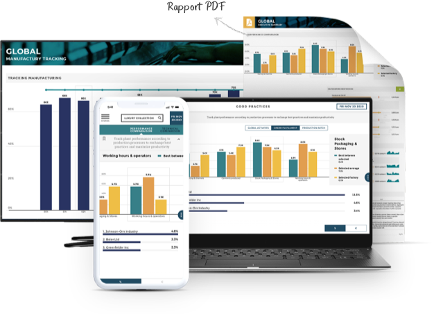
Along with effective visualization software, organizations require resources for effective data storytelling to craft a narrative for their data and ensure it connects with their target audience as intended. Solutions like Toucan can help you navigate data storytelling for your customers, empowering you to boost engagement and provide the best user experience possible.
Learn more about Toucan’s data storytelling solutions today!

.png)