Executive dashboards serve an important purpose in an increasingly data-driven business world. When it comes to making informed choices, data is often the first part of the formula. To make data more actionable, it can help to visualize it in a manner that reflects changes as they come. That’s where robust reporting comes in. With properly configured dashboards, executives can quickly get to the root of the issues they’re exploring, and glean actionable insights.
Reporting Dashboards Explained
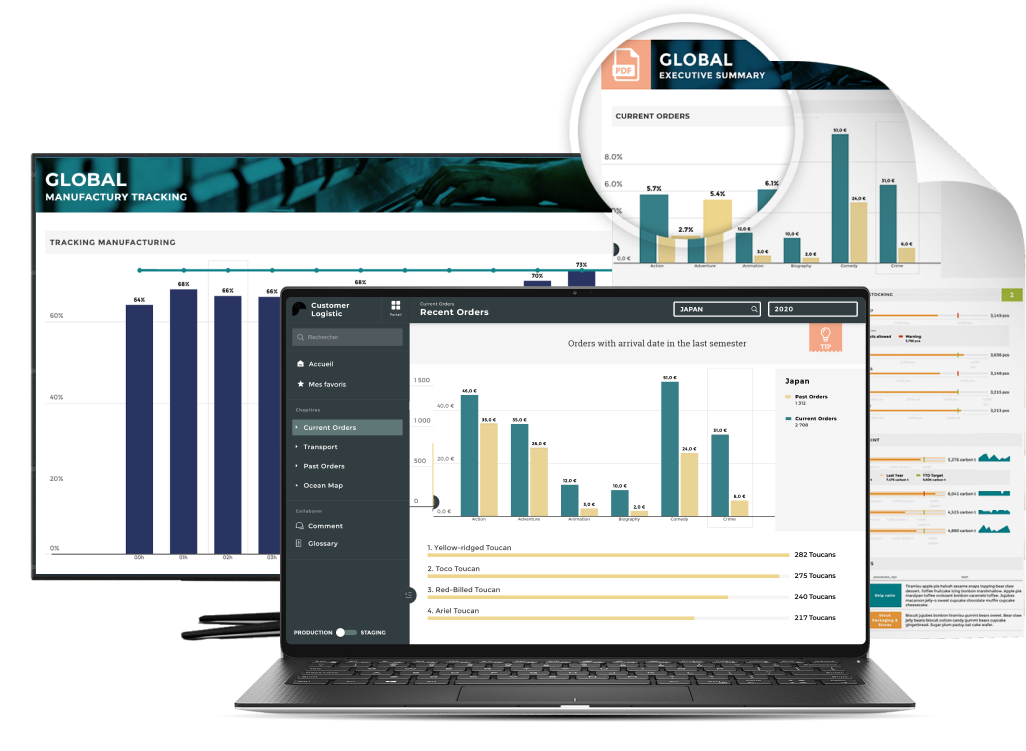
A reporting dashboard is a software solution — often cloud-based — that enables organizations to take raw data and transform it into easily followable visualizations — such as charts and graphs.
Executive Dashboards
These visualizations enable executives to quickly see data at various levels of granularity, which can aid significantly in decision-making and strategy development. Since reporting dashboards are often cloud-based and feature automated updating capabilities, they can often be accessed through various devices at any time. This can aid in fast decision-making and can help teams communicate more effectively.
Dashboards - Best Practices
The effectiveness of a reporting dashboard may hinge on its configuration, usability, visual design and layout, and the accuracy of the data that it’s generated from.
Layout
Importantly, dashboards should be designed in a manner conducive to ease of use. This might mean utilizing easy-to-understand visualizations, configuring visual components correctly, and organizing data in such a manner that the most pressing KPIs (Key Performance Indicators) and signals are quickly readable, followed by details and less pressing KPIs. It also may involve ensuring consistency in visual details such as color schemes, fonts, and layouts, so that dashboards remain consistently usable.
Relevance
Relevance is a key consideration when creating effective dashboards. Not only should dashboards be tailored to their audience (for example, a Chief Revenue Officer is likely interested in metrics relevant to revenue, such as Customer Acquisition Cost [CAC]), but dashboards also should include only KPIs relevant to the task at hand, to mitigate the risk of clutter and offering irrelevant distracting information.
Accuracy
A dashboard is only as good as the data from which it is generated. As such, accurate, vetted, and up-to-date data is essential. To accomplish this, it may be necessary to implement systems that aim to ensure the validity and accuracy of data regularly to ensure that dashboards provide consistently accurate information.
Optimization
Without knowing for sure which device a dashboard may be viewed on, it’s often crucial to ensure they’re optimized for accessibility and readability. Ensure that dashboards are both mobile optimized and suitable for desktop viewing, to ensure they’ll be most useful whether they’re viewed on a mobile device or a desktop system. Optimization also may involve ensuring that dashboards can load quickly regardless of end device, which may involve carefully utilizing the most efficient scripts possible.
Executives Dashboard Examples by Departments
To better understand what executive reporting dashboards may look like, let's explore some executive dashboard examples by department. As you may note, the metrics that we outline for each department are designed to be relevant to the executives responsible for overseeing various departments and their unique considerations.
1: CRO - Revenue dashboard
The chief revenue officer is responsible for the organization’s revenue-oriented practices. As such, the metrics that may be included in a dashboard configured for a CRO might include those that signal important revenue factors.
Presentation
For a chief revenue officer, the presentation of a revenue dashboard can be essential. It may be helpful to offer not only data that is ordered, hierarchically, in descending order of both importance and scope size, but also to ensure that the data is presented in a manner conducive to identifying revenue patterns over time. This may mean utilizing charts and graphs that factor in change over time, and offering insights that can inform future projections.
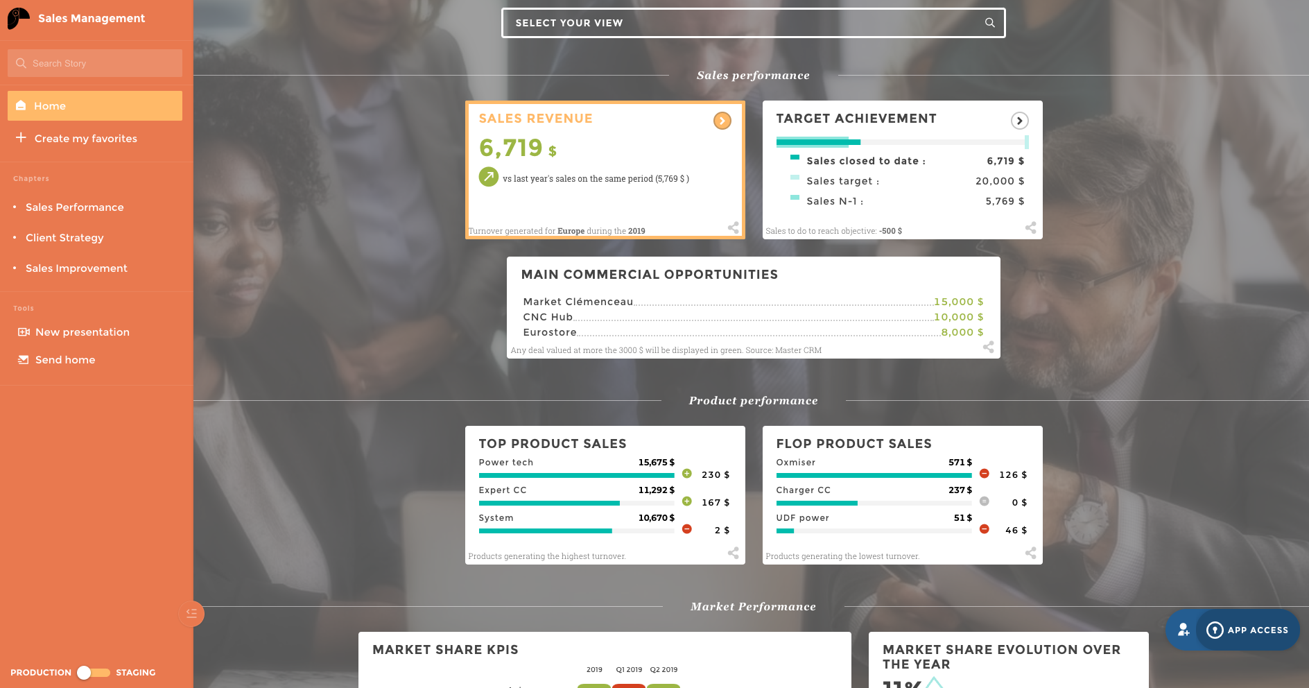
KPIs to Include
For a chief revenue officer, KPIs should inform crucial revenue considerations. These might include:
- Cost Per Acquisition: This metric looks at the total cost to acquire a new customer, factoring in each step of the customer journey.
- Customer Lifetime Value: This metric looks at the total revenue produced, or estimated to be produced per customer, on average, during the total duration of their doing business with the organization.
- Recurring Revenue (Both annual and monthly): This metric looks at total revenue by time period. Annual recurring revenue (ARR) can be calculated using monthly recurring revenue (MRR).
- Sales Growth: This metric compares sales at one point in time to sales at another point in time. When charted out, it can provide a clear indication of the trajectory of sales efforts. For example, annual sales growth might look at whether sales have increased or decreased since the same time a year ago.
2: CMO - Marketing dashboard
Chief marketing officers are tasked with overseeing a company’s marketing efforts. As such, a reporting dashboard tailored for a CMO might include metrics that aim to quantify marketing efforts, and presented in a manner conducive to identifying trends in marketing efforts.
Presentation
This will often necessitate a design that considers how easy it is to identify marketing trends. To do so, it can be important to organize data in a manner that offers ease in identifying brand reach, campaign performance for various campaigns, and customer engagement. This may involve creating color-coded graphs that help quickly outline which marketing efforts are working most effectively based on the success metrics determined by the marketing team.
KPIs to Include
For a CMO, KPIs should help inform marketing practices. These might include:
- Return on Ad Spend: ROAS, or Return on Ad Spend, looks at the cost that the organization incurs running ads, particularly in online platforms such as social media and search engines.
- Conversion Rates: Conversion rates outline the rate at which visitors or viewers of online ads and marketing pages convert to paying customers.
- Cost per Lead: Cost per lead, or CPL, outlines the costs that the organization incurs producing leads.
- Click-Through Rates: This metric looks at the rate at which your audience takes action by following a link. This can be applied to various marketing campaigns, whether they be email, social media, or inorganic search ads.
- Retention Rates: This metric measures the rate at which customer churn occurs. Higher retention rates can be a significant boost to marketing efforts.
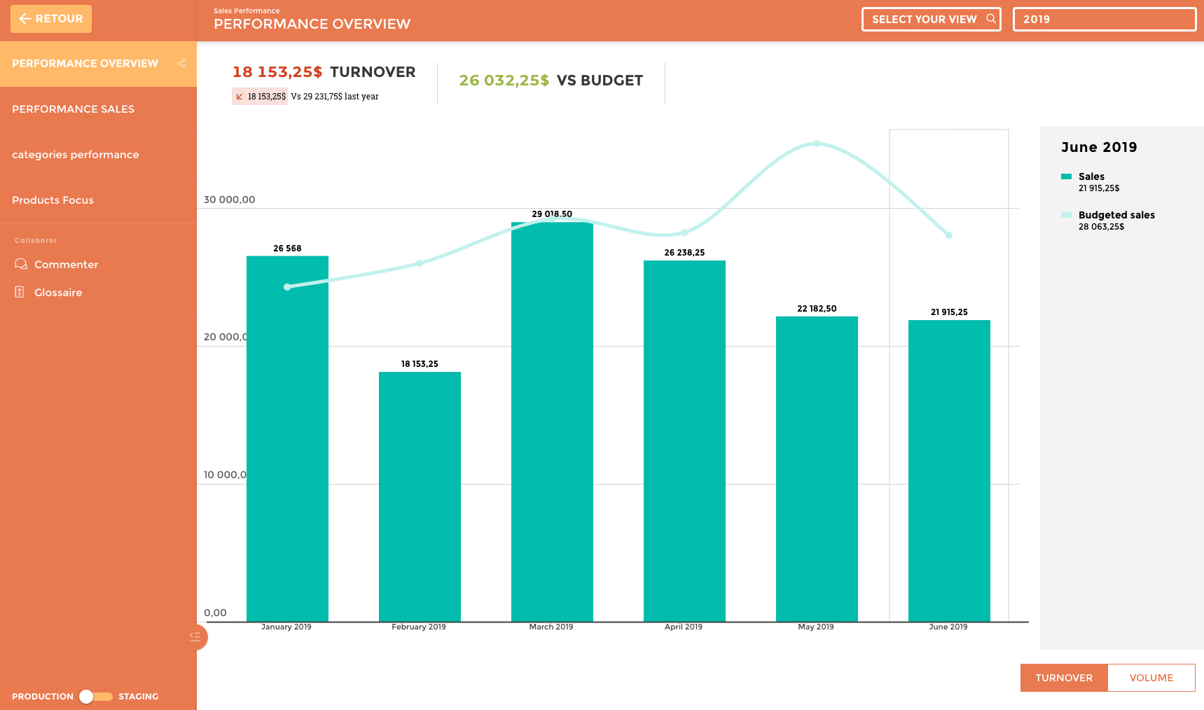
3: CFO - Financials dashboard
A chief financial officer is tasked with overseeing a company’s financial performance and practices. As such, a dashboard tailored to a CFO will typically involve employing metrics relevant to financials and should be presented in a manner conducive to quickly drawing accurate conclusions about financial performance.
Presentation
It can be important to organize a financial dashboard in a manner conducive to tracking profitability, financial performance, and compliance. This may involve creating visualizations tailored to provide insights on comparative financial performance, such as line graphs and bar charts from which comparisons and trends can be easily identified. For example, a line graph may help track net revenue over time; from here executives can conclude the trajectory of financial performance.
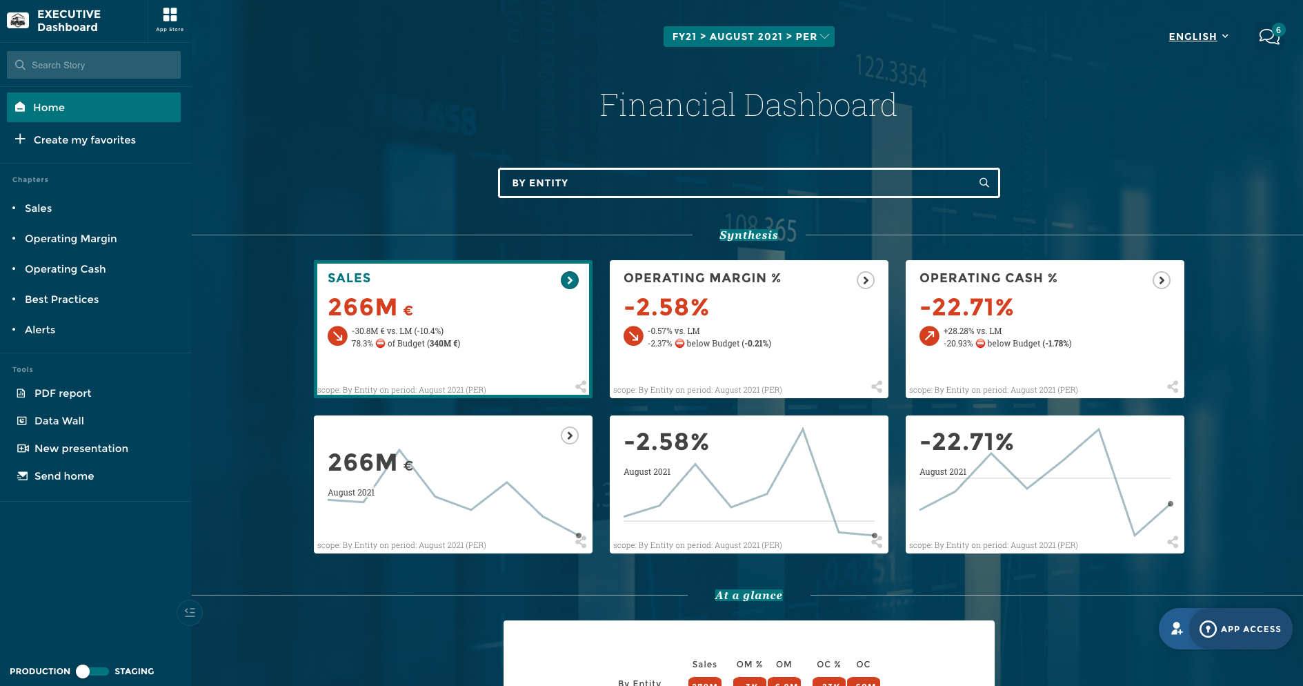
KPIs to Include
Some of the KPIs to utilize in such a dashboard might include:
- Net Revenue: This is the measure of an organization’s total net revenue, factoring in both gross revenue and costs for a certain time period.
- Operating Cash Flow: This is the measure of cash flow specifically in the context of operations. This can help inform the viability of operations in terms of generating revenue sufficient to fund future operations.
- Debt to Equity: This is a ratio metric that looks at the total net worth of the company to shareholders in comparison with the company’s total debts.
- Gross Margin: This metric looks at the total gross revenue of an organization minus the cost of goods sold (COGS), without factoring in operating costs, divided by the total revenue, typically expressed as a percentage. This can be an important metric for understanding a company’s profitability at a glance, and the addition of operational and other costs (such as those associated with taxes) to the equation can provide the Net Margin metric.
4: COO - Operations dashboard
Chief operations officers, or COOs, are tasked with overseeing operations within an organization. As such, dashboards tailored for COOs typically offer actionable insights relevant to operations, presented in a manner conducive to actionable insights.
Presentation
Presentation can be vital when tailoring dashboards to the use of a COO. This can necessitate the use of actionable visualizations of metrics relevant to operations — such as operational flowcharts and line graphs.
KPIs to Include
KPIs to use for a COO dashboard may include the following:
- Employee Turnover: This metric looks at the rate at which employees leave the company. COOs might rely on more specific variations of this metric, such as high-performance turnover, which outlines metrics to determine which employees are considered high performers and looks at their rate of leaving.
- Customer or Client Churn Rates: This metric looks at the rate at which customers or clients leave. Churn rates can be vital in identifying weak spots and addressing customer or client success.
- Throughput: This metric analyzes the speed at which the company is able to produce deliverables and can be a crucial metric for COOs.
- Time to Productivity: This metric is often crucial for informing hiring and employee retention practices, as it outlines the time it takes for new onboards to become fully productive.
The Bottom Line
Offering executives actionable insights can be crucial — but data, alone, isn’t always sufficient to fully communicate a clear picture. That’s where visual reporting comes in, creating actionable narratives from raw data.
However, it’s important to note that this will necessitate the creation of dashboards carefully tailored to their roles. Best practices for creating these dashboards include ensuring that data is relevant to the audience and purpose of a dashboard, creating visually effective layouts from which executives can quickly derive insights, and ensuring that dashboards are well-optimized for accessibility and generated using accurate, up-to-date, information.
If you’re looking for a way to do more than just organize data — but to create compelling stories that drive data-informed action, don’t hesitate to reach out. At Toucan Toco, we can help you engage in storytelling in your reporting. To learn more or get started, reach out for a demo today.