


Dashboard Prototyping: A Comprehensive Guide
.png?width=88&height=88&name=portrait_agathe_face%20(1).png)
Agathe Huez
Publié le 02.09.22
Mis à jour le 13.01.26
6 min
-3.png?width=800&name=Blog%20Graphics%20(8)-3.png)
You're a decision-maker at a company that has generated high but consistent revenue. You're investing yearly in new BI tools that promise high ROI and growth, yet none of them are delivering on their promises. Even worse, employees at your company are becoming disgruntled with confusing interfaces, glitches, and discrepancies with data sets.
You're running out of ideas, consulting your IT department, and maybe even outsourcing consulting firms. You want to start fresh and deliver a tool that will hold your team accountable and provide ownership over accurate data. So you embark on a journey of choosing an embedded analytics platform to satisfy your firm's goals, a daunting task when considering the necessary collaboration between departments and management.
This is an all-too-common scenario that many decision-makers face today. Because yes, embedded analytics solutions are expensive. Yes, you're taking the plunge on a solution that all too possibly will not deliver on its promises. And yes, you will have to devote time and resources to a solution that may not deliver your expected results.
We've heard all of these concerns and reservations from our customers who embark on their embedded analytics journey or make the shift from a solution that did not meet their needs. Based on our experiences, we're putting together a series explaining the planning, design, deployment, and maintenance of dashboards for professionals who are looking to drive growth and provide their teams with meaningful insights.
Why create a dashboard?
Dashboard creation requires a great deal of brainstorming, planning, preparation, and execution. Neglecting any of these stages can cause poor performance and insights, putting any investor on the back foot.
Prototyping dashboards can be a difficult process if you don't have the answers to the following questions:
- What insights do your users need to make the best decisions?
- What metrics do your users need to make those decisions?
- What is the goal(s) of my dashboard?
Answering these crucial questions will be essential to building the most effective dashboards for any use case. After learning about the best practices and tips for creating a dashboard, it's time to begin designing your ideal data visualizations.
In this article, we will cover the 4 main steps to follow when creating a dashboard prototype and explain the importance behind each step.
Brainstorming
The most important step when prototyping a dashboard is the gathering of relevant documentation and review. The most important materials you gather should include:
- Goals
- Decisions
- Metrics
By assembling this information, dashboard creators can assess the requirements necessary to create successful and useful visualizations.
Once all the relevant materials are assembled, it's time to conduct a storyboarding process. Each dashboard conveys a unique story, and as we all know, stories can be told well or poorly. The main differences between a well-told story and a poorly-told one are the organization of the events and their delivery to an audience.
Dashboards are no different. Before entering the wireframing phase, designers must understand exactly what story the dashboard must tell, and all the ways that story can be told as clearly and effectively as possible. Often, it is beneficial to come up with the main questions your end-users want answered and if they can be answered at all.
This stage is also the point at which project management comes into play. Important considerations when managing a new data visualization project include deadlines, roles, and the roadmap.
Wireframing
Putting pen to paper allows a dashboard creator to create a rough vision for a dashboard. By sketching chart types and versions of their specific layout, designers can provide their audience with multiple versions of what they think would be more helpful in everyday situations.
When wireframing variations of dashboard designs, it is normal to generate new ideas that involve various metrics. This is why designing multiple layouts can be beneficial to your end-users. Any ideas for included metrics should be noted and discussed further to determine their effectiveness.
The most important aspect of prototyping a dashboard is preserving the simplicity and readability of metrics. Creating a cluttered dashboard with useless metrics will have an adverse effect, confusing your end-users and driving flawed decision-making.
Ask yourself questions about the types of graphs and metrics included in your sketches. For example:
- If I had to only include one chart, which would be the most important?
- If my visualization could not include more than 2-3 metrics, which would be the most important for my end-users?
Although your dashboard will likely be able to track more chart types and metrics, asking yourself which metrics and visualizations are essential ensures that your dashboard includes the necessary insights.
Visualizations
In this phase of your dashboard design process, it is necessary to think of the graphs and charts that best fit your use case and design. Selecting the most effective visualization is often the difference between a superb and subpar dashboard.
The most popular visualizations included in dashboards include:
- Tables
- Single-value
- Bar chart
- Pie chart
- Bar-line
Although these dashboards are the most used, it doesn't necessarily mean they are the best optimized. Be wary of a generalized approach when selecting the visualizations that answer your data question.
Your use case may demand a more complex visualization, such as a heat map, bubble chart, and/or funnel chart. However, be aware that bar-line, bubble, bullet, single-value, and bar charts are the most viewed, meaning that more of your audience may have an easier time drawing insights from them.
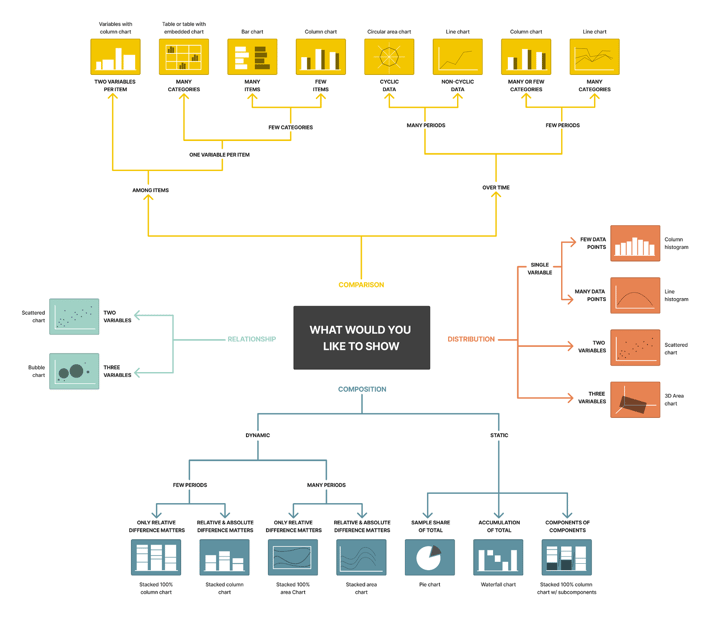
It is important to understand the utility of each visualization before sketching or designing your mock-ups. Here is a detailed map of each use case for the most popular visualizations:
Once you have an idea of the visualizations and metrics to include in your dashboard, there are many different ways to bring your design to life:
- Software
- PowerPoint
- Fake Data
- Paper
- Whiteboard
These mediums can be helpful, and dashboard designers have achieved their desired results using each. Use whatever resource is available to you and whatever medium you are most comfortable with to create a mockup.
If you have an IT team or graphic designers at your disposal, software solutions can offer a more realistic insight into what your design will look like in an application. Using software will also allow you to visualize the best locations for logos and icons, which will save time later in the process.
Alignment
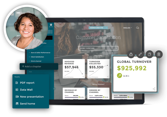
Once you select the visualization that best conveys the answer to your audience's questions, the next step is arranging them in an optimal layout for your audience. We're including an example of a Toucan dashboard to demonstrate some best practices when conceiving a dashboard layout.
Although the previous steps in the process relied heavily on scientific thinking and logic, this step in the process relies on some artistic and creative skills. From font size to colors, the details of your layout have the power to improve the audience's user experience.
Here are some quick tips to inform your layout creation process:
- If two visualizations express a specific metric, place them next to each other.
- Line charts expressing data from the same period should be stacked vertically to encourage comparisons.
- Place items that describe the same metric adjacent to each other to ensure that the user understands the reasoning for a singular title
- Avoid overcrowding your dashboard with too many visualizations and information. When too many visualizations are present, confusion can overpower the end user.
Layout
Once you decide on how to group your visualizations, be sure to devote time to examining the most beneficial layout for your end user.
An important consideration for choosing your layout is the aspect ratio of your device or devices on which you will be displaying your dashboards. There are plenty of dashboard templates on the internet that can get the ball rolling, these layouts may be used to spark new ideas or can be replicated entirely.
Editing
You gathered the most important information to create your dashboard, chose your visualizations, sketched your ideal dashboard layout, selected the right metrics, and you're done!
This is the mistake many dashboard creators make when designing their first dashboards. Although much of the leg work has already been done, garnering feedback from these initial steps is the most important part of the dashboard-building process.
Designate a person to provide feedback on your design, ideally an experienced end-user. For example, if the sales team requested a dashboard from which the whole sales team in the field can draw insights, choose your best-performing sales team member to review the helpfulness of your design.
Once this person has been designated, provide them with your designs. It is also important to include questions for them to answer about your prototype, including:
- What are the decisions you will need to make?
- What other data do you need to make those decisions?
- Can you obviously draw the necessary conclusions from this design?
- Does the most important visualization catch your eye?
- Is there anything else missing from this dashboard?
By asking these questions, you can save your IT department and end-users from data headaches and redesigns post-deployment. It is much easier to iterate multiple versions of a dashboard based on constructive criticism than generate data sets after finding a dashboard fails in practice.
For this reason, it is important to have an open mind to constructive criticism as a dashboard designer. Ask as many members of your target audience for advice and feedback on what would be helpful to them.
Iterating
You've asked your audience for feedback, and after making a couple of tweaks, your dashboard is ready to go! Unfortunately, this may not always be the case.
Once you have an initial wireframe and you have taken feedback into account, you must understand the technical requirements necessary to run your specific dashboard. Important factors of technical consideration include:
- KPI calculations
- Data assumptions
- Data connectors
- Automation
These factors all play a major role in the success of your dashboard, and each solution could provide different capabilities than what your firm needs. Having these details carefully planned is important to know exactly what to ask data visualization providers for when attending discovery meetings.
It is common for many cycles of this process to occur for a single visualization and the entire dashboard. Because data visualization solutions are often expensive, a designer following the best building practices will ensure that a dashboard is 100% complete and usable before engaging in the next step in the process.
Be sure that you are confident in your target audience's content in your design before bringing it to life. By engaging with all relevant members and rigorously testing your design, you can save your team frustration, confusion, and time.
If this first step in the dashboard application process was helpful in beginning your embedded analytics journey, be sure to read about the next step in the process!
.png?width=112&height=112&name=portrait_agathe_face%20(1).png)
