


5 Data visualization Ideas to Breathe New Energy into NPS Analysis
.png?width=88&height=88&name=portrait_agathe_face%20(1).png)
Agathe Huez
Publié le 07.12.20
Mis à jour le 13.01.26
4 min

A typical NPS survey asks: How likely are you to recommend us to someone else? Choose an answer between 0 and 10, 0 being “not likely at all” and 10 being “extremely likely.”
Depending on the answer, customers are classified as a detractor (0-6), passives (7-8), and promoters (9-10). Your Net Promoter Score or NPS is:
[(No. of promoters/total number of responders) x 100]- [(No. of detractors/total number of responders) x 100]
The traditional NPS metric is limited
NPS has a lot of going for it.
It’s one sharable number that helps to make quick impressions in the market. Also, it tells retailers at a glance how their customer feels about the company. A positive NPS means that your promoters outnumber your detractors, multiplying the chance of referrals and business opportunities. Conversely, a negative NPS implies that you have a definite customer experience problem on your hands.
But here’s the thing – it is almost impossible for a static metric to capture the myriad intricacies of customer experience, loyalty, and engagement levels.
Further, it often doesn’t point to a real action point for retailers. Take, for instance, Forrester’s NPS benchmarks for 2019. Its scores go from 59 to -47, which is a massive range of variance!
Without going into the underlying factors, experts don’t recommend using NPS as a tell-all metric.
But does this mean it is time to retire this industry-favorite and look for other alternatives?
Not in the least.
NPS is a proven clear measure of customer loyalty, and it only needs a little help from its good friend, DataViz.
Is the nearly two-decades-old customer satisfaction metric still relevant for retailers?
5 visualizations to give your NPS data a necessary boost
NPS, in isolation, doesn’t tell you too much about how the company is doing. You could compare it with competitors, but there are so many variables involved that your analysis could become skewed.
Instead, NPS should be mapped as an evolving continuum – demonstrating how a company has worked on its customer experience, product quality, and loyalty programs to bring about measurable results. In fact, time-based NPS reports can reveal valuable information on market movements, shifts in customer demand, and how your company fared across these changes.
At Toucan Toco, we have worked closely with retail data visualization experts and industry SMEs to develop the perfect DataViz tools for your NPS data.
1. Use a stacked bar to quickly view your promoters, passives, and detractors
A major limitation of NPS scores is that they overlook passive customers – or those indifferent to your brand. A stacked bar chart assigns a separate bar to each product line-up, breaking down the NPS composition of each.
A good DataViz dashboard following data storytelling principles will include a dynamic legend. You can click on detractors to sort your analyzed variables in the descending order of detractors – and follow the same for passives or promoters to get the full picture.
2. Choose multiple lines to map NPS evolution over time in different regions
Is every location (or product, child company, etc.) improving its customer experience at the same pace? Or, is one location failing miserably behind, requiring immediate intervention? In many cases, NPS can dip due to unpreventable reasons like a larger competitor opening up or simply a restructuring of local demographics.
It might make sense to slowly retire the location – but you need timely data to make this decision.
Here’s where a multiple line chart comes in.
You can add multiple lines like this to retail data visualization, one for each store, to view the evolution of the NPS scores simultaneously.
3. Add highlighted KPIs to horizontal bar charts for easy deep-diving
You might want to view an NPS score in the context of associated metrics such as the industry average, the number of responses, store NPS vs. NPS of brands, etc. To do this, you can add highlighted KPIs that are visible to the user on-demand.
For example, the chart below displays specific KPI text if you click on the Jan 2020 datapoint indicator.
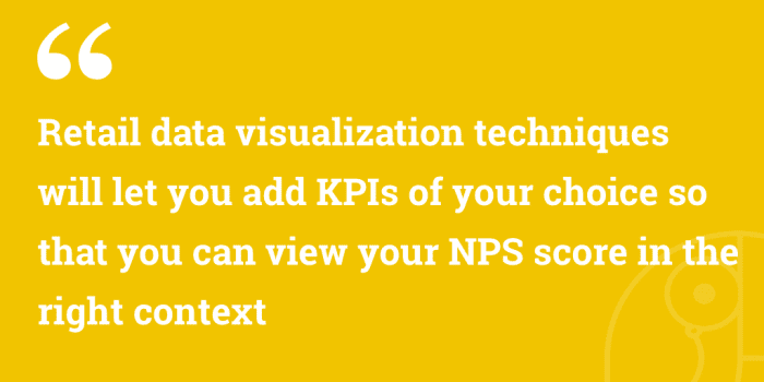
Retail data visualization techniques will let you add KPIs of your choice so that you can view your NPS score in the right context. This should be governed by data storytelling principles so that business users can gain the most relevant insights with a minimum amount of effort.
4. Combine multiple charts into a Master-Slave format to explain underlying forces
Often, you’d want to give users a little more information on a particular store’s NPS before they make a decision. For example, it is possible that a product saw soaring NPS one quarter – but digging deep, it is clear that customers rated it poorly in-store while online shoppers were extremely impressed. This extra information could make all the difference between a smart marketing investment or an ineffective one.
A Master-Slave Dataviz layout lets you combine two charts into a single story. You can not only visualize NPS progress over time, but also expose the underlying forces contributing to the change.
5. Configure bar charts to show the average NPS for every region
The humble bar chart can be surprisingly useful.
You could visualize many locations together, capturing the average NPS of all the stores in a location in one bar. This is particularly useful for large, globally-distributed companies where one customer experience strategy usually governs the entire region.
Location-based average NPS analysis tells you if your customer experience strategy (or even the regional customer service manager) is doing its job. You might have to tweak operations for one region to bring it up to speed with the global standard.
NPS is here to stay, and DataViz is your new best friend
Retail analytics is a rich field, and NPS continues to sit front and center of this discussion. A report found that 89% of all companies with a well-defined customer experience strategy rely on NPS. What’s more, experts agree that there is nothing called a “good NPS” – the scores of one industry and region, ruled by its unique set of market forces, doesn’t translate into a baseline for another.
That’s why Toucan Toco works with brands around the world to give NPS the context it needs, to find the actionable results it deserves, using the latest in retail data visualization. Feel free to contact us for more information by clicking the button blow 😉
.png?width=112&height=112&name=portrait_agathe_face%20(1).png)
