


5 D3js alternatives to create data visualization and reporting
.png?width=88&height=88&name=portrait_agathe_face%20(1).png)
Agathe Huez
Publié le 02.01.24
Mis à jour le 13.01.26
5 min
In today’s data-driven world, creating interactive data visualizations is crucial to conveying complex information simply and engagingly. D3.js is a popular code library that allows developers to create stunning data visualizations from scratch. However, D3.js can be challenging for beginners due to its steep learning curve. Fortunately, there are several D3.js alternatives available that provide a simpler and more user-friendly approach to data visualization.
In this article, we will explore the top 5 D3.js alternatives that are suitable for creating data visualizations and data reporting. Whether you’re a developer, data scientist, or business analyst, knowing these alternative tools can help you make an informed decision when it comes to building compelling visualizations without the steep learning curve of D3.js.
What Is D3?
D3 stands for Data-Driven Documents. D3.js is a code library that allows developers to create interactive data visualizations for the web from scratch. It provides a powerful set of tools for manipulating data and presenting it in a meaningful way. With D3.js, developers can create a wide range of data visualizations, from simple bar charts and line graphs to complex interactive visualizations that allow users to explore large data sets.
Common use cases of D3.js include creating interactive dashboards, visualizing large datasets, and building custom data visualizations for web applications. Additionally, D3.js is also used for scientific and statistical visualizations, as well as for creating custom graphics and animations.
However, there are D3.js limitations to be aware of. While it is a powerful tool, it does have a steep learning curve that makes it difficult for developers who are unfamiliar with the library. It can be challenging to create complex visualizations without extensive knowledge of web development, data visualization principles, and the D3 library itself. This is where D3.js alternatives come in.
The Top 5 D3.Js Alternatives
If you’re looking for a D3.js alternative that’s easier to pick up, you’ve come to the right place. Below, we list the top 5 platforms that provide similar functionality, with pre-built visualizations and simpler APIs so that you can create compelling and interactive data visualizations without learning an entirely new library from scratch.
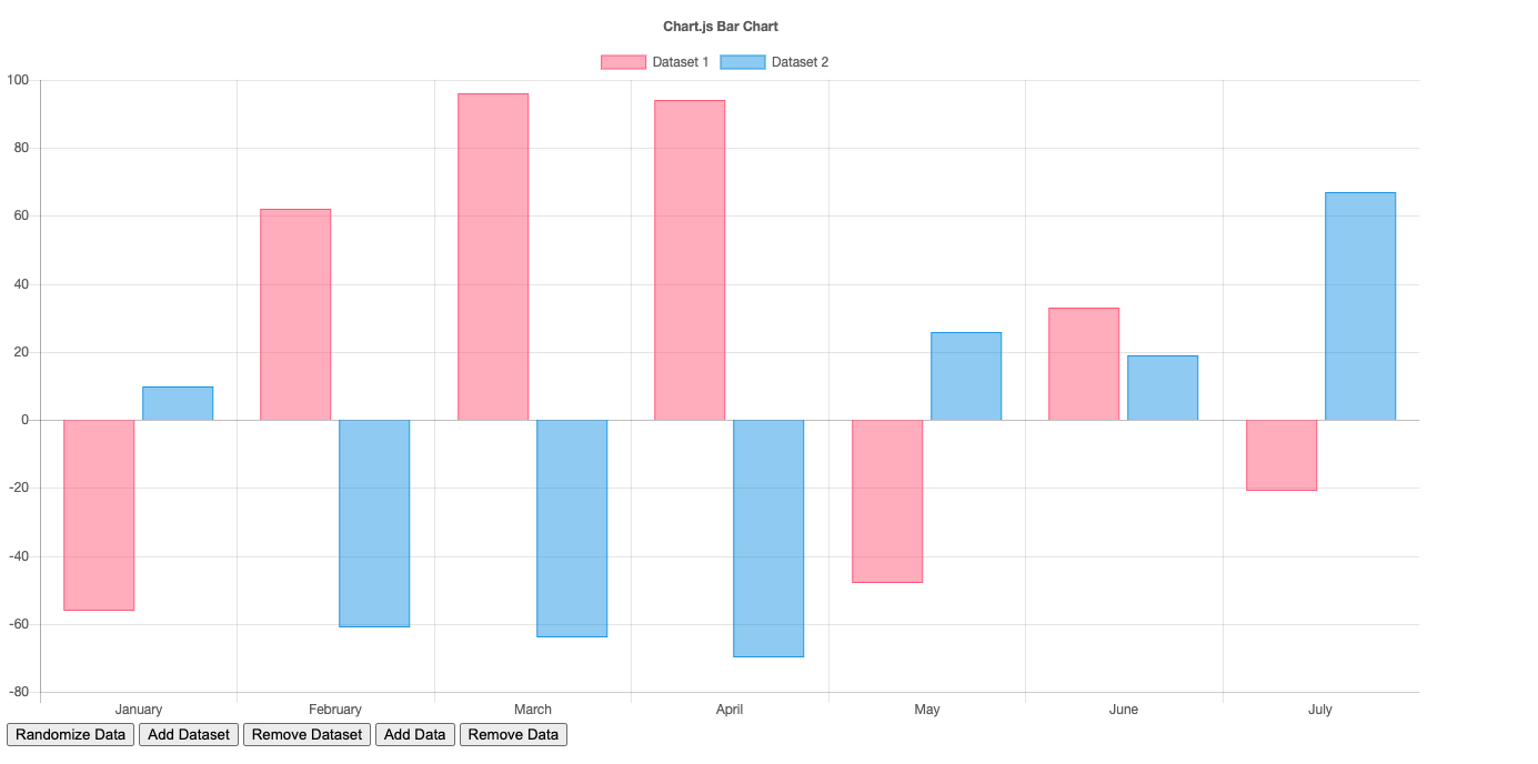
#1 Chart.Js - Javascript library

Chart.js is a JavaScript library designed to enable developers to create interactive and visually appealing charts and graphs on web pages. Using the HTML5 Canvas element for rendering, Chart.js makes it simple to integrate directly with web applications. Charts provided by this library include line charts, bar charts, radar charts, doughnut charts, and more. Using Chart.JS is simple. Just include the library in your HTML file, create a canvas element, and initialize the chart using JavaScript. Then, define the data and options for the chart within the initializations and let Chart.Js take care of the rendering.
Chart.js is designed for web developers looking for an easy and free way to create animated graphs on their website without having to use D3.js. It is particularly useful for developers who already have a solid understanding of HTML, CSS, and JavaScript. This library can also handle a range of data complexities, from simple data sets to more complex scenarios. Its design enables it to work well for visualizing both static and dynamic data, and it is versatile enough to accommodate a variety of data formats.
Chart.js is known for a number of features, including:
- Simplicity of Use
- Responsive Design (all charts are responsive by default)
- Interactive Features (right out of the box)
- Community Documentation (easy to find the resources you need)
#2 Redash - open source dataviz

Redash is another alternative to D3.js. Redash is an open-source project designed to support SQL-based data analysis. It’s built with the Python programming language. Its design was inspired by the number of times the data team had to generate new reports or help walk people through the complexities of generating their own queries. Redash makes it easier for those with a background in data to create new queries and visualize the data through shareable dashboards. It’s designed to be a versatile tool that will integrate with most databases. It is also open-source, being built on top of SQL and Metabase (open source visualizations library). This means that it can support a wide variety of databases and provides excellent web support.
Redash is intended to support self-service reporting. Its use cases range from data exploration and dashboarding to reporting and collaboration. It is used by organizations across a variety of industries. However, users will still need to have a technical understanding of SQL queries in order to get the most out of Redash. Also, when considering the level of data Redash can process, it will move pretty slowly when processing large amounts of data due to its design.
The top features of Redash include:
- Multi-Data Source Support
- Query-Based Editing
- Custom Dashboards
- User Collaboration Features

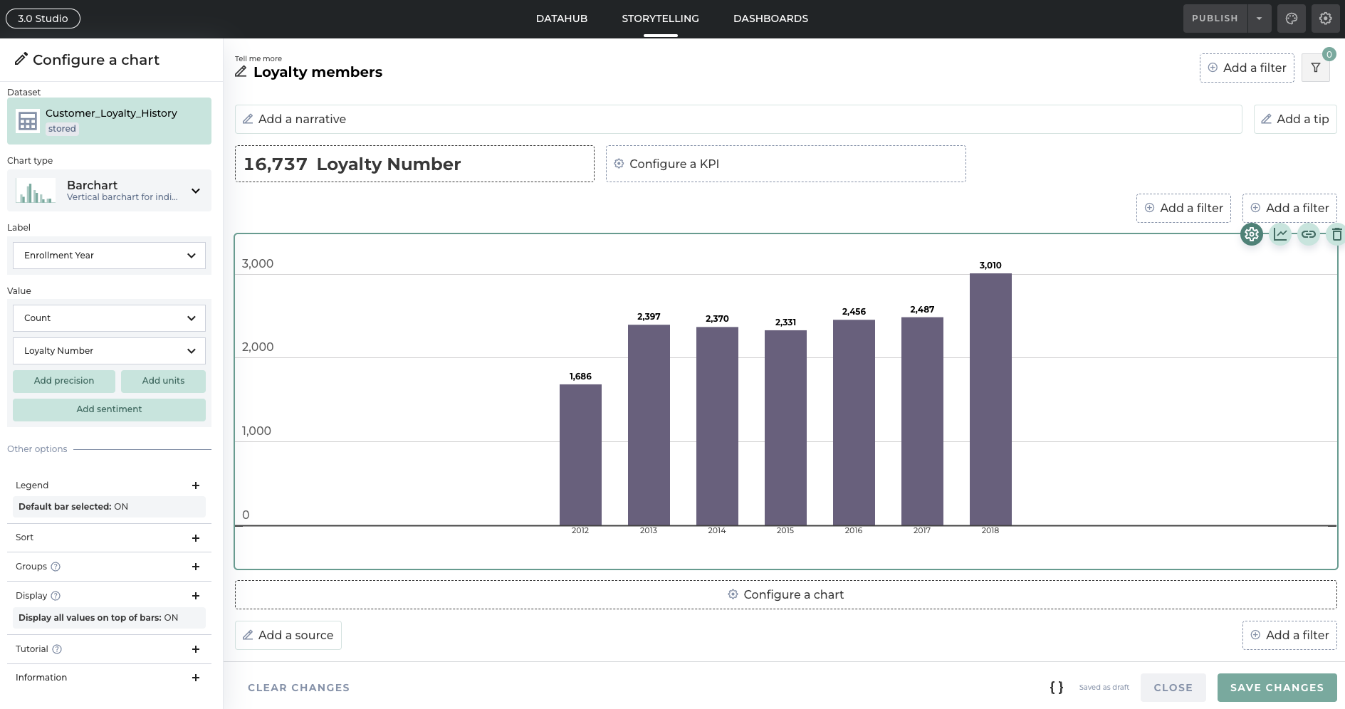
#3 Toucan - Customer-facing analytics

Toucan is a D3.js alternative that features a wide range of functionalities and is intentionally designed to be an easy-to-use, customer-facing analytics and data storytelling solution. Easily connected to any data source, Toucan also features a fully equipped dashboard building Studio that you can use to easily construct and deploy data visualizations in mere seconds. Powered by an award-winning Storytelling Framework, Toucan also features a “View As” option to enable you to prototype your data visualization as any user or role with the constraints and permissions assigned to them.
Toucan is also designed to support distribution and collaboration. All Toucan visualizations can be easily broadcast using web components or iFrames. Once your visualization is built, you can access it on any device with a browser. The ease of use that Toucan provides makes it well-suited for all kinds of users. Non-technical users who need to make data-driven decisions will find Toucan easy to use and deploy. On the other hand, experienced IT professionals and business analysts can use the power and speed of Toucan to provide much-needed reports in just a few hours instead of weeks.
We’re well-known for a number of features, including:
- Collaboration Features (annotate, share, live chat + Slack and Teams integrations)
- AnyConnect (connect to any data source, in the Cloud or on-prem, using hundreds of built-in connectors)
- YouPrep (no-code data transformation using the Visual Query Builder)
- Governance and Security (enterprise-grade security, powerful role permissions)
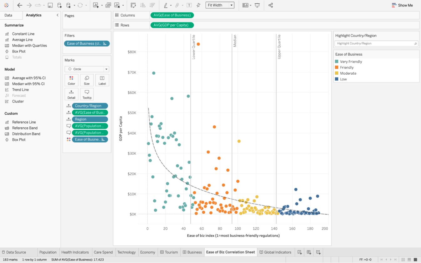
#4 Tableau - Business intelligence platform
Tableau is a powerful business intelligence and visualization tool that allows users to connect to, analyze, and visualize data. It works by connecting databases, spreadsheets, and cloud-based data warehouses together to provide users with a full, real-time picture of their organization. Users can import data or establish live connections to update data visualizations in real-time. One of the key features of Tableau is its intuitive drag-and-drop interface that allows users to create visualizations by dragging and dropping fields onto the canvas. Tableau automatically generates charts and graphs based on the selected data.
The target users of the Tableau platform include a wide range of categories, including business analysts, data scientists, executives, and IT professionals. Tableau can be used for quickly analyzing data without needing extensive skills, but it can also support advanced analytics and statistical capabilities.
Unlike Redash, Tableau is particularly suited for high-level data and Big Data analysis. Users can connect to large datasets, perform aggregations, and create sophisticated visualizations.
It’s known for a wide range of features including:
- Exploration
- Complexe visualization
- Scalability (designed to handle large and small-scale data sets)
- Data Connectivity (wide range of data connectors)
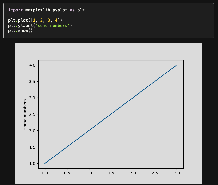
#5 Matplotlib - Python library
Matplotlib is a comprehensive 2D plotting library for Python. It’s designed to enable users to create static, animated, and interactive visualizations in Python scripts, applications, and notebooks. The first step in using Matplotlib is importing the library into your Python environment; you can then use its simple interface to create plots. Matplotlib provides a unique degree of customization and control over plotted charts and data visualizations by enabling users to plot their data manually using figures and axes.
The Matplotlib library is well suited for a number of different users, including data scientists, python developers, researchers, and students. It also features a simple-to-understand interface. Data scientists often use this library to create exploratory data visualizations and present their findings. Matplotlib is widely used in the Python development community for embedding plots into applications, scripts, and web applications. Matplotlib supports a wide range of data complexities, supporting both small and large data sets. Whether it’s simple ad hoc reporting or complex data science tasks, Matplotlib can be adapted to various data scenarios.
It is well known for a number of features, including:
- Flexibility and Customization (users are given granular control over the appearance of plots)
- Extensive Documentation
- Integration with Jupyter Notebooks (seamless integration with a popular interactive environment for data exploration)
- Rich Set of Plot Types (scatter plots, bar plots, histograms, 3D plots, and more)
The Bottom Line
In conclusion, creating data visualizations is a crucial part of conveying complex information simply and engagingly. While D3.js is a popular choice, it can be challenging for beginners due to its steep learning curve. Fortunately, there are several alternatives available, including Chart.js, Redash, and Tableau. However, for those looking for an easy-to-use solution that can create visually appealing and interactive data visualizations, Toucan emerges as one of the best alternatives to D3.js. Toucan’s pre-built visualizations, drag-and-drop functionality, and user-friendly interface make it easy for anyone to create amazing data visualizations.
.png?width=112&height=112&name=portrait_agathe_face%20(1).png)
