


12 Examples of Embedded Data Visualization
.jpg?width=88&height=88&name=PORTRAIT_Baptiste%20(1).jpg)
Baptiste Jourdan
Publié le 30.06.23
Mis à jour le 13.01.26
11 min
Embedded data visualization refers to the integration of interactive charts, graphs, maps, and other visual data representations directly within applications, websites, or business software. It allows organizations to present complex data in visually accessible formats that enhance understanding and drive informed decision-making without requiring users to switch to separate analytics tools or platforms.
Implementing embedded analytics is the easiest method of integrating analytics, since reports can be rendered with a simple copy-and-paste of the embed code. Embedded analytics can be found on public websites we interact with on a daily basis as a result of the ease with which reports can be embedded into a website, blog, or news article.
The use of embedded analytics on public websites has become more common as our data-driven culture continues to grow. Most likely, you have interacted with similar visualizations without realizing that they constitute basic embedded analytics.
These types of analytics implementation can benefit content creators who, in the past, may not have been considered data-savvy; they provide readers with a visual representation and interactive dashboards that their brains can more quickly analyze and interpret than text alone, improving user experience and enabling more informed decision making.
It is possible to integrate advanced embedded analytics into a third-party product or web portal. Most commonly, this is done by software-as-a-service (SaaS) companies with core applications that lack native reporting capabilities. By partnering with an analytics vendor who sells this software, a SaaS company can integrate the vendor's technology into their native SaaS product rather than develop their own analytics solution from scratch.
It is important to note that advanced embedded analytics implementations, from a technical perspective, require software engineering, but offer more robust functionality than basic implementations such as advanced filtering, row-level permissioning, near-real-time data calculation, and report scheduling. Here are come examples of embedded analytics you may have seen.
1. Onbrane
Onbrance produces innovative technology-based platforms for the debt market. They chose to partner with Toucan to bring customer-facing embedded analytics to Their website that could be used by everyone, improving their business intelligence capabilities.
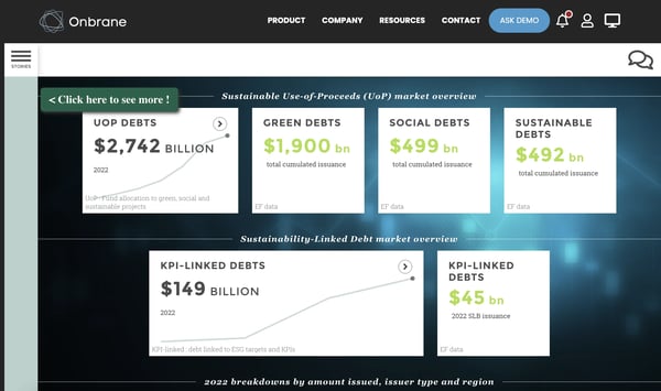
Onbrane’s users are able to have a comprehensive analytics dashboard rendered in real-time, highlighting important data that customers are able to leverage within their website, to easily obtain actionable insights.
The seamless integration between the two products allows users to access analytics without having to navigate between multiple systems or even know that the dashboard was created in Toucan’s entirely separate application. This fluid approach optimizes work processes while enriching the user interface with dynamic visualizations.
2. Politico
This article in Politico compares a series of maps of the United States, each showing the degree to which gun ownership varies by demographic using embedded data visualization. Whenever you hover over any state on a map, it shows you the percentage of voters who (don't) possess guns and who they voted for.
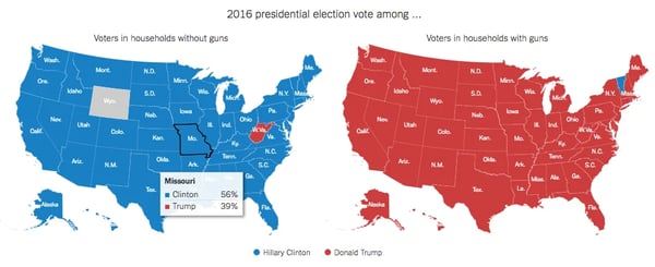
With this visualization, you can understand how gun owners are divided along party lines at-a-glance by comparing the classic colors associated with the Democratic and Republican parties. The pop-out information you get when you hover your mouse is also great, since it adds a dynamic element to the map that otherwise would have been displayed as a series of 50-item graphs.
From a technical perspective, this visualization represents the culmination of an integration process where big data is transformed into immediate visual insights. The underlying cloud architecture allows Politico to update these visualizations with new electoral or demographic data without disrupting the user experience. This flexibility resembles that of modern multi-tenant applications, where different data sources can be combined into a unified presentation.
For readers, the advantage is clear: instead of analyzing tables or raw statistics, they can intuitively explore correlations between gun ownership and electoral behavior.
3. Zilliow
Zillow, an online real-estate company, displays a market value line graph for each house listing using embedded data visualization.
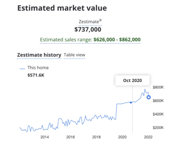
When the user navigates across the years listed on the x-axis, the displayed home value updates. With this embedded graph, users can immediately see how a home's value has changed over time, and interact with it.
By integrating data elements into their platform, Zillow offers potential buyers a sophisticated property evaluation tool without the complexity of a traditional data warehouse. This approach transforms real estate search into a data-driven experience where each user benefits from a personalized visualization of a property's valuation history. This functionality represents just a fraction of the potential of modern analytics platforms, which offer a wide range of capabilities from artificial intelligence to machine learning for transforming raw data into actionable visual displays.
4. Manhattan Marathon
In embedded data visualizations, the reader is often given a sense of how the data compares to what they know. Comparing a human figure to a bear displays the bear's size more effectively (for example, a human figure standing next to a bear).
This interactive is an excellent example of how data can be made accessible. When you enter an address, the tool will display a visual representation of a race and how quickly the participants ran it. In this way, the average Joe can gain a better understanding of how amazing these athletes are. For example, they might examine the marathon:
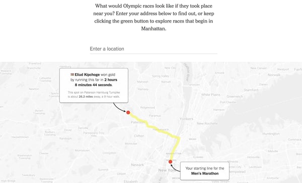
Then consider how long it would take them to walk, run, ride or drive even a portion of that distance and you will realize how the runners are. The cruising speed for these athletes - and that is not even halfway through the race - should be no surprise to anyone who has ever walked or jogged from Midtown to the Bronx.
It is the goal of a good data visualization to enable people to connect with statistics, and this feature accomplishes this effectively by providing a familiar framework for understanding statistics.
5. Disappearing shorelines
This interactive embedded data visualization illustrates how parts of cities may disappear from water without engineered protection. By moving the slider, different percentages of land in major US cities would be covered by water as sea levels rise. By increasing the tide, you will be able to see what landmarks and areas will be submerged as the tide rises. Readers can easily flip back and forth between different maps by overlaying them on top of each other.
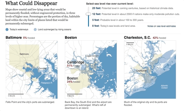
The interactive slider represents a key feature of modern embedded analytics platforms, giving users control over how they view and analyze critical information. By embedding this element within environmental planning applications, organizations gain a powerful tool for visualizing the potential impact of climate change on urban infrastructure.
6. Uber drivers and wait times
In this interactive embedded data visualization, you can see how the number of drivers idling nearby is having an effect on the wait times for passengers on a city street. There is an option for viewers to choose from 50-250 drivers nearby in order to see how the number of idling drivers and wait times change as time passes.
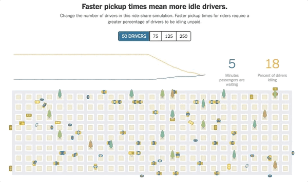
The interactive graphic does a really good job of giving an overview of how many cars have to be present for the wait time to be low, and what this means in practice. The above argument provides a much stronger support for the thesis than just saying you need 125 cars idling for an eight-minute wait time. This interactive data visualization is a great way to convey a message and make an impact.
7. Game of Thrones opinions
As illustrated in this NYT article, Good, Evil, Ugly, Beautiful: Help Us Make a "Game of Thrones" Chart, data can be a fun way for readers to interact. As part of the NYT's contest, readers are asked to plot characters on an axis from beautiful to ugly, evil to good. You will then be able to see the aggregated data gathered from all readers. (Alternatively, you may skip straight to the aggregate without plotting anything.)
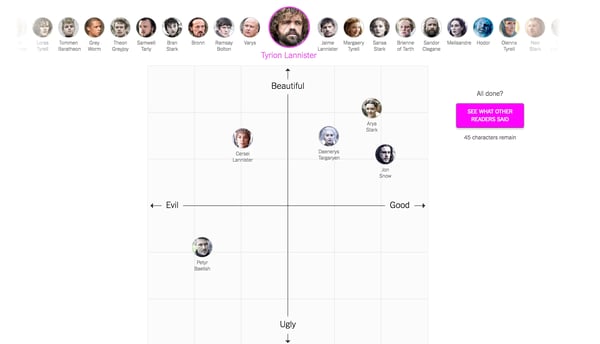
This article is engaging because of its reliance on reader sentiment, which has been captured in an interactive embedded data visualization. Moreover, it provides a heat map showing the average distribution of characters, which illustrates that some characters have a much larger consensus than others, while some are deemed more beautiful than others.
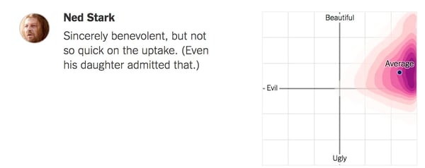
A highly engaging interactive embedded data visualization can be created by testing readers' intuition and then revealing what more data reveals about the question you pose. You can drive deeper consideration of your content by asking readers to categorize their own thoughts before revealing your data.
8. Renting vs buying a house
By now, it should be obvious that interactive embedded data visualizations are more enjoyable to work with. Despite the fact that mortgages aren't everyone's idea of a leisure activity, the interactive slider on these graphs can make planning your financial future more enjoyable.
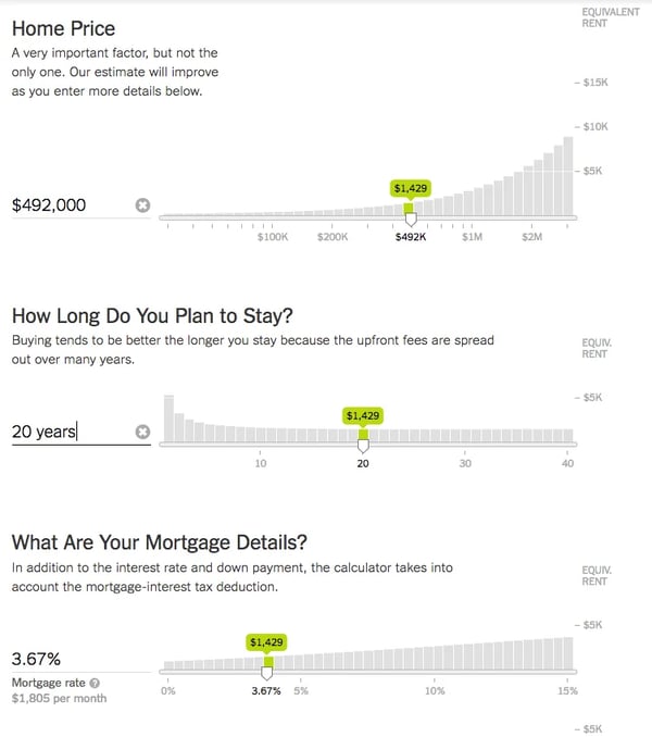
This is a great example of how adding interactive embedded charts can spice up otherwise straightforward information. A reason why it works so well here is that people are interested in playing with the term and rates, and creating a live representation of their thoughts is a great example of how it helps people decide whether to rent or buy. When developers integrate these interactive data elements directly into housing applications, they create powerful decision-making tools that give users control over their data analysis experience.
9. N.F.L. playoff simulator
Sports simulators and prediction tools use the most amount of embedded data visualizations to convey information effectively to fans. The N.F.L playoff simulator calculates 174 duodecillion ways that each team could end its season.
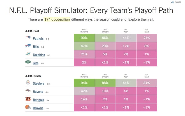
Upon clicking on a percentage, you will be taken to a second page of interactive graphics that allow you to explore all the different ways your team could reach - or win - the playoffs.
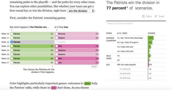
Thanks to our modern digital capabilities, probability and decision trees are once again brought together. Interactive features like this are something only possible today, and boy are they fun. The combination of this chart with a more traditional chart is designed to bring things back down to earth and provide readers with an understanding of which scenarios are likely to favor their team.
10. Rio Olympics
The Rio Olympics visualization stands as a masterclass in data storytelling through embedded analytics solutions. This dynamic bubble chart elegantly displays all Olympic medals won since 1896, transforming what could be a mundane statistical list into an engaging data exploration experience. With a single glance, users gain immediate insights into medal distribution patterns that would take minutes to process in traditional formats.
What makes this embedded data visualization tool truly powerful is its intuitive geographical layout. Rather than forcing users to mentally connect countries with their medal counts, the pseudo-map creates immediate visual relationships between physical locations and performance metrics. This spatial arrangement reveals compelling patterns – the concentration of medals in North America and Western Europe contrasted with fewer achievements across Central America and Pacific island nations – all without requiring users to navigate through complex data sources.
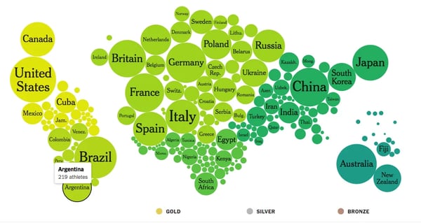
The interactive elements transform passive viewing into active analysis. When users hover over each circle, the visualization responds with precisely the information they need – total medal counts alongside the breakdown of gold, silver, and bronze achievements. This layered approach to data processing keeps the interface clean while providing depth on demand, a key feature of well-designed embedded reporting tools.
Color also plays a critical role in this visualization's effectiveness. The bold, distinctive palette does more than simply make the display visually appealing – it creates a visual taxonomy that helps users mentally organize information by geographical region.
What sets this Olympics visualization apart is how it balances immediate accessibility with rich data integration. Whether embedded within a sports analytics platform or used as a standalone educational tool, it demonstrates how thoughtfully designed data visualization tools can transform complex datasets into experiences that inform, engage, and illuminate patterns that might otherwise remain hidden in the numbers.
11. School district comparison
Another excellent example of context and how interaction can enhance a reader's understanding is the map showing how school districts compare. This embedded data visualization plots how far ahead of their grade level students' test is in comparison to their parents’ socioeconomic status. Although this is a telling picture on its own, it becomes even more compelling as you scroll over the graph.
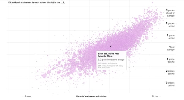
If you hover your mouse over a dot on the graph, you will see which school district it represents, how much above average the students test, the median family income, and the breakdown of ethnicity by percentage.
By including this interactive feature, this chart is able to resist the tendency to be reductive. As one scrolls over the peaks and troughs of the graph, it is evident that poorer students of color tend to make up the majority of the schools with the lowest performance, whereas richer white students tend to make up the majority of the schools with the highest performance. It is not surprising to anyone who is aware of the widening wealth gap between white and black citizens of the United States since the 1980s. The inclusion of this demographic breakdown in this chart enables this data to tell a more complete story as a result of interactions.
12. Historic trends in the Arctic’s sea ice
The environmental warriors aren't kidding when they say you'll see a trend. Charts in the article illustrate how the area of arctic sea ice has changed from 1979 to 2017, and just glancing at the chart alone is sufficient to demonstrate that the amount of ice is diminishing each year. The graph displays specific statistics for each year when you move your cursor over it.
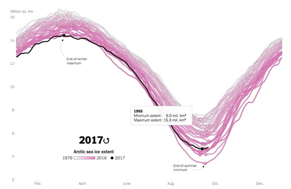
With the increasingly hot pink hue backing up the trend of more and more ice melting, they are using an intuitive color scheme. Additionally, we like the fact that it shows the variation in ice coverage without simply stating that the difference is in millions of square kilometers - since that is not an easily visual metric.
Frequently asked questions about embedded data visualization
What are the three common types of data visualization?
When it comes to making sense of complex data, not all visualizations are created equal. Let's explore three fundamental types that you'll encounter in the world of embedded analytics:
- Charts and graphs form the backbone of data visualization. From simple bar charts that compare values across categories to line graphs that reveal trends over time, these classics remain popular for good reason. They're intuitive enough for most users to grasp immediately, yet flexible enough to present complex relationships when needed.
- Geospatial visualizations unlock the power of location-based insights. Maps with data overlays help users spot geographic patterns that might remain hidden in traditional charts. Whether you're plotting customer concentrations, comparing regional performance metrics, or tracking resource distribution, these visualizations create immediate visual connections between data and physical spaces.
- Interactive dashboards represent the evolution of static reporting into dynamic exploration tools. By combining multiple visualization types with filtering capabilities, these interfaces allow users to navigate complex datasets without feeling overwhelmed. The best dashboards seamlessly integrate into existing workflows, letting business users analyze data without switching between applications.
How to create a data visualization that is memorable?
Creating visualizations that stick in your users' minds isn't just about aesthetics – it's about crafting experiences that change how people understand information. Here's how to make your data visualizations truly memorable:
- Tell a compelling story with your data. The most powerful visualizations guide users through a narrative, revealing insights that build upon each other. Don't just present numbers; show the human implications behind them. Like the Uber wait time example we discussed earlier, let users discover the "why" behind the data through their own exploration.
- Design for intuitive understanding. A memorable visualization doesn't require extensive training to comprehend. Use visual cues that align with how humans naturally process information – larger elements for greater values, color intensity for importance, and placement that follows a logical reading pattern. Remember that your visualization might need to communicate effectively to both experts and newcomers.
- Add meaningful interactivity. When users can manipulate and explore data themselves, they form stronger mental connections with the information. But be purposeful – each interactive element should reveal something valuable, not just exist for novelty. The best interactive features help users test their assumptions or see how different variables influence outcomes.
The most memorable visualizations don't just display data – they transform how users think about the underlying subject. Whether embedded in business applications or standalone dashboards, these thoughtfully designed tools become extensions of users' analytical thinking, not mere illustrations of numbers!
Big takeaways
There are so many ways you can represent data in an interesting and interactive way. Let’s go over some common themes we saw in this article:
- Add value through interaction. There was more to the embedded data visualizations than just being fun. Interactivity allowed them to create charts that were otherwise difficult (or impossible) to plot and interpret. Others helped the user reflect critically on their own choices and perceptions. It is a waste of time to create a chart or graphic just for the sake of throwing it out there. Your visualizations should help users better understand your subject and discussion, providing actionable insights for business intelligence.
- They don’t have to be complex to be good. Your readers can gain insight from something as simple as a pop-up with more information. Take the school district comparison, for example. If you can’t build a full interactive model of the entire dataset, don’t let that hold you back from creating something interactive. You can be smart about any data you’re trying to present — if you’re dealing with geographic data, for example, pull out a map and ask yourself how you can use it to illustrate your point. If you’re doing political visualizations, let that pick your color scheme. Even simple bar charts can provide powerful data analysis when designed thoughtfully.
- They build an intuitive understanding. A good embedded data visualization should assist people in understanding and engaging with complex data more effectively. Whenever you are creating a visualization, keep your average user in mind. Maybe you are catering to experts in your field who do not require exhaustive descriptions of your data. As we saw in renting vs buying a house, if you are creating for a more general audience your users may need an additional key to help them understand the chart.
- Embrace the concept of data storytelling. Through storytelling, humans are able to learn and remember information. When adding an interactive visual, you have the opportunity to create a narrative based on the data. This is called data storytelling. Take Uber drives and wait times — instead of just listing the wait times, the reader builds the narrative of how and why the changes happen through the embedded data visualization.
The data represented here ranged from demographics to sports statistics to global economic systems. Using interactive embedded data visuals, any type of data can be explored, and you may have more data that can be visualized than you think - it does not have to be two coordinating points on two axes. The more creative and interesting ways you can present your data, the better.
.jpg?width=112&height=112&name=PORTRAIT_Baptiste%20(1).jpg)
