Back


Interactive visualization- What is it ?
Interactive visualization is the use of data analysis software to manipulate and explore graphical representations of data. It is an evolution of the concept of "dataviz" (data visualization) based on the incorporation of interaction tools.
These tools make it easier to change the parameters of data visualization to:
- See more detail
- Extract information
- Generate relevant questions
- Make full use of the data
Interactive data visualization brings many benefits compared to "static" visualizations. It is particularly suitable for large, complex data sets, as it allows information to be identified and isolated.
This method makes it possible to identify trends more quickly. One of the reasons for this is that the human brain processes visual representations quicker. Thus, data presented visually are psychologically easier to understand.
Similarly, interactive visualizations allow for more effective identification of cause and effect relationships between data by focusing on specific metrics.
 They also allow a better data narrative by presenting a story where it is possible to highlight or filter relevant information. Similarly, interactive visualization helps to simplify complex data with the ability to filter information or zoom in on a particular point.
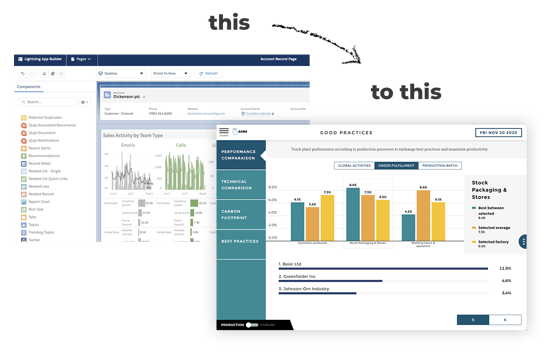
In comparison, a static visualization does not offer interaction tools or changes over time. It allows data to be viewed from only one point of view. This approach, therefore, is better suited to less complex data sets, and communicating a predetermined view.
Interactive visualizations encourage more exploration and user autonomy but are also more expensive to implement. When choosing between static or interactive visualization, consider ROI, data complexity, and audience preferences.
An interactive data visualization should:
- Have a sufficient amount of data to implement it
- Be presented in an intuitive and understandable way
- Allow relevant and exploitable insights to be identified
Start by first identifying your objectives, identifying constraints, and designing a model, user interface and technology using the various interactive visualization tools at your disposal.
Feel free to test your interactive visualization to ensure its functionality, security, and performance. To be able to update the visualization with new data, consider implementing rapid update methods.
There are many popular libraries to create your own interactive data visualizations. Some of the most popular include
- Altair
- Bokeh
- Celluloid
- Matplotlib
- nbinteract
- Plotly
- Pygal
- Seaborn