


Top 10 Data Visualization Tools to Consider
.png?width=88&height=88&name=portrait_agathe_face%20(1).png)
Agathe Huez
Publié le 14.09.21
Mis à jour le 13.01.26
5 min
Data visualization tools are part of an industry worth over $8 billion and it is growing.
These are tools that allow you to represent data in a visual format, so that information can be more easily communicated. Our modern world relies on data visualization. However, knowing which tools are the best for you can require a bit of research and comparison.
While the market is full of different tools and types with different costs and quality, this is a list of our top 10. Whether you are a seasoned professional or someone just getting into data visualization, these tools can help you.
Before this reading, be sure to understand what data visualization is.
1. Toucan Toco
Connect people with data - no Ph.D. required. If you need data storytelling or apps built for businesses, Toucan Toco is a great solution.
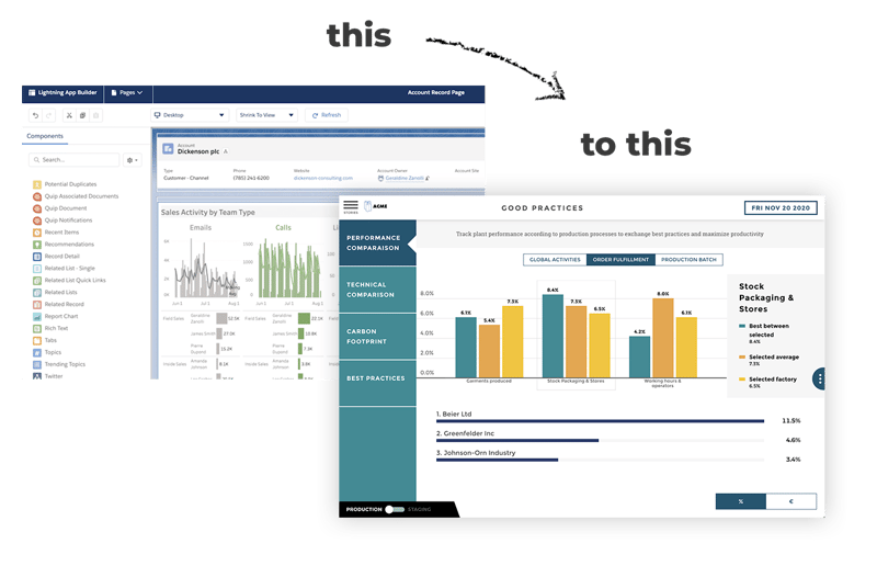
What is Toucan Toco?
Toucan Toco is a fully cloud-based, end-to-end analytics platform built with one goal in mind: destroy the friction that exists between people and data. Users can connect to any data, cloud-based or other, streaming or stored, using Toucan’s AnyConnect™ — a suite of hundreds of included connectors.
Main features
- Data Transformation
- Data Modeling
- WYSIWYG Report Design
- Integration APIs
- Connectors
- Data Governance
- Perfect for small businesses
Pricing
The price is based on the complexity and duration of each job, so you won’t be paying an arm and a leg for a service you’re not using. You can use our ROI Calculator to determine if Toucan is a great fit for you.
2. Visme
Visme is a tool offering the ability to create presentations, infographics, and other visual content. This tool is intended for small or independent operations that want an easy-to-use data visualization tool.
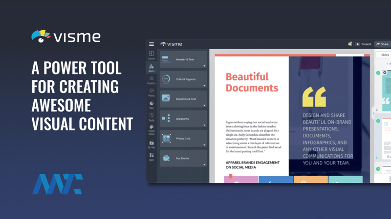
What is Visme?
Based in Maryland, Visme is great for those who want beautiful infographics, reports, or social media images. It is possible to use completely free, but you should be aware that only 80% of its features are available without paying for a premium account. To unlock all services, it will cost you $25 a month.
Main features
- A great choice for small or independent operations that want an easy-to-use data visualization tool.
- G2 Leader in both small and mid-market visualization tools
- High customer satisfaction
- Offers similar services to Infogram at a lower cost
Potential Drawbacks
- May frustrate professionals
- Lack of technical features
Pricing
Starts at $0 up to $39.
3. Canva
Canva is a free graphic design platform that allows you to edit photos without extensive photo editing knowledge or experience. It's a web application that has made the design easier for everyone, even the non-designers.

What is Canva?
Canva is great for students or others who are just wanting to make a nice-looking background or infographic using stock images. It is easy to use, however, nothing you make using their stock templates can be copyrighted. This limits it for professional use considerably.
Main features
- Canva Pro, Canva Enterprise, Canva for Education, and Canva for Not-For-Profit users also get access to an additional set of features to simplify creation.
- Background remover, magic resizes to instantly change your designs to fit where you're planning to publish, and additional premium images, videos, animations, music, and fonts.
Potential Drawbacks
- Lack of copyright makes this a frustrating option for professionals
Pricing
Starts at $0 up to $129 for professional use.
4. Sisense
Sisense is a business intelligence solution. They provide advanced tools to support businesses with complete data analytics features and reporting. Need for business intelligence skills to unlock the potential.
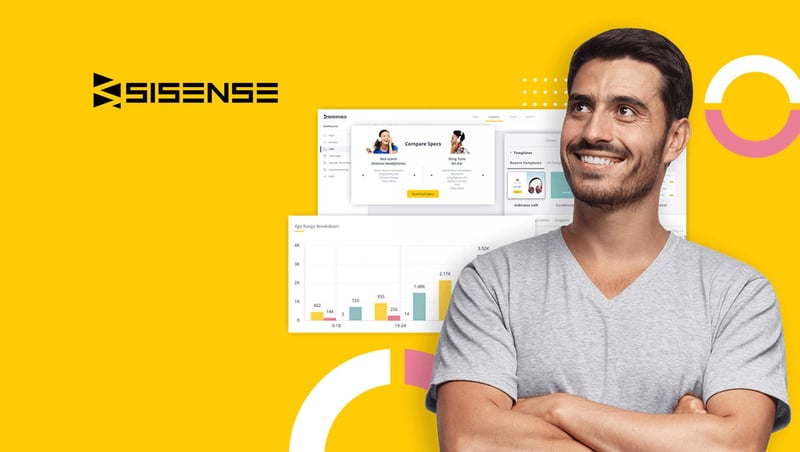
What is Sisense?
Sisense is a professional tool that is often regarded as one of the top data visualization tools based in New York. You can build great dashboards and other infographics using Sisense. While this is a professional tool, the high cost of use means that not everyone will see as much value in using it.
Main features
- Ad-hoc analysis of high-volume data
- Centralized data hub
- Handles data at scale on a single commodity server
- Interactive browser-based dashboards
- Integrates with web portals
- Exports data to CSV, PDF, Excel, Images and other formats
Potential Drawbacks
- Casual or novice users may not grasp technical aspects
Pricing
It is one of the most expensive tools, costing $83 dollars per person. More premium packages are available at a higher cost
5. Infogram
Infogram is a tool allowing users to create visually stunning reports and graphics without technical experience. This tool is intended for individuals or collectives looking to beat out competition through visuals.
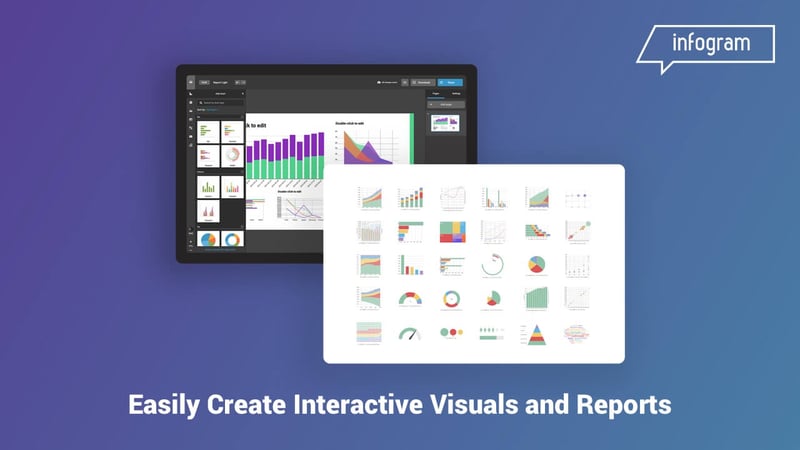
What is Infogram?
Infogram is based in Latvia. It allows you to make charts and graphs and share them with others. It works well for those who are looking for a slick final product without having to devote the time to learning excel or other programs.
Main features
- Access to stunning animations
- Optimizes for numerous media formats (Slides, Social Media, Maps, Infographics).
- Optimized for mobile users
- Offers in-depth analytics and metrics (interactivity)
- Offers free plan
Potential Drawbacks
- Complicated interface and difficulty for Google to read the text presented
- Extra charge for the sizing and scaling of text
- Pricier than the competition
Pricing
Starts at $25 up to $149 a month.
6. Google Data Studio
Google Data Studio is a great, free data visualization tool that lets you build interactive dashboards, and customized, beautiful reporting.
What is Google Data Studio?
One of the only truly free data visualization tools on the market, Google Data Studio is great for translating raw data into reports and dashboards. While it lacks the templates and organization of some of the other tools, it does remain completely free with all of its services intact.
Google Data Studio is tied into the Google Analytics suite of offerings. This makes it easy to use if you’re depending on that structure, but less advantageous if you’re using your own systems or data input.
Main features
- Seamless data and chart entry
- UX is pleasant and easy to use
- Offers data blending
Potential Drawbacks
- Lacks the templates and more complex features of the other premium offerings
Pricing
Starts at $0 up to $29- 299$ for paid connectors
7. Tableau
Tableau is a powerful and fast-growing data visualization tool used in the Business Intelligence Industry. It helps in simplifying raw data in a very easily understandable format.
What is Tableau?
Tableau is a great and complete toolbox to get insights from your business data. On the other hand, you can't build your dashboard without dedicating a significant amount of time and with business intelligence skills.
Main features
- A detailed, multipurpose dashboard
- One of the best at data extraction and blending
- Predictive analysis and forecast
Potential Drawbacks
- High price
- Lacking support after purchase
Pricing
For a single user, the price is $70 per month with no enterprise option.
8. Whatagraph
Whatagraph is a cross-channel reporting tool that helps businesses to track, measure, and analyze marketing performance with clients and teams.
What is Whatagraph?
Whatagraph is a great solution for those who are building reports for clients. It has an easy-to-use and easy-to-understand format. It helps bring together data and automatically makes graphs and charts for your use.
Main features
- Data Visualization
- Data Automation
- Custom Data Reporting
- Data Source Centralization
- Integration
Potential Drawbacks
- High price for base plan, almost double of what competitors charge
Pricing
With professional packages costing $119 a month and premium packages over $200. There are even packages that will cost you $699 a month if you want to unlock all services.
9. DataWrapper
Useful for anyone who wants to build tables and maps, Datawrapper is a versatile tool that can help anyone from a journalist to a student. A lot, but not all, the Datawrapper services are free.
What is Datawrapper?
Datawrapper is an innovative data visualization software developed by Datawrapper GmbH for journalists, developers, and designers working in fast-paced newsrooms. It’s an open-source solution that enables users to create and visualize charts and maps that are responsive, interactive, and embeddable in the organization’s website.
Main features
- Maps
- Export as PNG, PDF
- Full chart styling customizations
- Own custom layout
- Discrete colors
- Live chart updates
Potential Drawbacks
- Limited professional packages
Pricing
Datawrapper does suffer from inflexible costs with a lot of free services but there are also professional packages costing around $600 a month. If you need more, you have to contact them and expect to pay even more.
10. ChartBlocks
ChartBlocks is great for making presentations and is good for those who don’t want a steep learning curve.
![]()
What is Chartblocks?
Chartblocks is a cloud-based data visualization tool for SMB to large companies. The platform offers different chart types for your data and contains pre-made templates with editable sizes, colors, fonts, grids, and legends.
Main features
- Analytics
- Templates
- Data Import
- Social Media Integrations
- Chart Building Wizard
- Multiple File Support
Pricing
The professional package costs $20 dollars a month while the elite package is $65 dollars a month.
The Best Data Visualization Tools for You
What data visualization tools you go with will depend on what you need. Pricing, ease of use, and who they are designed for are all important factors. Make sure you choose a data visualization tool that works for your business.
If you want a tailored experience that is agile and appropriate for any business, Toucan Toco is ready to help. If you have any questions about what we can do, or what we offer, please don’t hesitate to request a free trial.
.png?width=112&height=112&name=portrait_agathe_face%20(1).png)
