


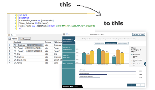
The 6 Most Widely used SQL Data Visualization Tools
.png?width=88&height=88&name=portrait_agathe_face%20(1).png)
Agathe Huez
Publié le 27.12.22
Mis à jour le 02.06.26
4 min
Structured Query Language (SQL) is a popular programming language used to interact with relational data in domains such as business analytics. SQL is widely used by professionals for tasks such as data manipulation, data analysis, and data visualization.
Being able to interact with data is one thing, but translating that data into meaningful information is another. This article will explore the best tools for SQL data visualization in 2024, helping you transform your raw data into actionable business insights.
The Importance of SQL Data Visualization
Visualizing SQL data is crucial for making sense of large datasets and deriving actionable insights. SQL allows you to ask questions and receive answers about your data, and each business intelligence (BI) tool offers a different approach to doing so. By leveraging SQL data visualization tools, you can make data-driven decisions that provide a significant competitive advantage for your business.
We have compared various business intelligence tools, but it's crucial to understand how each one interacts with SQL to create data visualizations. All these tools provide the basic features needed for data visualization, but choosing the right tool depends on the specific challenges your organization faces.
Top 6 SQL Data Visualization Tools
1. Toucan

Overview:
Toucan is a no-code embedded analytics and business intelligence tool that can integrate into any database with just one click. It offers an easy-to-use interface designed for non-technical users, making it an excellent choice for end-user analytics.
Features:
- No-code embedded analytics and business intelligence tool
- Integrates with any database in one click
- Easy-to-use interface designed for non-technical users
- Focus on end-user analytics
- Highest-rated business intelligence solution according to G2
- Customization and white labeling for visualizations and dashboards
- Comments feature for team collaboration
- Annotate and share features for exporting visualizations as PDFs or Slack messages
Challenges:
- Extensive customizations require a Toucan expert
- Specialty databases need a data expert for integration
- Cannot export visualizations as PowerPoint presentations

2. Microsoft Power BI
Overview:
Microsoft Power BI is a powerful business intelligence tool that integrates seamlessly with the Microsoft ecosystem, including Excel, Access, SQL Server.
Features:
- Integrated with the Microsoft ecosystem
- Power Query Editor for building queries using menus and options
- Advanced settings for direct SQL use
- Requires minimal coding but some technical knowledge is needed
Challenges:
- Best performance is within the Microsoft ecosystem.
- Issues may arise if the technology stack is not Microsoft-based.
- Not well-suited for handling relational databases. James Anderson’s TrustRadius review said: “The relational database only allows one true join so you have to get creative.”
- Uses a proprietary XML language for modeling and visualization, limiting access for non-technical users.
- Reliance on data analysts for creating visualizations can slow down workflows and decision-making.
3. Looker

Overview:
Looker Studio, now part of Google Cloud, uses a proprietary language called LookML to create SQL queries and model data, offering powerful visualization capabilities.
Features:
- LookML for SQL query creation
- Pre-built Looker Blocks for quick visualizations
- Integration with Google Cloud services
Challenges:
- New language to learn alongside a decent knowledge of SQL
- LookML is designed for data analysts, not end business users, leading to low adoption among non-technical users.
- Non-technical users face delays in obtaining actionable insights, affecting company growth
- Looker Blocks are static and lack sufficient customization, increasing reliance on data analysts
- Unique and unintuitive terminology for data visualization processes can be confusing for new users. Bill Ulammandakh on Quora said: “Expect to be confused and learn a lot of weird and arbitrary terminology when ramping up with Looker.”
4. Sisense

Overview:
Sisense is an enterprise-level BI tool designed for efficient data analysis, featuring elasticubes, a columnar database technology ideal for large datasets.
Features:
- Enterprise-level business intelligence tool
- Standard SQL editor with shortcuts and saved snippets
- Uses elasticubes, a columnar database for handling terabytes of data
Challenges:
- Cannot manipulate data on the go, the entire cube needs restructuring to add a column
- Only admins can restructure cubes, limiting access for end users
- Basic dashboards and visualizations require R or Python knowledge for customization. An IT administrator on G2 said: “The actual … dashboards are relatively basic.” Another G2 reviewer echoed this by saying, “Formatting controls are very limited.”
- Customizations increase dev team workload and may still fall short compared to other solutions
- Positioned for large enterprises, making it costly for small to medium-sized businesses
5. Tableau
Overview:
Tableau is a well-established BI tool known for its robust visualization capabilities and integration with SQL databases.
Features:
- Renowned business intelligence tool with legacy SQL visualization features
- Acquired by Salesforce, maintaining a strong market presence
- Offers selections and filters for querying data
- Custom SQL option for coding queries
- Designed primarily for data experts
Challenges:
- Complex tool with features designed for data experts, limiting usability for non-technical users
- Steep learning curve requires significant time to master. Even a Tableau fan said that you are “require[d] to invest 2-4 weeks, and you will gain 80% of the good parts of Tableau.”
- High cost with important features locked behind a paywall
- Focuses on larger enterprises, making it expensive for smaller businesses
- User feedback indicates licensing is considered overly expensive. One user on Reddit summed it up best: “Is it just me or is licensing crazy expensive?”
6. Domo

Overview:
Domo is a business intelligence tool with a mobile-first approach, offering SQL data visualization through its DataFlow function.
Features:
- Business intelligence tool with a mobile-first philosophy
- Standard feature in most analytics solutions
- DataFlow function for running queries across multiple databases
- Allows direct data transformation with SQL
Challenges:
- Customer support is often inadequate. One Capterra reviewer said: “The support case has been open for nearly a month and has just been escalated to someone that appears to know how to read the code I have been sending them to troubleshoot THEIR integration.”
- Integration process is cumbersome and requires help from Domo experts
- Dependency on connecting to multiple databases can halt projects
- Limited customization options for visualizations
- Lack of flexibility can lead to insufficient actionable insights for teams
Choosing the Best SQL Data Visualization Tool
Choosing the right SQL data visualization tool depends on your specific needs and the challenges your organization faces.
For non-technical users seeking ease of use, Toucan stands out as the best overall tool. Power BI and Tableau are excellent for those already embedded in the Microsoft ecosystem or looking for extensive customization options. Looker and Sisense offer robust solutions for data experts and enterprise-level needs, while Domo provides a mobile-first approach with real-time data integration.
By considering the features, challenges, and cost of each tool, you can select the SQL data visualization tool that best fits your organization's requirements, helping you turn raw data into actionable business insights.
.png?width=112&height=112&name=portrait_agathe_face%20(1).png)
