


Death by powerpoint : reporting automation to the rescue
.png?width=88&height=88&name=portrait_agathe_face%20(1).png)
Agathe Huez
Publié le 10.11.17
Mis à jour le 13.01.26
5 min
To challenge my passion for user friendly and well-designed tools, I came up with a great idea: submitting myself through 5 days of “fun” with PowerPoint. In the end automated reporting wins every time.

Day 1: Data Collection & Reporting
Or better said, trouble in the making. At this stage in my adventure, I had to use Excel, which is tremendously easy compared to PowerPoint.
When you know how to use it properly, Excel is a very powerful tool. Keyword here being properly. Although demanding as far as mastering all its capabilities, it remains satisfactory enough for any experienced user.
It offers an organized system to collect data, with specific filters that will allow you to easily find X data and Y factor you need to prepare your reporting.
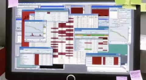
But Excel is not, and never will be a presentation tool. To all of you presenting results to your teams with horrendous tables nobody can read – nor understand for that matter, please stop.
When you use Excel for reporting or presenting, it’s just like using your tablet to take photos. It’s ridiculous, impractical and you know there are far better options. Just don’t.
Day 2: Analytics be free!
My tumultuous journey doesn’t start just yet. Analytics remains relevant on Excel and we actually use them in our Marketing ceremonies. Specifically to filter data retrieved from Google Analytics.
Tab segmentation on the Microsoft tool enables to easily draw up targets: site visits, number of demos requested, blog shares, etc. All these allow date-based performance tracking.
I must admit to a slight satisfaction when it comes to juggling with figures and observing a positive trend of my results over time.
Everything comes to an end however and now starts the real battle.
Day 3: Formatting the data (or trying to, rather)
Diversity in graphs is OK for average users but appears limited to those wanting to emphasize particular ideas in their reporting.
Graphs are unique and you can’t go much further to extract subcategories, just like in the one below:
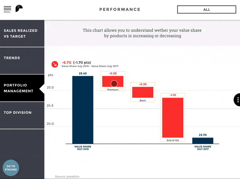
What about PowerPoint, you ask? What if I want to get to the bottom of an aggregated vision? Well, you’d have to create a second appendix, which loses any dynamism or pedagogy provided by the above graph.
Not lacking in courage, I create a second graph to express my vision in more details until… An untimely thought: what if I want to go back to a general view to rapidly synthesize the impact generated by products A, B, C and D on the entire range? Well, either I come back to the previous slide or I copy-paste the overview graph onto the next slide.
Thanks, but no thanks.
Horrors of horrors, I just spent an entire day giving my soul away to Pie Charts. Time to save my presentation and go curl up in bed. At least tomorrow will be brighter. Or will it really?
Day 4: Out of the frying pan and into the fire
Day 3 basically revolved around the absence of visual dynamism. Surely nothing worse could exist? Except for PowerPoint, the gift that keeps on giving.
Prezi, Emaze, Haiku Deck… Brothers in arms with one common goal: offer a product that is more attractive than Powerpoint, at least visually.
Who could blame them?
The poster child of bad taste. Time wasting mastery. Picture perfect for “just no”.
Remember Halle Berry’s Oscar? That’s right, a sham. Just like using PowerPoint for a presentation.
Because one can only take so much star effect and checkerboard transitions (I mean, really Microsoft?), my triumphant self resolves to leave the office.
To clean up my soul, I’ll watch Hayao Miyazaki’s entire anime collection tonight.

Day 5: Reporting Automation: Collaborating, sharing, Exploring
COLLABORATING 101
Two words: multiple versions. PowerPoint is one of those softwares with zero notion of real time. Quite problematic for projects involving group work. Indeed, different people can work on one particular slide at a particular time.
When you don’t have this real-time opportunity, some issues will arise.
Person A edits doc saves version 1.1 and send it to person B to complete their part. B edits own part, saves under 1.2. The only problem is person A noticed a typo and corrected it. Saved it under 1.3, unbeknownst to B who only got 1.2. What more is person C also noticed person A’s typo and nicely edited for them…
Never ending story.
Guess what, you will also encounter this problem if you have to report to two people 24H apart. Your data is not automatically updated, you’ll just have to do it manually.
A chat is a perfect feature to handle miscommunication on reporting tools. It allows for real-time work with different people on one project. Without the fear of working on an out of date document.
SHARING DATA 101
With PowerPoint, you can share presentations directly from the software to an email. And that’s it. How generous! With PowerPoint, you can share presentations directly from the software to an email. And that’s it. How generous!
With pretty much every company under the sun turning agile while growing allergic to internal emails, that’s got to be a no-no.
No compatibility with Slack, or any other collaborative chat like Skype or Hangout… Sad, very sad. Or better yet, as mentioned above, a chat that would be included in the tool itself !
This issue makes PowerPoint presentations more complex to share. Either because you can only rely on email to have it delivered, or because the only other way to share it is this:
Save as => send by email… Wait, what? Isn’t that the same thing?
Let’s not forget its lack of safety. This kind of software should give users the option to manage access as a staple. The alternative is pretty much like handing the keys to your house over to some stranger and have them do a complete makeover without your input. How would you like that?

EXPLORING DATA 101
A genius way to make you hate the tool? Make it impossible to explore further.
First things first: just know that PowerPoint does NOT work on mobile. Please spare us any comment about your Android e-book reader which enables you to read ppt docs perfectly.
What we’re talking about here is pure tool exploration. You just can’t create anything from a mobile. Not to mention that navigation is linear only.
What we’re talking about here is pure tool exploration. You just can’t create anything from a mobile. Not to mention that navigation is linear only.
Tablet usage more or less sorts the issue out thanks to screen size. It provides a better user experience, although this still remains insufficient.
What more? PowerPoint only allows for data formatting (and that’s being generous), not extraction. No way your co-worker can extract the selected data to explore it. They would need the excel file.
Bonus points: a PowerPoint presentation will never speak for you.
Quality reporting needs putting things in context, which basically equates to data storytelling.
Where a PowerPoint presentation will work as a support tool, a well-designed data visualization will make things obvious. At this point, your words are like the icing on the cake.
We keep saying a picture’s worth a thousand words. Well, a PowerPoint presentation kind of needs a thousand words to be understandable.
Charles Miglietti, co-founder @ Toucan Toco
ABOUT TOUCAN TOCO
Our mission: using pedagogy to turn raw and complex data into Dataviz and interactive stories.
Our users: Management teams working in Marketing, Operations, Finance, HR or Sales in large corporations.
Toucan Toco in numbers:
- From 4 partners to a team of 50 in 3 years
- 90+ key accounts clients
- 200 projects including EDF, Total, LVMH, Renault, JCDecaux, Marques Avenue or BPCE
Toucan’s Small Apps are mobile, user-friendly, easy to implement and integrated into existing IS. Everything you need for operational excellence in HR, Marketing, Finance, Sales and Executive Management.
.png?width=112&height=112&name=portrait_agathe_face%20(1).png)
