Back


What does data charting mean and why is it important?
Data charting is a visual representation of data that uses symbols to illustrate a story to enhance the understanding of large amounts of data. The use of visual data metaphors, such as charts, engages human perception and amplifies human cognition more effectively than the use of semantic data alone. By using data charting, enormous volumes of dense, unfocused data can be transformed into comprehensible, meaningful visuals that allow valuable insight to be obtained.
What are the Different Ways to Implement Data Charting?
There are many different ways to implement data charting that can improve our understanding of large, complex data sets. But each data chart serves a different purpose, not every chart is appropriate for every project, and choosing the wrong type of chart for your data can make understanding the data even more confusing. Choosing the best chart depends on the type of data being analyzed and the types of questions being asked.
There are four major ways of data charting. Below are the best types of charts for data for each category:
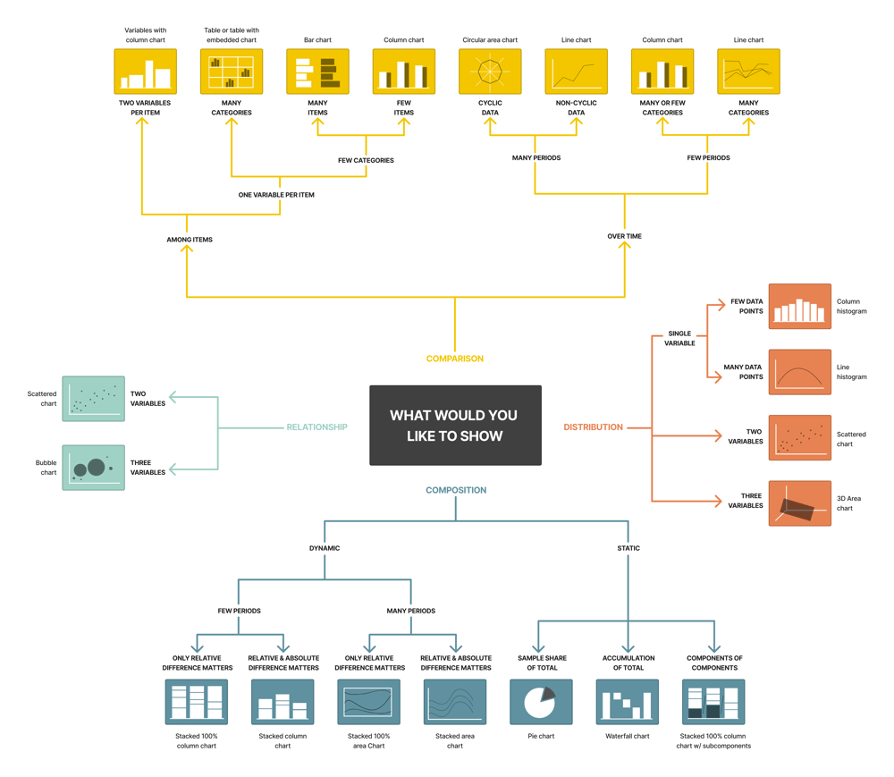
Comparison Charts
- Bar: are the pictorial representation of data (generally grouped), in the form of vertical or horizontal rectangular bars, where the length of bars is proportional to the measure of data.
- Column: are useful for showing data changes over a period of time or for illustrating comparisons among items.
- Circular area: this chart shows the different dimensions such as scores and rankings of one item. The further out a point is from the center, the higher it ranks in a category. Also known as the Spider or Radar Chart.
- Line: present data as points connected by a continuous line, measuring a variable over an interval of time.
- Table: depicts the relationships between two or more groups of elements in a grid format. There must be at least two variables assigned to the X- and Y-categories. Variables beyond the first two are denoted with different colors.
Distribution Charts
- Column histogram: depict the distribution of data over a continuous interval or particular period of time, estimating where values are concentrated with the use of vertical bars.
- Line histogram: depict the distribution of data over a continuous interval or particular period of time, estimating where values are concentrated with the use of a horizontal line.
- 3D Area chart: emphasizes the amount of change over a period of time or compares multiple items. 3D area charts also show the relationship of parts to a whole by displaying the total of the plotted values.
Composition Charts
- Pie: uses a single circle divided into “slices,” each slice representing a numerical proportion of the whole circle’s value.
- Stacked Column: Data visualization charts use columns to show numerical comparisons between categories.
- Stacked area: area charts are essentially data visualization line charts that fill the space between the x-axis with colors, which helps visually communicate part-to-whole relations.
- Waterfall: a type of multidimensional bar chart that uses floating bars to illustrate how an initial value is affected positively and negatively by different factors
Relationship Charts
- Scattered: shows two variables in the form of data points, with the physical orientation of each point determined by the value of the variable. A popular scatter plot variant is the data visualization bubble chart, in which the area of each data point bubble represents the third value.
- Bubble: an extension of the scatter plot used to look at relationships between three numeric variables.
Why Is Data Charting Important
In the midst of the continuously expanding data deluge, visual storytelling is more important than ever. Interactive, visual metaphors engage human perception more effectively than numerical values and text alone. Statistically, visual elements increase engagement significantly.
Graphs, charts, and visuals convey information faster than dense reports or spreadsheets. The use of visual metaphors provides a universal language that can be understood by people of any spoken or written language. Using data charting, people can gain valuable insights, improve decision-making, uncover hidden patterns and relationships, identify upcoming trends, facilitate visual analytics, and collaborate more effectively.