


9 Best Practices to Create Insightful BI Dashboards
.png?width=88&height=88&name=portrait_agathe_face%20(1).png)
Agathe Huez
Publié le 05.11.21
Mis à jour le 13.01.26
4 min
Business intelligence dashboards display KPIs and other data for both technical and non-technical staff in a visual interface. Good BI dashboard design starts with the user experience, understanding the needs of the user and aligning them with business goals. It's not just about presenting statistics, but about highlighting insights that will help users make better decisions.
A well-designed BI dashboard provides informative data visualizations that are understood by all users. These visualizations increase data literacy in the organization and develop a curiosity for analytics. The dashboards should be easy to use and engaging to promote higher user adoption rates. Here are 9 best practices and design tips to build insightful dashboards that guarantee growth.
01. Identify requirements
It all starts by understanding the basis of your analytics. Answer the 3 basic questions
- Who will be using the reports?
- What will the reports convey?
- Why are these reports needed?
This will help determine which data is important, parameters to evaluate on and key performance indicators (KPIs) to focus on. Remember the purpose of your BI dashboard is to gain actionable insights and make better decisions. So all the graphs and charts must be curated with the user in mind to help optimize the evaluation and thinking process.
02. Understand your dashboards
Before you get to creating your BI dashboards, it is important to know the different types of dashboards available and their uses.
- Strategic: This type of BI dashboards I used daily by the C-suite. It gives a high-level view of the data, highlighting only import KPIs and doesn’t dive too deep into the analytics. Used to scope out future opportunities and monitor current operations.
- Analytical: Used by most of the organization, these BI dashboards measure data variables with relation to time. It is great to analyze trends, understand the correlation between different parameters and gain a detailed analysis of overall organizational health.
- Operational: Focused on real-time data that monitors important KPIs, this BI dashboard is often highly specific. Used primarily by team leads or department heads, the BI dashboards give a high-level understanding of specific aspects of the organization.
- Tactical: By far the most detailed of the BI dashboards, it is most commonly used by mid-level managers. The reports drill down deep into the analytics to give weekly actionable insights that influence short-term and long-term strategies across departments.
You can choose the type of BI dashboard depending on users or incorporate various types to give the best visualization of the organization's performance.
03. Avoid clutter
.webp?width=500&name=illus-usp-2%20(3).webp)
It is easy to pack as much information as humanly possible into a BI dashboard but that would be counterproductive, as the most important aspect of the dashboard is communications. Any user should be able to look at the BI dashboard you have created and get the relevant information in 5 seconds. If they can not. Then your dashboard is cluttered.
Avoiding clutter does not mean creating a visually appealing, easy-on-the-eye design. Rather is it about the effective communication of insights and KPIs that are important to the user. A few things to keep in mind would be
- How closely the graphs and charts are packed
- Representing related data with similar fonts and colors
- Having a border to differentiate between graphs
- Put related data in blocks to represent the whole picture
- Have linear movement from one topic to another
- Use white spaces and contrast to show separation
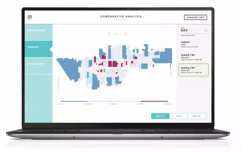
04. Choose the best visualization
The type of visualization you pick should depend on the message you are trying to convey with the data. There is no one visualization that works in all situations. The BI dashboard should be curated in such a way that information is easily communicated and the charts can accurately depict the textual insights. Here is a cheat sheet for picking your visualization.
- To depict relationships use a bubble chart or a scatter chart
- To understand distribution a column chart or scatter chart works best
- To see static composition use a waterfall chart
- For dynamic compositions, stacked column charts work best
- To show the comparison between multiple items a table or bar chart is optimal
- To compare over time use a line chart or column chart
For a more in-depth understanding of more types of visualizations check out this article.
05. Add context
The biggest downfall of many BI dashboards is context. Data visualizations and analysis without content are just numbers displayed on a screen. Context gives them meaning and makes them usable in business decision-making. The most basic form of context is data metrics, like currency, units and time.
More context can be added with headings, descriptions, filters, glossary and comments. These aren’t features found in a lot of Bi solutions but are features essential to increasing the adoption of your BI dashboards and helping make insightful decisions.
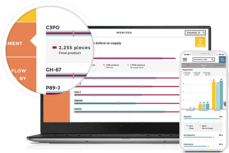
06. Web-based data sharing
![]()
Web-based data-sharing ensures that you can assess your BI dashboards from anywhere at any time. It also makes it easy to have a common working space where you can interact with co-workers, leave comments, annotate and share your findings.
The biggest advantage of web-based data access is the ability to work with real-time data and have your analytics fit the screen of your laptop, tablet or smartphone, without the loss of any features or context.
07. Tell a story with your metrics
Data storytelling is the most powerful way of communicating business insights, regardless of industry or sector. It takes the generic data in your BI dashboard and gives it a compelling narrative, capturing your audiences’ attention. It is a more efficient way to communicate with non-technical users who with the story provided can now understand the origins, use and value of the data, prompting them to dig deeper.
Learn more about data storytelling and how it changes the way you see data.
08. Test Dashboard Design
Once you have the first draft of your BI dashboard, ask a few intended users to use it. See if they are able to understand graphs and charts as intent. Analyze the ease of use and how often they come back to the dashboards for answers. Monitor if the context is sufficient and check to see if they are able to find all the information they need. Get feedback and incorporate it into the dashboard before releasing the final product.
09. Continuous analysis
Now that you have a great BI dashboard that is useful to the users and tells stories using your data, the building process isn’t over. The most forgotten aspect of BI dashboard building is continuous analysis. Depending on the rate of change in your industry, every 6 months to a year, reevaluate the effectiveness of your dashboard.
- Is it still generating value for all the users?
- Has it continued to align with the goals of the organization?
- Are any of the graphs or charts out of date?
- Have the metrics/parameters changed?
- Are there any graphs or charts that aren’t useful?
- What new analytics needs to be added?
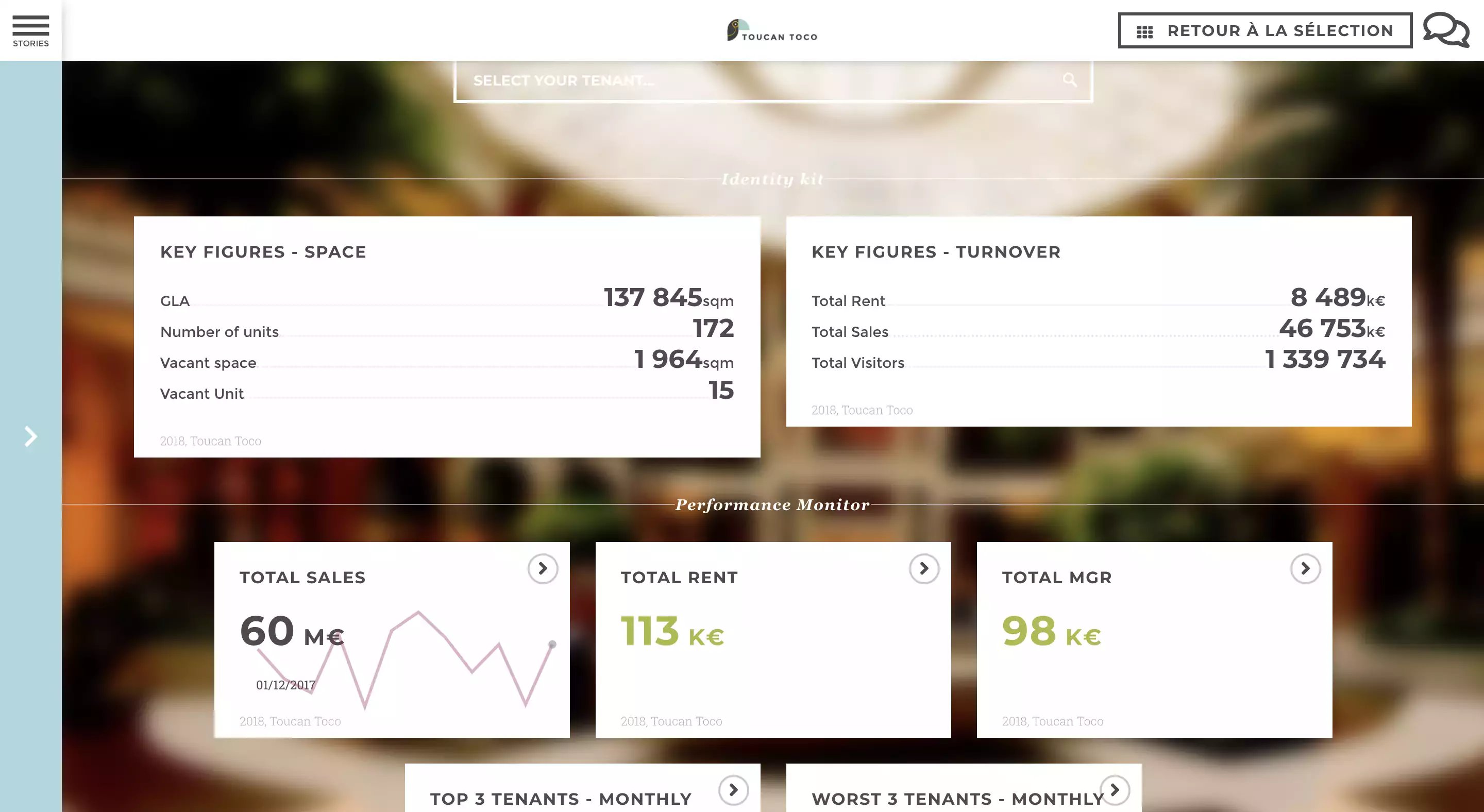
This is just a small set of questions that need to be answered regularly to make sure that your analytics are up-to-date. Periodically working through these 9 steps will ensure that your BI dashboard remains insightful, generates significant value and sets you apart from the crowd. See what a great BI dashboard looks like.
.png?width=112&height=112&name=portrait_agathe_face%20(1).png)
