We’ve all seen poor design in the workplace—the presentation with the clashing text and background, the email that uses way too many fonts, or the chart with ambiguous labeling. At best these faux pas are cringy, at worst they obscure important insights to the detriment of the business. This is especially true of data visualizations.
A clear, well-organized chart or dashboard helps to tell a story. It explains an observation and suggests a responsive action. The better teams can communicate their insights, the more value the organization is able to realize from their data. The reverse is also true: a poorly designed data visualization can hide the insight it’s intended to convey, or even mislead the viewer.
The Expertise Gap
Business folks know the business. They don’t necessarily know graphic design or data preparation. Nor should they. Unfortunately, in the rush to provide self-service business intelligence (BI) tools, organizations often forget this reality. Many of the leading platforms overwhelm business users by cramming even more features into their tools. While this seems like a good thing—providing users with more choices—when those users don’t know how to make wise decisions, it leads to a decline in the quality of the results. More choices, if they are poor choices, lead to a worse outcome.
Business folks know the business. They don’t necessarily know data or graphic design. Nor should they.
Some organizations seek to remedy this problem by designating gifted users as data storytellers and having them carry the bulk of the data visualization burden. They either design everything themselves with input from the business user whose insight it is or review and edit designs that less talented users have created before they reach their intended audience. This strategy is fundamentally flawed, however, in that it eliminates many of the benefits of business user oriented tools. When only a handful of people actually use the tool on behalf of everyone else, the process remains effectively centralized. This is not data democratization.
CUstomer-facing Data Storytelling
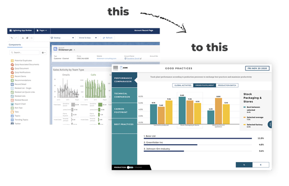
The alternative is a customer-facing data storytelling platform. Unlike traditional BI tools, customer-facing platforms intentionally limit choice. Instead of presenting users with enumerable options for customization, the platform embeds best practices for aspects such as color, font, and chart types. It provides a template experience through which business users can communicate their expertise and insights in a way that will later be legible to others. In so doing, it removes the burden of design.
Unlike traditional BI tools, guided platforms intentionally limit choice. Instead of presenting users with enumerable options for customization, the platform embeds best practices for aspects such as color, font, and chart types.
Of course, sometimes visualizations require something beyond the basic structures. But for 80% of use cases, the essential 20% of a tool’s capabilities are sufficient. And for business users, the simplicity of the experience allows them to spend more time generating actual insights than worrying about how to present them. If every once in a while, they need to leverage a different tool or call on a dedicated data storyteller to help them with a particular project, that’s okay. With a customer-facing platform, at least it’s not every time.
No code Data Preparation
Increasingly, data storytelling platforms, like Toucan Toco, are expanding their experience beyond the design aspects of visualizing the data and communicating insights. They extend this approach to the process of preparing the data. Just like graphic design, data preparation is a technical task that requires certain expertise. Unless the business user is highly data literate, they may not be comfortable preparing their own data. This discomfort forces them to rely on data engineers or other colleagues to do that work for them, slowing their workflow and placing an extra burden on more technical folks.
Just like graphic design, data preparation is a technical task that requires certain expertise. Unless the business user is highly data literate, they may not be comfortable preparing their own data.
As with data storytelling, data prep holds the hands of business users as they go through what otherwise might be a daunting process. By making recommendations and providing guardrails, these tools place business users at ease and allow them to realize the promised benefits of customer-facing analytics.
Conclusion
Ultimately, guided data storytelling platforms meet the needs of less technical businesspeople in a way that traditional approaches to self-service BI simply don’t. By meeting folks where they are, and not asking them to be experts at everything, these tools empower business users to become self-sufficient data users. Without additional expertise or training, business user can turn their insights into compelling data stories and help drive the business without waiting around for more technical users to respond to their requests.
Written By: Joe Hilleary, Senior Research Analyst at Eckerson Group